30 Best Skateboard Logo Design Ideas You Should Check
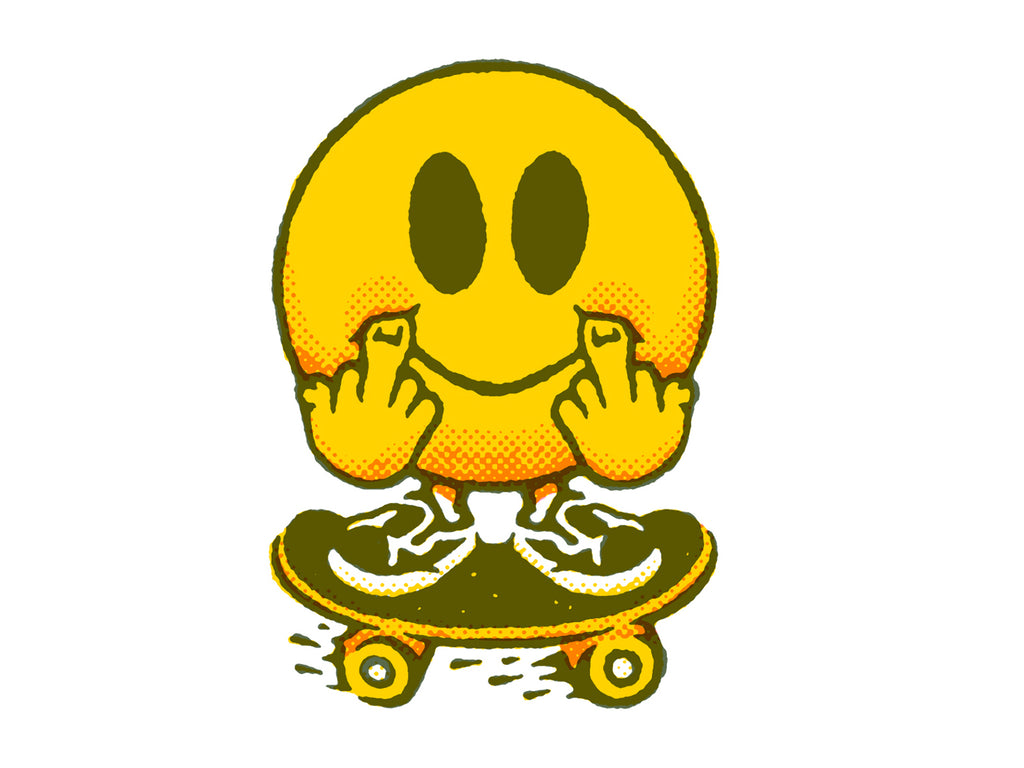
Created by Dan Lehman | https://dribbble.com/shots/16910232-Flippy
In the world of extreme sports, where adrenaline and creativity collide, the art of skateboard logo design stands out as a beacon of individuality and brand identity. Crafting the perfect logo for a skateboard brand is not just about making a visual statement; it's about encapsulating the spirit of freedom, rebellion, and artistic expression that defines the skateboarding culture. As we dive into the depths of design inspiration, we're here to spotlight some of the most innovative and captivating skateboard logo design ideas that are sure to kickflip your imagination into overdrive.
This journey through the world of skateboard logo design is tailored for designers, brand managers, and skateboarding enthusiasts alike, seeking to carve a unique identity in the crowded marketplace. Whether you're looking to revamp an existing brand or starting from the grip tape up, our collection of design ideas promises to deliver a burst of creativity. With a fun and unique writing tone, we aim to make this exploration as thrilling as landing your first half-pipe. So, grab your decks, and let's roll through the dynamic world of skateboard logo design, where every curve, color, and font choice reflects the vibrant soul of skateboarding.
Skateboard Logo Design Ideas
1. Okay Cool

Created by Andy Gilmore | https://dribbble.com/shots/14744269-Okay-Cool-Logo
2. Anwer

Created by Jeret Coe Chiri | https://dribbble.com/shots/14048789-Shred-Till-Ya-Dead
3. Board Stabber

Created by Narendra Setya | https://dribbble.com/shots/9623968-BOARD-STABBER
4. Superfreunde Tasty Ride

Created by Christian Bögle | https://dribbble.com/shots/19910772-SUPERFREUNDE-TASTY-RIDE
5. Kick-Flip Stego

Created by David DeSandro | https://dribbble.com/shots/4814158-Kick-flip-stego
6. Madtown Skatepark

Created by Ty Fortune | https://dribbble.com/shots/4080285-Cartoon-Rebrand-Madtown-Skatepark
7. Nelson Nokela

Created by Nelson Nokela | https://dribbble.com/shots/4800757-Skate-Mascot
8. Grom

Created by Ty Fortune | https://dribbble.com/shots/6894774-Lingo-Type-Grom
9. Tarik Raiss

Created by Tarik Raiss | https://dribbble.com/shots/17689721-Skateboard-and-Rock-n-roll
10. Globe Skateboards

Created by Alex Aperios | https://dribbble.com/shots/6233693-Globe-Skateboards-Logo-Experiment
11. Puppets Skateboard Co

Created by Nick Zotov | https://dribbble.com/shots/15656065-Skateboard
12. State Champs
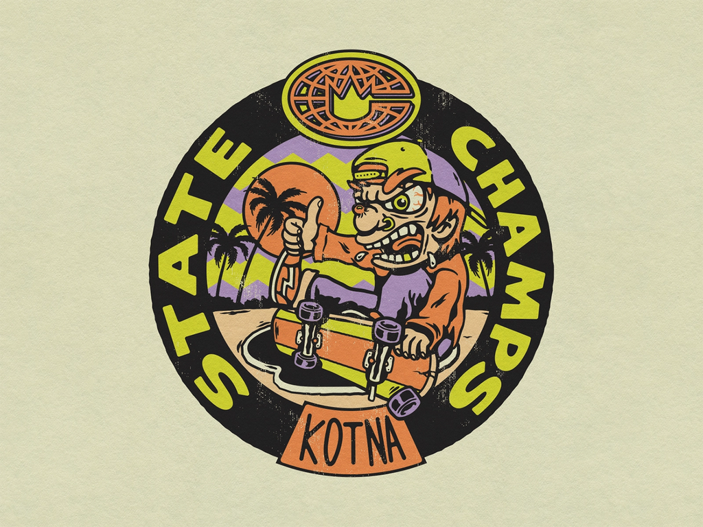
Created by Vinicius Gut | https://dribbble.com/shots/18904492-State-Champs
13. Ride the Sky

Created by Konstantin Reshetnikov | https://dribbble.com/shots/15677628-Ride-the-sky
14. Cowtown Skateboards

Created by Mark Johnston | https://dribbble.com/shots/16774435-Cowtown-Skateboards-Merch
15. Skate Off

Created by David Ristevski | https://dribbble.com/shots/14210858-Skate-Of
16. Patswerk

Created by Patswerk | https://dribbble.com/shots/19863768-Stickers
17. Great Lakes Skateboard Co

Created by Brethren Design Co | https://dribbble.com/shots/5700663-Great-Lakes-Skateboard-co-Flash-Sheet
18. Horn Lake Skatepark Association

Created by Curt Crocker | https://dribbble.com/shots/20249766-Horn-Lake-Skatepark-Association
19. Dermot Reddan

Created by Dermot Reddan | https://dribbble.com/shots/5474047-Skate-design-mascot
20. Jud Lively

Created by Jud Lively | https://dribbble.com/shots/12004182-Skateboarding-Butterfly
21. Cowtown Skateboard

Created by Mark Johnston | https://dribbble.com/shots/19988890-Cowtown-Speed-Cow
22. Sk8school
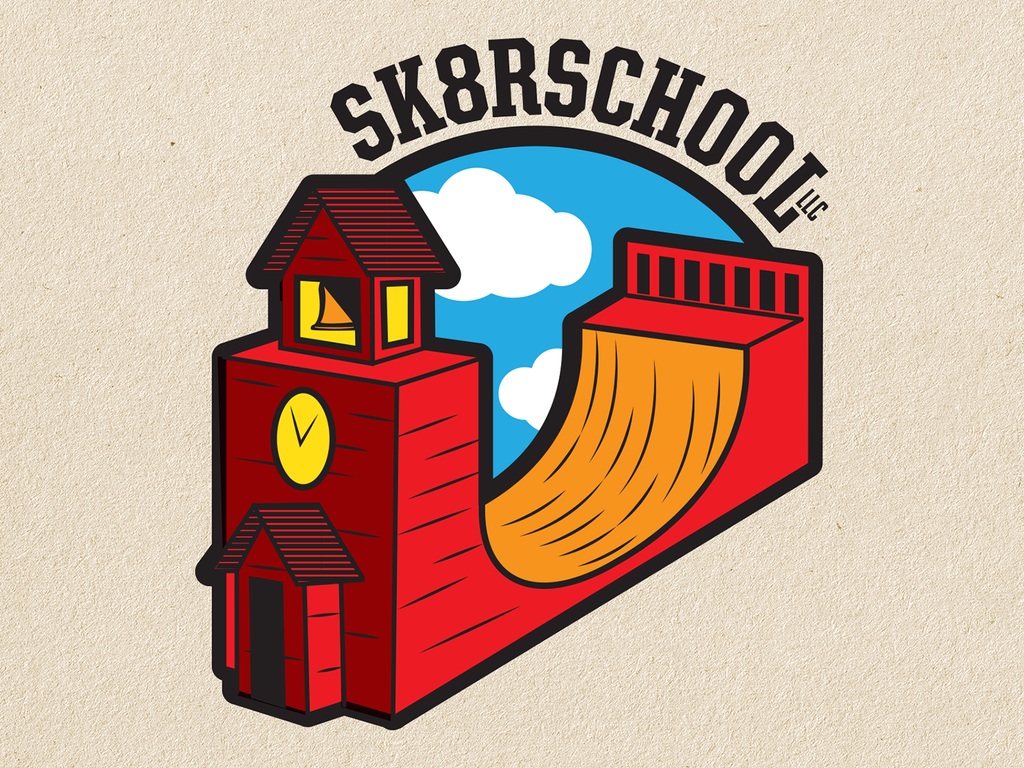
Created by Tom Deja | https://dribbble.com/shots/12101500-Skateboarding-School-Logo-Concept
23. Hesh Skating

Created by Jay Master | https://dribbble.com/shots/9876244-Hesh-Skating
24. Pense

Created by Vinicius Gut | https://dribbble.com/shots/15045285-Pense
25. Cowtown Skateboard

Created by Mark Johnston | https://dribbble.com/shots/19788232-Cowtown-Eagle-Cow-Skull
26. Bad Cat

Created by TMPL DESIGN COMPANY | https://dribbble.com/shots/15706283-Bad-Cat
27. Dashboard Confessional

Created by Vinicius Gut | https://dribbble.com/shots/15071404-Dashboard-Confessional-Valentine-s-Day
28. NDSA

Created by Nathaniel Navratil | https://dribbble.com/shots/20181504-NDSA-Logo
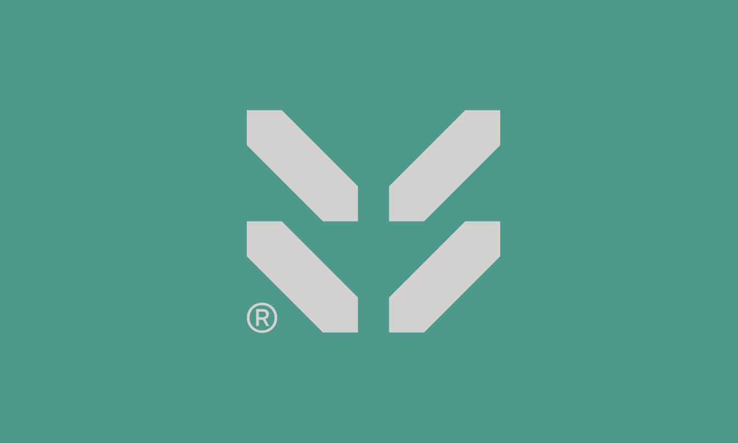
29. Flippy

Created by Dan Lehman | https://dribbble.com/shots/16910232-Flippy
30. Do Something Different

Created by Skilline | https://dribbble.com/shots/20859732-Apparel-Graphic
What Are the Common Styles in Skateboard Logo Designs?
When diving into the world of skateboard logo design, you're entering a realm where creativity knows no bounds and where the bold, the rebellious, and the downright gnarly come to play. Skateboard logo designs are not just about branding; they're about making a statement, telling a story, and resonating with the free-spirited heart of the skateboarding community. If you're looking to create a logo that ollies off the page and into the hearts of skaters worldwide, understanding the common styles is your first step to mastering the art of skateboard logo design. Let's grind through five of the most iconic styles that define the scene.
Bold and Edgy
Skateboard culture thrives on boldness and edge. Logos in this style often feature sharp, angular typography paired with dynamic, abstract shapes that evoke a sense of movement and energy. Think about designs that scream (not whisper) from the decks and apparel, making a statement that's impossible to ignore. These logos tap into the essence of skateboarding's roots: rebellion against the mainstream.
Vintage and Retro
Nostalgia plays a big part in skateboard logo design, with many brands opting for a vintage or retro aesthetic that harks back to the golden era of skateboarding. These designs often incorporate elements from the '70s, '80s, and '90s, using groovy typography, warm color palettes, and classic imagery like palm trees, sunsets, or old-school skateboards. This style appeals to the soulful side of skate culture, celebrating its history and timeless appeal.
Minimalist and Modern
In contrast to the more is more approach, some skateboard logos go for the sleek, minimalist look. This style focuses on simple, clean lines, limited color schemes, and a focus on symbolic imagery or text. It's the art of conveying the brand's essence without the clutter, appealing to the skater who appreciates the beauty in simplicity and the modern twist on skateboarding's evolving identity.
Street Art and Graffiti
Skateboarding and street art have always rolled hand in hand, making graffiti-inspired logos a natural fit for many brands. This style is all about vibrant colors, spray-paint effects, and urban-inspired fonts that look like they've been lifted straight from a city alleyway or skate park wall. These logos capture the raw, unfiltered voice of the streets, reflecting the grassroots nature of skate culture.
Custom Illustrations
Finally, custom illustrations offer a unique avenue for brands to tell their story and showcase their identity. These logos might feature mascot characters, detailed scenes, or abstract artworks that are as distinctive as the brands they represent. This style allows for maximum creativity and personalization, connecting with the audience on a more intimate level through storytelling and art.
Exploring the common styles in skateboard logo design is like taking a tour through the diverse neighborhoods of skate culture. Each style speaks to a different aspect of skateboarding's rich tapestry, from its rebellious roots to its artistic expressions. Whether you're a brand looking to make your mark or a designer eager to push the boundaries of creativity, understanding these styles is your ticket to creating a skateboard logo that resonates, rebels, and rides off into the sunset with style.
What Are Some Creative Ideas for Skateboard Logo Designs?
When it comes to carving out a unique identity in the skateboard world, the logo design you ride with can make all the difference. It’s not just about slapping some cool graphics on a deck; it’s about encapsulating the spirit of skateboarding—its freedom, its defiance, its artistry. If you're looking to kickflip your brand into the hearts of skaters everywhere, sparking creativity in your skateboard logo design is crucial. Let's pop-shuvit into five creative ideas that will ensure your logo is more than just a graphic; it's a statement.
Merge the Urban with the Natural
Skateboarding thrives in urban landscapes, but its soul is deeply connected to the natural world—the freedom of the ocean waves, the thrill of mountain slopes. Why not blend these elements into your logo design? Imagine a skyline silhouette seamlessly transitioning into mountain peaks, or wheels morphing into ocean waves. This fusion symbolizes the skateboarder's journey, navigating the concrete jungle with the spirit of a wild adventurer.
Play with Perspective
Skateboarding is all about seeing the world from a different angle. Take this philosophy to heart by crafting a logo that plays with perspective. Think of a design that might initially appear abstract, but upon closer inspection, reveals a skater executing a trick or a hidden element related to skateboarding culture. This approach encourages engagement, inviting viewers to take a second look and connect with the logo on a deeper level.
Incorporate Skateboarding Lingo
Skateboarding comes with its own vibrant lexicon—a mix of technical terms, slang, and iconic phrases. Incorporating this language into your logo can resonate deeply with the skate community. Visual puns or designs that visually represent phrases like “grind,” “ollie,” or “kickflip” can add a layer of insider knowledge and fun to your brand, making it instantly recognizable and relatable to skaters.
Use Dynamic Motion
The essence of skateboarding is motion, and your logo should reflect that. Create a design that captures the fluidity and dynamism of skateboarding. This could mean incorporating elements that suggest movement, such as streaks, blurs, or lines that trail behind a central figure or object, giving the impression of speed and agility. A logo that looks like it’s moving can convey the energy and excitement inherent to the sport.
Craft a Custom Typeface
While images and symbols are powerful, never underestimate the impact of a unique, custom typeface. Designing a font that mirrors the curves, lines, and edges of skateboarding infrastructure—like ramps, rails, and half-pipes—can set your logo apart. A typeface that embodies the essence of skateboarding not only makes your brand name stand out but also weaves the spirit of skate culture directly into the fabric of your logo.
Embarking on the journey of creating a skateboard logo design is an invitation to blend art with action, culture with creativity. By exploring these ideas, you're not just designing a logo; you're crafting a beacon for your brand, one that signals to skaters worldwide that you understand what drives them—both on and off the deck. Remember, in the world of skateboarding, your logo is more than a visual identifier; it's a badge of honor, a symbol of community, and a declaration of your brand's love for the ride. Let's make it unforgettable.
How to Show Playful in Skateboard Logo Designs?
Diving into the world of skateboard logo design, one quickly realizes that playfulness isn't just an option—it's a must. Skateboarding, at its core, is about fun, freedom, and expressing oneself in the most dynamic ways possible. A playful logo captures this spirit, inviting onlookers to not just view but to feel the vibrancy and joy of skate culture. If you're looking to bring a sense of playfulness into your skateboard logo design, here are five tips to help you ollie above the standard and land with a design that's truly rad.
Embrace Bright and Bold Colors
Nothing screams playful like a palette that pops. Utilizing bright, bold colors in your skateboard logo design can immediately infuse it with energy and fun. Think neon greens, electric blues, and hot pinks that stand out against the backdrop of concrete and asphalt. These colors not only grab attention but also reflect the youthful, vibrant essence of skateboarding.
Incorporate Fun Illustrations and Mascots
What better way to show playfulness than with characters and illustrations that tell a story? Design a mascot or a set of illustrations that embody the fun, rebellious spirit of skateboarding. Whether it's a skateboarding panda with a mischievous grin or a set of wheels come to life, these characters can add a layer of personality and charm to your logo, making your brand memorable and engaging.
Play with Typography
Typography in skateboard logo design can be a playground in itself. Go beyond standard fonts and create something that jumps off the page (or deck). Experiment with fonts that have unusual shapes, playful curves, or even elements that mimic skateboarding tricks and movements. A typeface that tilts, twists, or loops can convey movement and fun, drawing viewers into the playful world your brand represents.
Integrate Skateboarding Elements in Unexpected Ways
Skateboarding is all about creativity and seeing potential where others see obstacles. Apply this philosophy to your logo design by integrating skateboarding elements—like decks, wheels, and trucks—in unexpected ways. Imagine a logo where the wheels double as O's in your brand name or a deck that morphs into a playful creature. These clever integrations show not just playfulness but also a deep understanding and love for skateboarding culture.
Use Dynamic Shapes and Patterns
Finally, infusing your skateboard logo design with dynamic shapes and patterns can elevate its playfulness. Opt for designs that suggest movement and fluidity, such as swirls, splashes, or abstract shapes that seem to dance around the logo. Patterns that evoke the rhythm of rolling wheels or the flow of a skater in motion can make your logo not just seen but felt, capturing the essence of playfulness in skateboarding.
Crafting a playful skateboard logo design is about channeling the heart of skate culture into visual form. It's an opportunity to connect with the community on a level that transcends words, through colors, shapes, and images that speak directly to the soul of skateboarding. Remember, in the world of skateboarding, your logo is more than a brand mark; it's a reflection of the joy, creativity, and freedom that define the sport. Let your logo be an invitation to join the ride, to embrace the fun, and to celebrate the boundless spirit of skateboarding.
What Color Palettes Are Suitable for Skateboard Logo Designs?
When it comes to creating a standout skateboard logo design, selecting the right color palette is as crucial as landing the perfect kickflip. Colors not only define the visual appeal of your logo but also convey the brand's personality, mood, and values. Skateboarding, with its rich culture of creativity, rebellion, and freedom, offers a unique canvas for designers to experiment with vibrant, bold, and sometimes unexpected color combinations. Let's dive into five color palettes that will make your skateboard logo design pop, grind, and slide into the hearts of skaters everywhere.
Bold and Vibrant
Skateboarding isn't known for its subtlety, and neither should your logo's color palette. Embrace bold and vibrant colors that stand out in a crowd. Neon greens, electric blues, fiery oranges, and hot pinks can electrify your design, capturing the dynamic energy and youthful spirit of skateboarding culture. These colors work well for brands looking to make a loud, unapologetic statement and appeal to an audience that thrives on excitement and adventure.
Urban and Gritty
Reflect the raw, urban essence of street skating with a palette that echoes the colors of the cityscape. Think steel grays, asphalt blacks, brick reds, and muted greens. These colors can give your logo a gritty, edgy feel, resonating with skaters who see the city as their playground. This palette is perfect for brands that want to embody resilience, toughness, and the authentic street roots of skateboarding.
Retro and Nostalgic
Pay homage to skateboarding's golden eras—the '70s, '80s, and '90s—with a retro-inspired color palette. Soft pastels, sun-faded oranges, teal, and mustard yellows can invoke nostalgia and capture the soulful side of skateboarding. This palette suits brands that blend modern skate culture with a nod to its history, appealing to both new skaters and those who've been riding since the vinyl records era.
Natural and Earthy
For brands that emphasize sustainability, outdoor exploration, or the connection between skateboarding and nature, an earthy color palette can speak volumes. Incorporate shades of forest green, sky blue, sandy beige, and stone gray to evoke the great outdoors. This approach is ideal for logos that aim to convey a sense of harmony, balance, and respect for the environment, resonating with eco-conscious skaters and those who find their freedom carving through natural landscapes.
Monochromatic and Minimalist
Sometimes, less is more. A monochromatic color palette, using various shades of a single color, can create a sleek, modern look for your skateboard logo design. Whether it's a cool blue, a warm red, or a neutral gray, sticking to one color with varying tones can offer a sophisticated vibe while maintaining focus on the logo's shape and form. This palette is suited for brands aiming for a minimalist, understated elegance that stands out through simplicity and refinement.
Choosing the right color palette for your skateboard logo design is about more than just aesthetics—it's about telling a story, invoking a feeling, and connecting with the community on a visual and emotional level. Whether you're drawn to the loud and lively or the subtle and sophisticated, remember that your color choices should reflect the essence of your brand and the spirit of skateboarding itself. Let your palette be a bridge between your brand's identity and the vibrant, diverse world of skate culture, inviting skaters to ride along in style.
What Famous Brands Are Using Skateboard Logo Designs?
Skateboarding isn't just a sport; it's a culture, a lifestyle, and, most importantly, an art form that transcends the bounds of the skatepark. This vibrant world is not only about the tricks and flips but also about the brands that have become synonymous with the sport. These brands have mastered the art of skateboard logo design, creating iconic symbols that represent more than just merchandise—they signify a part of skateboarding history. Let's drop into the halfpipe and explore five famous brands whose logos have become emblematic of the skateboarding world, each telling its own story of creativity, rebellion, and community.
Santa Cruz Skateboards
With its screaming hand logo, Santa Cruz Skateboards boasts one of the most recognizable symbols in the skateboarding universe. Designed by Jim Phillips in the early '80s, this logo perfectly captures the raw energy and rebellious spirit of skate culture. The screaming hand is not just a logo; it's a symbol of resistance, creativity, and the loud, unapologetic essence of skateboarding. Santa Cruz's use of bold colors and graphic imagery in their skateboard logo design continues to inspire skaters and designers alike.
Thrasher Magazine
Thrasher Magazine's flaming logo is as iconic as the publication itself. Known for its edgy content, photography, and embodiment of skate culture, Thrasher's logo is a testament to the brand's fiery spirit and its status as the bible of skateboarding. The simple yet striking design, featuring the magazine's name engulfed in flames, speaks to the passion and intensity that skateboarding invokes. This logo design has transcended its original purpose, becoming a fashion statement and a symbol of skateboarding's enduring influence.
Powell-Peralta
Powell-Peralta, a cornerstone of the skateboarding industry, is renowned not just for its innovative skate products but also for its memorable logo designs. The most famous among them is the Ripper graphic, a skull breaking through the surface, which has become an enduring symbol of skateboarding's gritty and fearless nature. Powell-Peralta's commitment to artistic and bold skateboard logo designs reflects the brand's significant impact on skate culture and its legacy in promoting skateboarding as an art form.
Vans
While Vans started as a shoe company, its "Off The Wall" slogan and logo have become deeply embedded in skateboarding culture. The logo, which symbolizes the brand's dedication to the skateboarding lifestyle, reflects Vans' identity as a supporter of individuality, creativity, and the unconventional. The simple, yet impactful design of the Vans logo, coupled with its association with the sport's most influential athletes and events, cements its place in skateboarding lore.
Element Skateboards
Element Skateboards brings a unique approach to skateboard logo design, with its simple yet profound tree logo symbolizing growth, positivity, and the interconnectedness of life. The Element logo embodies the brand's commitment to environmental sustainability, community, and bringing progress to skateboarding and society. This emblem stands out for its meaningful message and the way it resonates with skaters who share a deep connection with nature and the outdoors.
These famous brands have leveraged the power of skateboard logo design to carve out their niches within the skateboarding world, creating symbols that are instantly recognizable and laden with meaning. Their logos are not just marks of identification; they are beacons of the skateboarding ethos, encapsulating the thrill, creativity, and community that define the sport. As skateboarding continues to evolve, these logos remain steadfast symbols of its vibrant culture, inspiring new generations of skaters and designers to leave their mark on the world.
Conclusion
Skateboard logo design is not just about creating a visual identity; it's about capturing the soul of skateboarding itself. Through the exploration of famous brands and their iconic logos, we've seen how design can encapsulate the essence of rebellion, creativity, and community that defines this vibrant culture. As designers, our challenge is to continue pushing the boundaries, blending artistry with the spirit of skateboarding to create logos that resonate deeply with skaters worldwide. By keeping authenticity, innovation, and connection at the heart of our designs, we can contribute to the ever-evolving tapestry of skateboarding history and culture.
Let Us Know What You Think!
Every information you read here are written and curated by Kreafolk's team, carefully pieced together with our creative community in mind. Did you enjoy our contents? Leave a comment below and share your thoughts. Cheers to more creative articles and inspirations!


Leave a Comment