30 Best Pilates Logo Design Ideas You Should Check
Created by Jai Taylor | https://dribbble.com/shots/5472988-Logo-Pilates-At-Studio-8
Are you on a quest to find the ultimate pilates logo design that embodies the essence of strength, flexibility, and balance? Dive into our vibrant selection of the best pilates logo design ideas that are not just visually appealing but also brimming with inspiration and creativity. In the dynamic world of fitness and wellness, a captivating logo is your first step towards standing out, and what better way to shine than with a design that speaks volumes about your brand's philosophy?
Pilates, a discipline known for its focus on core strength, flexibility, and mindful movement, deserves a logo that mirrors these qualities. From minimalist designs that embody elegance and simplicity to more dynamic, colorful creations that capture movement and energy, the possibilities are endless. Whether you're a seasoned studio looking to revamp your visual identity or a fresh face on the pilates scene, finding that perfect blend of creativity and clarity in your logo is key.
Our article will not only showcase some of the most eye-catching pilates logo design ideas out there but also sprinkle in fun and unique insights to help ignite your imagination. Get ready to be inspired by designs that are as flexible and balanced as the pilates method itself. Let's embark on this design journey together and find the logo that truly represents your brand's spirit and ethos.
Pilates Logo Design Ideas
1. Mindbody Pilates Studio

Created by Alejandro Torres | https://dribbble.com/shots/6179290-Mindbody-Pilates-Studio
2. Pilato

Created by Victoria Dimitrova | https://dribbble.com/shots/17223984-Logo-for-pilates-club-Pilato
3. Victoria Rose

Created by Mat Finch | https://dribbble.com/shots/11395334-Victoria-Rose-Pilates-Logo-Design
4. Solus Pilates

Created by Une Design Criativo | https://www.behance.net/gallery/133761669/Solus-Pilates-Brand-Identity
5. Reset by Riser
Created by Octavo Designs | https://dribbble.com/shots/20528900-Reset-by-Riser
6. The Pilates Guy
Created by Stina Norgren | https://dribbble.com/shots/1676262-The-pilates-guy
7. Pause

Created by Влада Мирошкина | https://www.behance.net/gallery/147815799/pauseyoga-and-pilates
8. A.R.C Pilates Studio

Created by Dustin Ryan | https://dribbble.com/shots/3646755-A-R-C-Pilates-Studio
9. Ka'minhos de Cura

Created by Fábio Carneiro | https://www.behance.net/gallery/112393717/Kaminhos-de-Cura-Branding
10. LON Pilates
Created by Lucas Fontes | https://www.behance.net/gallery/152590389/LON-Pilates-RPG
11. Alessandra Moreira

Created by Abdalla Jow | https://dribbble.com/shots/4544185-Am1
12. Renata Firmino Pilates

Created by Julia Felix | https://www.behance.net/gallery/148375255/Identidade-Visual-Renata-Firmino-Pilates
13. Pilates Designs

Created by Koncepted | https://dribbble.com/shots/3407670-Pilates-Branding
14. Ayska Niyoshaa
Created by Ayska Niyoshaa | https://www.behance.net/gallery/137776733/Trainer-pilates-woman-yoga-logo-identity
15. Simply Pilates
Created by April Scarduzio | https://dribbble.com/shots/2908653-Simply-Pilates
16. Movimood

Created by Renato AB | https://www.behance.net/gallery/116526011/Movimood
17. Joice Rodrigues Pilates

Created by Felipe Samir | https://www.behance.net/gallery/124319893/Branding-Pilates
18. The Pilates Room Bristol

Created by Hannah King | https://dribbble.com/shots/3486025-The-Pilates-Room-Bristol-Logo
19. PiYo Pilates & Gym

Created by razi | https://dribbble.com/shots/12072175-PiYo-gym-logo
20. Equilibrium Pilates
Created by Jamie Stark | https://dribbble.com/shots/2241200-Equilibrium-Pilates
21. Brighton Pilates

Created by Celsey Jones | https://dribbble.com/shots/13893407-Brighton-Pilates-Brand-Identity-Web
22. Number Φ

Created by Niki A. | https://www.behance.net/gallery/158132723/Visual-Identity-Strategy-Case-Study-Pilates-Studio
23. Bird Pilates

Created by ExPerimental Cargo | https://www.behance.net/gallery/150364481/BIRD-PILATES-Brand-Identity-Design
24. Anatis Pilates

Created by Verena Tam | https://dribbble.com/shots/5321241-ANATIS-PILATES
25. Estudio C

Created by Rafael Ramírez | https://dribbble.com/shots/2975131-Estudio-C-Logo
26. Studio Sunday

Created by Rachel Rippy | https://dribbble.com/shots/4007356-Studio-Sunday
27. Evolura
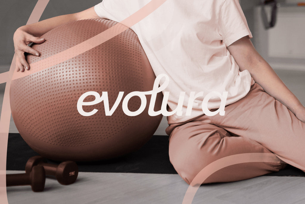
Created by Sollara Brands | https://www.behance.net/gallery/160142075/EVOLURA-Naming-Visual-Identity
28. Mindful Movements

Created by Evan Delagrange | https://dribbble.com/shots/10877353-Mindful-Movements
29. Pilates At Studio 8

Created by Jai Taylor | https://dribbble.com/shots/5472988-Logo-Pilates-At-Studio-8
30. Pilates On Third

Created by Ansley Randall | https://dribbble.com/shots/5302429-Logo-design
What Are the Common Styles in Pilates Logo Designs?
Embarking on a pilates logo design journey is akin to entering a pilates class—both require an understanding of form, balance, and the styles that best communicate your message. Just as pilates blends strength, flexibility, and mindfulness, effective logo designs for pilates studios or brands combine aesthetics with clarity to perfectly represent the practice's essence. Let's roll out our design mat and explore five common styles in pilates logo designs, ensuring your brand's visual identity is as engaging and unique as the pilates method itself.
Minimalist and Clean
Reflecting the precision and simplicity at the core of pilates, minimalist logo designs are incredibly popular. This style uses clean lines, simple shapes, and a restrained color palette to convey elegance and clarity. A minimalist logo might feature a single, graceful human figure in a pilates pose or simple geometric shapes representing balance and harmony. The beauty of this style lies in its ability to communicate the essence of pilates without overwhelming the viewer, embodying the principle that less is indeed more.
Organic and Nature-Inspired
Pilates emphasizes the natural alignment and strengthening of the body, making organic and nature-inspired designs a fitting choice. Logos that incorporate elements like leaves, waves, or the silhouette of a tree can symbolize growth, flexibility, and the connection to nature. This style often employs a soothing color palette of greens, blues, and earth tones, inviting viewers to experience the rejuvenating and grounding effects of pilates.
Elegant and Sophisticated
For studios or brands that want to highlight the grace and exclusivity of their pilates practice, an elegant and sophisticated logo design can be very appealing. This style might feature refined typography, classic color schemes like black, gold, or navy, and subtle symbols of luxury, such as a stylized monogram or a sleek, abstract form. The aim is to attract an audience looking for a high-end pilates experience, promising not just physical fitness but a lifestyle of elegance and refinement.
Dynamic and Energetic
Capturing the vitality and movement inherent in pilates, dynamic and energetic logo designs are all about conveying motion and energy. Bright colors, bold shapes, and elements that suggest movement (like swirls, curves, or figures in action) are key features of this style. This approach appeals to those drawn to the more vigorous aspects of pilates, emphasizing strength, endurance, and the dynamic flow of the exercises.
Whimsical and Playful
Pilates is a practice that can bring joy and lightness to its practitioners, making whimsical and playful designs a delightful choice for certain brands. This style uses fun illustrations, vibrant colors, and creative typography to convey a sense of playfulness and approachability. It’s perfect for studios or products aiming to demystify pilates and make it accessible to beginners or those looking for a fun way to stay fit.
Each of these common styles in pilates logo design offers a unique way to communicate your brand’s identity and values. Whether you lean towards the elegance of minimalism, the natural vibes of organic designs, the luxury of sophistication, the vibrancy of dynamic styles, or the fun of whimsical logos, your pilates logo can be a powerful tool in connecting with your audience. Remember, the best logo is one that resonates with your brand’s spirit, inviting everyone to roll out their mat and join the pilates movement.
What Are the Common Styles in Pilates Logo Designs?
Embarking on the creation of a pilates logo design is akin to stepping onto the mat for a Pilates session—both require a blend of concentration, balance, and the avoidance of common pitfalls to achieve perfection. Just as a slight misalignment in pilates can lead to less effective workouts, certain missteps in logo design can prevent your brand from truly resonating with your audience. In the spirit of mastering our craft, let's explore five common mistakes in pilates logo designs, ensuring your brand stands tall and proud, much like a perfectly executed teaser pose.
Overcomplicating the Design
In pilates, precision and simplicity lead to the most profound results. Similarly, a logo cluttered with too many elements, colors, or intricate details can overwhelm the viewer, diluting the brand message. The mistake here lies in forgetting that clarity and ease of recognition are key. Opt for a clean, minimalist design that captures the essence of Pilates with elegance and simplicity, ensuring your logo is as memorable as it is meaningful.
Ignoring Brand Personality
Pilates is a practice rich in nuance, catering to a diverse range of individuals. A logo that fails to reflect the unique personality of your pilates brand—whether it's focused on strength, mindfulness, rehabilitation, or energy—misses a vital connection with its intended audience. Tailor your design to mirror your brand's core values and spirit, ensuring it speaks directly to the hearts (and cores) of your clientele.
Using Clichéd Imagery
While it's tempting to lean on obvious symbols like generic human silhouettes or the ubiquitous pilates equipment, these can render your logo indistinguishable from a sea of similar designs. The error here is not in using these elements, but in failing to inject them with a unique twist that sets your brand apart. Get creative—blend these familiar symbols with unexpected elements or stylize them in a way that tells a story unique to your brand.
Neglecting Versatility
A great pilates logo, much like a well-rounded pilates program, should be adaptable to various contexts. Designing a logo that looks fabulous on a website but loses its charm on smaller formats like business cards or merchandise is a common oversight. Ensure your logo maintains its integrity and impact across all mediums by testing its scalability and readability in different sizes and applications.
Disregarding Color Psychology
Colors evoke emotions, set moods, and can deeply influence perceptions. A misstep in choosing your logo's color palette can send the wrong message about your pilates brand. Vibrant reds might convey intensity and passion, which could clash with a brand that emphasizes tranquility and mindfulness. Select colors that align with your brand's ethos, leveraging color psychology to evoke the desired emotional response from your audience.
Crafting a pilates logo design is an exercise in balance, requiring mindfulness to sidestep these common mistakes. By focusing on simplicity, reflecting your brand's unique personality, avoiding clichés, ensuring versatility, and thoughtfully choosing your color palette, you can create a logo that not only captivates but also accurately represents the essence of your Pilates brand. Remember, in pilates and in design, alignment is key—align your logo with your brand's core values and watch as it helps your business gracefully soar.
What Symbolisms Can I Feature in Pilates Logo Designs?
Embarking on the creation of a pilates logo design is much like preparing for a pilates session itself: it requires thoughtfulness, creativity, and a deep understanding of the practice’s core principles. Pilates, with its emphasis on strength, flexibility, and mindfulness, offers a wealth of symbolic inspiration for designers. So, how can you distill this rich exercise philosophy into a compelling visual symbol? Let’s stretch our creative muscles and explore five vibrant symbolisms perfect for any pilates logo design.
The Silhouette of Grace
One of the most captivating aspects of pilates is the graceful, fluid movements it involves. Incorporating human silhouettes in poses that emphasize flow and elegance can immediately convey the essence of pilates. Think of a figure holding a pose that showcases balance and strength, encapsulating the poise and precision pilates practitioners strive for. These silhouettes can serve as a powerful central motif, inviting viewers into the world of mindful movement.
The Powerhouse Circle
In pilates, the core is often referred to as the "powerhouse" - the central source of strength and stability. Using circles or partially completed loops in your logo can symbolize this concept of central strength. A circle also represents unity, wholeness, and the continuous journey of health and self-improvement. This geometric shape, whether used prominently or subtly, can add depth to your design, echoing the holistic benefits of pilates.
The Path of Balance
Balance is a key element in pilates, not just physically but in the harmony it creates between body and mind. Incorporating elements that symbolize balance, such as the classic scales or even abstract representations of equilibrium (think asymmetric but balanced designs), can resonate deeply. This symbolism reflects the stabilizing effect pilates has on those who practice it, promoting a logo design that speaks to inner harmony.
The Motif of Flexibility
Pilates stretches and strengthens, promoting an incredible range of motion and flexibility. Using imagery that suggests flexibility, such as flowing lines, spirals, or even the graceful arcs of a ribbon, can capture the dynamic essence of pilates. These elements, when woven into a pilates logo design, tell a story of movement that is both free and controlled, highlighting the physical and mental flexibility gained through the practice.
The Emblem of Renewal
Pilates is not just a physical exercise; it’s a pathway to revitalization and health. Symbols of renewal, growth, and vitality, like the phoenix, sprouting seeds, or the rising sun, can encapsulate the rejuvenating spirit of pilates. Such symbols can inspire viewers, promising a transformational journey through pilates that leads to a stronger, more vibrant self.
As you design your pilates logo, let these symbolisms guide your creative process. They’re not just motifs; they’re reflections of the transformative power of pilates. By embedding these symbols in your design, your logo won’t just represent a brand; it will tell the compelling story of pilates and its profound impact on practitioners. So, unleash your creativity and let your pilates logo design be a beacon of strength, balance, and renewal!
How to Show Elegance and Wellness in Pilates Logo Designs?
Embarking on the creation of a pilates logo design is like stepping into a well-orchestrated dance between form and function, where elegance and wellness are the lead performers. In the world of pilates, where every movement is a testament to grace and every breath a journey towards well-being, your logo must encapsulate these intrinsic values. Here's how you can weave the essence of elegance and wellness into your pilates logo design, creating a visual symphony that resonates with the soul of your brand.
Simplify to Amplify
Elegance in design often lies in simplicity. Opt for clean, uncluttered lines and minimalistic shapes to convey the sophistication and precision of pilates. A simple silhouette of a pilates pose, an abstract form that hints at balance and harmony, or a graceful curve that mimics the fluidity of movement can speak volumes. This approach not only underscores the elegance inherent in pilates but also ensures your logo is versatile and memorable.
Choose Colors Wisely
The palette you select can profoundly influence the perception of your brand. For elegance and wellness, consider soft, soothing colors like sage green, sky blue, or lavender, which evoke a sense of tranquility and healing. Alternatively, a monochrome scheme or the use of gold or silver accents can add a touch of luxury and sophistication. Colors have the power to evoke emotions; choose ones that reflect the serene yet invigorating spirit of pilates.
Embrace the Power of Typography
The right font can elevate your logo from ordinary to extraordinary. Select typography that reflects the elegance and wellness your pilates brand embodies. Serif fonts can lend a classic, timeless feel, while clean, sans-serif fonts can offer a more modern, minimalist look. Whichever you choose, ensure it complements the other elements of your logo for a cohesive and harmonious design.
Incorporate Nature-Inspired Elements
Nature is synonymous with wellness, offering a rich source of inspiration for your pilates logo design. Elements like leaves, waves, or the sun can symbolize growth, fluidity, and energy, respectively. Integrating these symbols subtly can reinforce the connection between pilates and the natural balance and rejuvenation it promotes. Let your logo be a breath of fresh air, inviting viewers to embrace wellness.
Focus on Symmetry and Balance
Symmetry is inherently pleasing to the eye, symbolizing stability and harmony—key principles in both pilates and the pursuit of wellness. A balanced logo design can reflect the equilibrium that pilates practitioners strive for in their practice. Whether it's through the equal weighting of elements, the harmonious arrangement of type, or the mirrored symmetry of a graphic, balance in your logo can signify the poised and centered experience of pilates.
Designing a pilates logo that exudes elegance and wellness is an artful journey that requires a delicate balance of simplicity, color, typography, natural elements, and symmetry. By focusing on these core principles, you can create a logo that not only stands out but also resonates deeply with the transformative essence of pilates. Let your design be an invitation to a world where elegance and wellness dance together in perfect harmony.
What Color Palettes Are Suitable for Pilates Logo Designs?
In the world of pilates logo design, choosing the right color palette is like selecting the perfect playlist for your session—both set the tone and influence the experience. Color can communicate your brand’s values, evoke specific emotions, and resonate with your audience on a subconscious level. Just as pilates seeks to harmonize body, mind, and spirit, your logo’s color scheme should balance aesthetics with emotional appeal. Let’s dive into five color palettes that can truly embody the spirit of pilates, making your logo not just seen, but felt.
Earthy Greens and Neutrals
Inspired by nature, a palette of greens ranging from sage to forest, complemented by neutral tones like beige or gray, can convey growth, balance, and rejuvenation. These colors echo the grounding and revitalizing aspects of pilates, inviting practitioners to connect with their inner strength and the stability of the earth beneath them. This palette is perfect for brands emphasizing wellness, organic living, and the holistic benefits of pilates.
Serene Blues and Soft Grays
Think of the calmness of the sky just before dawn or the tranquil depths of the ocean. A palette combining various shades of blue with soft grays can evoke feelings of calm, trust, and clarity. Such a scheme is ideal for pilates studios or apps focusing on stress relief, mental clarity, and the soothing aspects of the practice. It’s a visual breath of fresh air, offering a serene escape from the chaos of daily life.
Warm Pastels
Soft pinks, gentle lavenders, and muted corals, when used in a pilates logo, can communicate warmth, nurturing, and a sense of welcome. These colors suggest a friendly, inclusive environment where every practitioner, regardless of their pilates prowess, can find a safe space to grow and explore. Warm pastels are particularly suitable for brands that emphasize community, compassion, and the gentle strength pilates fosters.
Vibrant Oranges and Yellows
For a pilates brand with a focus on energy, vitality, and the joy of movement, a palette of bright oranges and sunny yellows can be incredibly effective. These colors radiate positivity, enthusiasm, and the dynamic energy that pilates can unleash. It’s a palette that says, "Wake up, smile, and stretch into your best self!"—perfect for brands that aim to inspire and energize their community.
Rich Purples and Deep Indigos
A palette featuring shades of purple and indigo can convey luxury, wisdom, and depth. These colors are often associated with spirituality and mindfulness, resonating with those who view pilates as a meditative practice as much as a physical one. For high-end studios, retreats, or brands that marry the elegance of pilates with a touch of mystique, this color scheme can add a layer of sophistication and mystery.
Selecting the right color palette for your pilates logo design is a creative process that blends art with intuition. Like choosing the right pilates pose for the moment, picking colors requires a blend of knowledge, feeling, and an understanding of your brand’s core. Whether you lean towards earthy tones for their grounding effect, serene blues for calm, pastels for warmth, vibrant hues for energy, or rich purples for depth, your palette can transform your logo from a mere design into an experience. Let your colors stretch across the canvas, inviting everyone into the harmonious world of pilates.
Conclusion
Pilates logo design plays a pivotal role in how a brand communicates its essence and connects with its audience. Crafting a logo that encapsulates the core principles of Pilates—strength, flexibility, balance, and mindfulness—requires a thoughtful blend of creativity and strategic design. By selecting a style that aligns with your brand's identity, whether it be minimalist, organic, elegant, dynamic, or whimsical, you create a visual beacon that invites and inspires. A well-executed Pilates logo not only stands out in a competitive wellness market but also becomes a symbol of the transformative journey that Pilates offers to practitioners.
Let Us Know What You Think!
Every information you read here are written and curated by Kreafolk's team, carefully pieced together with our creative community in mind. Did you enjoy our contents? Leave a comment below and share your thoughts. Cheers to more creative articles and inspirations!







Leave a Comment