Why Large Companies Should Have a Responsive Logo Design
Adapt our tips, guide, and techniques for all platforms. Let's find out more!

Created by Ramotion | https://www.behance.net/gallery/120897261/Ninox-User-Interface-Design
Hey there fellow creatives! Let's dive right into the exciting realm of responsive logo design, especially tailored for large companies. In today's fast-paced digital landscape, being dynamic is the name of the game. That's where the power of responsive logo design kicks in! It's not just about aesthetics anymore, it's about functionality and adaptability across multiple platforms. Responsive logo design ensures that big brands maintain their visual identity and impact, regardless of where they're viewed. From the smallest smartphone to the largest billboard, responsive logos keep the brand image consistent and appealing. So, whether you're a seasoned designer or a fresh face in the industry, mastering the art of responsive logo design for large companies is a skill worth honing. As we dive deeper, we'll unravel how it shapes the way we interact with these corporate giants in the digital sphere. Remember, the future of design is responsive, and it’s high time we adapted. So, let's take this journey together to unlock the potential of responsive logo design and how it can revolutionize the corporate world! Buckle up, folks, it's going to be an insightful ride.
I. Why Large Companies Need Responsive Logo Design
Alright, designers! Now that we've introduced the exciting realm of responsive logo design, let's delve into why it's such a big deal for those corporate behemoths. Trust me, this isn't just another design trend; it's an evolution in how large companies communicate their brand identities in an increasingly digital landscape.
So, why do large companies need responsive logo design? Picture this: you've just designed an awe-inspiring logo for a multinational corporation. It looks perfect on their website and letterhead, but when it comes to smaller screens, it loses its magic. The details become indecipherable, the colors blend, and the magic is gone - poof! Just like that, the corporate identity you worked so hard to create is compromised. This is the predicament that responsive logo design for large companies aims to solve.
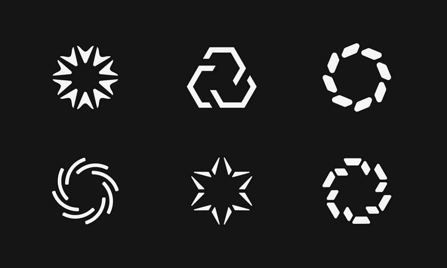
With the exponential growth of mobile devices and different screen resolutions, a logo needs to be flexible and adaptable. Large companies with global audiences can't afford to have their logos distorted or lose detail on any platform. This is where the responsiveness comes into play. Responsive logos can adjust, shrink, or morph while maintaining the core elements of the brand image. The result? A powerful and consistent brand identity that works everywhere, from the giant billboard to the palm-sized smartphone screen.

Created by Ramotion | https://www.behance.net/gallery/60974125/Mobingi-Branding
Large companies often operate in diverse markets and interact with customers on multiple platforms, making it crucial for their logos to be adaptable. Imagine the logo of a global fast-food chain or tech giant. It needs to be recognizable, whether it's on a TV ad, a mobile app, or the wrapper of your cheeseburger. That's the kind of flexibility we're aiming for with responsive logo design.
But it's not just about looking good on different devices. Responsive logo design also helps large companies future-proof their brands. The digital world is in a state of constant flux, with new technologies and platforms emerging faster than you can say "design". The rise of smartwatches and AR technology, for example, has opened up new spaces where logos need to perform.
Remember, large companies need to stay relevant and competitive in the market, and a crucial aspect of this is having a strong and consistent visual identity. By investing in responsive logo design, large companies can ensure that their brand identity remains robust and flexible, capable of adapting to the ever-evolving digital landscape.
One thing's for sure, responsive logo design for large companies isn't a mere luxury; it's a necessity in today's digital world. So, to all my fellow designers out there, it's time to embrace this challenge. After all, we're in the business of solving problems creatively, and responsive logo design is one intriguing problem to solve! Let's continue exploring this fascinating topic and further enhance our skills, shall we? Onward we go!
II. The Power of Responsive Logo Design
Alright, design enthusiasts, buckle up as we delve into the superpowers that responsive logo design brings to the table. Remember, we're not just creating logos; we're crafting brand identities that need to thrive across a myriad of platforms and devices. So, what makes responsive logo design for large companies such a game-changer?
First off, let's revisit what responsive logo design is all about. It's a design approach where the logo flexibly adapts to various screen sizes and resolutions while keeping the brand's identity intact. Essentially, it's about creating a logo that looks stunning, whether viewed on a colossal billboard or a nifty smartphone screen. Sounds cool, right?
Now, let's delve into its superpowers. The most obvious one is consistency. With responsive logo design, large companies can maintain a consistent brand image across all platforms. This consistency is crucial for brand recognition and establishing a strong connection with the audience. We all know the satisfaction of spotting a familiar logo on a bustling city street or an app on our phones. That sense of familiarity stems from consistent branding, and responsive logo design plays a pivotal role in making that happen.

Created by Happy Tri Milliarta | https://dribbble.com/shots/19847109-Samble-Logo-Brand-Design
Another power of responsive logo design is enhancing the user experience. Nothing dampens a user's interaction with a brand more than a distorted or incomprehensible logo. With a responsive logo, large companies can ensure that their logos are always on point, delivering a seamless user experience across all platforms.
Additionally, responsive logo design provides an opportunity to showcase creativity and innovation. Each adjustment for a different platform is a chance to rethink and reshape the logo without losing its essence. This flexibility can lead to innovative design solutions that set the brand apart and keep it fresh in the minds of the audience.
Moreover, responsive logo design for large companies offers scalability and future-proofing. We live in an age where technology evolves at breakneck speed. Today it's smartphones and tablets, tomorrow it could be smart glasses or holographic displays. With a responsive logo, large companies can ensure that their brand image scales seamlessly with new technologies and stays relevant in the ever-evolving digital landscape.

Created by Md Mehedi Hasan | https://dribbble.com/shots/16526414-Zenxian-Brand-Guidelines
Lastly, responsive logos can help large companies streamline their branding efforts. Instead of creating different logos for different platforms (which can be a design nightmare), they can have one logo that adapulously adjusts to various contexts. It's a win-win situation - maintaining brand consistency while saving time and resources.
That’s the magic of responsive logo design, my design aficionados! It’s a powerful tool that offers a blend of consistency, innovation, and scalability. So, as we continue to navigate the dynamic digital world, it’s essential to keep up with these changes and use them to our advantage. After all, that's what being a creative problem solver is all about, right? Let's continue our journey and unlock more secrets of the exciting world of responsive logo design.
III. Challenges in Creating Responsive Logos for Large Companies
So far, we've had a deep dive into the world of responsive logo design, understanding its power and why it's a necessity for large companies. But, just like any superhero, it does have its kryptonite. This section will uncover some challenges we may face while creating responsive logos for large companies, and don't worry, we'll also discuss some potential solutions.
Firstly, the task of maintaining brand integrity across different platforms is a significant challenge. Every change we make to a logo for it to fit a smaller screen or different context must be very carefully considered. We have to ensure that the brand's essence is not lost in translation. It's a fine line between flexibility and losing brand recognition, and that can feel like walking a tightrope sometimes.
Next, there's the issue of legibility and details. A logo may include intricate details or text elements that look fantastic on a large screen but become illegible or lose their impact on smaller screens. In responsive logo design for large companies, figuring out how to retain these details or whether to drop them can be a tough call.
Technical limitations also present challenges. Different platforms have varying capabilities, and there can be restrictions on size, colors, and resolution. So while we may want to push the boundaries with our responsive logo design, we sometimes have to reel it back to fit within these constraints.

Created by Ashraful | https://dribbble.com/shots/15499274-Brand-Identity-Design-Vetotel-Brandbook
Finally, there's the challenge of client acceptance. Some clients may struggle to understand the need for a responsive logo, sticking to the traditional idea of a single, unchanging logo. Convincing them about the power and need for a responsive logo design, particularly for large companies, can be a task.
So, how do we overcome these challenges? Well, the first step is planning. Understand the brand inside out, its values, and its essence. Make sure that this essence is embedded into every variant of the logo, no matter how it changes. For dealing with details, consider which elements are absolutely crucial and which can be simplified or dropped on smaller screens.
On the technical front, stay updated with the latest tech specs of different platforms, so you know the playing field. Create a logo design that's versatile, yet capable of fitting within these tech constraints.
And for clients? Communication is key. Educate them about the benefits of responsive logo design in today's digital world. Show them examples of successful responsive logos to help them understand its importance.
Designing responsive logos for large companies may be a challenge, but remember, it's challenges like these that lead to innovation and growth. As graphic designers, we're problem solvers at heart, and every problem is an opportunity for a creative solution. So let's embrace these challenges and continue to push the boundaries of design. Stay tuned as we continue to explore this exciting world of responsive logo design!
IV. Steps to Creating a Successful Responsive Logo Design
Alright, fellow design dynamos, we've unpacked the power of responsive logo design for large companies and explored the challenges that come along with it. Now, let's get down to brass tacks. How do we actually create a successful responsive logo? Here's a step-by-step guide to help you navigate this exciting journey.
Step 1: Understand the Brand
Before putting pen to paper, or in our case, cursor to canvas, we must fully understand the brand we're working with. What are its values? Its personality? What message does it want to convey? This understanding will be the foundation of the logo design and should guide every decision we make.
Step 2: Start with a Master Logo
Create a comprehensive, detailed master logo. This will be the largest iteration, containing all elements – text, symbols, colors, and any intricate details. It's important to start big and then scale down. This master logo is the one that will be used on large formats and should capture the brand's essence in its entirety.
Step 3: Identify Key Elements
Next, identify the essential elements of your logo – the parts that make it unique and recognizable. This might be a specific shape, symbol, or even a color. These elements should remain consistent across all variants of the logo to maintain brand recognition.

Created by asharfani | https://dribbble.com/shots/21667249-Branding-kit-for-property-real-estate-company
Step 4: Create Variations
Now, start creating scaled-down versions. Simplify the logo for smaller formats while ensuring it remains recognizable. This might mean removing some details or text elements. Remember, legibility is crucial – if a logo is too small to be read or understood, it loses its impact.
Step 5: Test Across Different Platforms
Testing is a vital step in responsive logo design for large companies. Once you have created different variants, test them across multiple platforms and devices. Check legibility, colors, and overall impact. Make sure the logo looks good not only on different screen sizes but also in different contexts.
Step 6: Gather Feedback and Refine
Gather feedback on your logo designs. This can come from the client, target audience, or fellow designers. Use this feedback to refine your designs. Remember, creating a successful responsive logo is an iterative process, and refining based on feedback is a crucial part of it.
Step 7: Implement and Monitor
Finally, implement your responsive logo across the brand's platforms and monitor its performance. How is it being received by the audience? Is it improving brand recognition? Keep an eye on its effectiveness and be prepared to make adjustments as needed.
Remember, creating a responsive logo design for large companies is not a linear process; it's a journey of exploration, creativity, and refinement. Each step brings us closer to a logo that not only looks good but performs excellently across all platforms, strengthening the brand's identity in the digital world.
So there you have it, design gurus, a step-by-step guide to creating responsive logos. Ready to put these steps into action? Let's dive in and create some unforgettable, versatile logos!
V. Case Study
So far, we've learned about the power of responsive logo design for large companies, the challenges we might face, and the steps to create a successful responsive logo. To solidify our understanding, let's take a real-world tour with a case study: the evolution of the logo for the tech titan, Google.
The Google logo is a perfect example of a successful responsive logo design that has undergone several transformations since its inception. It's a journey of how an initially complicated logo evolved into a simple, highly recognizable symbol known by billions worldwide.
Google's initial logo in 1998 was more intricate, featuring a strong 3D effect and an exclamation mark. However, as the company grew and the digital landscape transformed, the logo needed to adapt. Fast forward to 2015, Google rolled out a simplified, flat design logo that not only looked more modern but was also significantly more versatile.
This logo was created with a custom, geometric sans-serif typeface called Product Sans, reflecting a more playful and approachable image of Google. But the change didn't stop there. To align with the need for responsive design, Google developed a range of logo variations, each suitable for different digital platforms and contexts.
Perhaps the most recognizable is the "G" symbol. It's the ultimate simplification of the Google logo – a single letter that captures the company's brand identity. This logo variant is used on smaller screens where displaying the full logo isn't practical.

Created by ikram h sakib | https://dribbble.com/shots/20422727-Cloxury-Brand-Case-study
Google's use of color also plays a significant role in maintaining brand recognition across different logo variants. The distinctive four-color sequence – blue, red, yellow, and green – remains consistent across all versions. Whether you see the full "Google" logo or just the colorful "G," the brand identity is instantly recognizable.
This logo evolution highlights several key points about responsive logo design for large companies. Google understood the need to simplify their logo for it to remain effective across different platforms. They maintained key elements – the colors and the playful, approachable feel – across all logo variants to ensure brand consistency. And they tested and refined their logo over time to ensure it continued to resonate with their global audience.
Google's journey offers valuable insights for any graphic designer stepping into the realm of responsive logo design. It's a testament to the power of simplicity, the importance of adaptability, and the need to retain key brand elements, all while being open to evolution as technology and user needs change.
So, there you have it, a look at how one of the world's largest companies successfully implemented a responsive logo design. It's an inspiring case study, isn't it? As we continue to navigate the world of design, let's keep these lessons in mind and keep pushing the boundaries of creativity and adaptability.
Conclusion
And there we have it, design virtuosos! We've navigated the intriguing landscape of responsive logo design for large companies. From understanding its power, to addressing its challenges, to outlining the steps for successful implementation, and witnessing a real-world example in action. This journey highlights how integral responsive logo design is in today's dynamic digital world. It's about embracing adaptability while ensuring brand consistency, a challenge we designers are perfectly equipped to handle. So let's keep pushing those creative boundaries, experiment fearlessly, and create logos that can grace every screen size and platform with pride. Until our next design expedition, keep designing and keep inspiring!
Let us know what you think!
These fantastic logo design articles are written and curated by Kreafolk's team. We hope you enjoy our information and remember to leave us a comment below. Cheers!




Leave a Comment