10 Tips to Create a Good Nail Studio Logo Design
Here are some inspiring tips you can easily follow to create a fantastic nail studio logo design

Created by Laia Creative | https://www.behance.net/gallery/131895415/Polysh-Premium-Vegan-Nail-Polish
Getting started with a nail salon business can be challenging. Many things need to be prepared to make sure you can get a good first impression from potential customers. When it comes to initiating a nail bar, creating an impressive nail studio logo design is one small detail you should not skip.
When a visual identity is displayed in your ads, brochures, and other marketing materials, it can help connect your business with the audience. Not surprisingly, many nail salon owners compete to arrange a standout trademark that redefines their existence.

Created by Yaroslav Kryzhanivsky | https://www.behance.net/gallery/83548475/XNAILS-manicure-salon
There are several reasons to make the most out of your business sign. First, a well-designed artwork lets you quickly catch the audience’s attention. Of course, it works effectively to garner customers in the long run.
Second, it is one of the key factors to successful branding. Building your brand identity allows people to perceive your business the way you expect. An effective design helps form their perception so you can be recognized as a brand.
Last but not least, a good nail bar sign distinguishes you from your competitors. This is why crafting a unique layout is essential so your prospective customers can see your expertise. If you offer something different, it is more likely to grab their attention.

Created by Seyi Adebayo | https://www.behance.net/gallery/144994705/Hand-Made-Nail-bar-branding
Now that you know the importance of a nail studio logo design, it is time to learn how to make a good one. You can neither use some random elements to arrange a brand symbol nor get started without thinking about your business values.
Several tips can help you build a good sign for the nail studio. We have compiled the most useful tips and tricks that will promote a successful creative process. Be sure to understand each point below so you will not end up making serious mistakes.
10 Tips to Create a Good Nail Studio Logo Design
- Always Check Your Top Competitors
- Experiment with Some Sketches on Paper Before Digital
- Start from a Simple Shape
- Minimalist is Beauty
- Use a Classy Font but Powerful One
- Don’t Over Experiment with Typography
- Use a Vibrant Color
- Create a Nice Emblem for a Variety
- Test Your Logo in Various Sizes
- Use a Mockup to See How It Looks in Different Scenes
1. Always Check Your Top Competitors
First thing first, keep in mind that you are not the only player in the industry. A nail salon is a lucrative business that is crowded with competitors. On the one hand, it demands you to push your creativity to the limit so you can provide the market with innovation.
On the other hand, strict competition gives you a luscious advantage. You can always get ideas and inspiration on things you can do to stand out among your rivals. Do an observation about their themes, concepts, or elements used in their trademarks and make a better version of it.

Created by OhSeven Design | https://www.behance.net/gallery/119920061/Dashing-Diva-Glaze
That said, collecting information from every competitor can be time-consuming. Alternatively, make a short list of your top competitors and narrow down the scope of your research. This is much more effective than getting inspiration from every nail studio that you know.
Your top competitors can be nail studios in your areas. It can also be ones that deliver a similar personality, concept, or theme. Identifying your rivals is important so you can get the right inspiration from the right source.
Once gathered, analyze the existing elements and extract specific things you need for your project. Brainstorm for possible modifications you can apply to your nail studio logo design.

Created by Meredith Crawley | https://www.behance.net/gallery/106773487/Vivy-Nail-Bar
2. Experiment with Some Sketches on Paper Before Digital
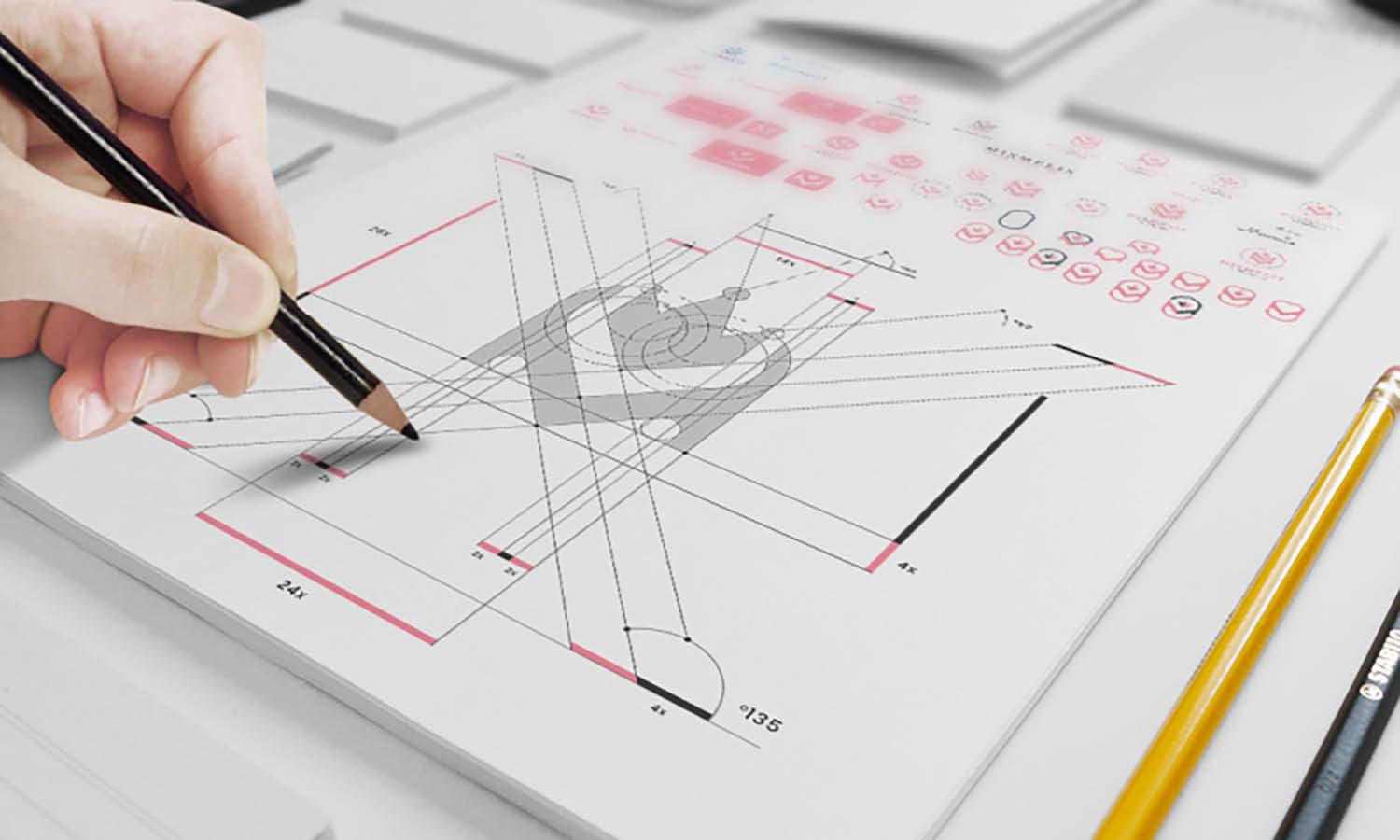
Creating sketches is an important phase when it comes to making a visual identity for your business. Sketches contain your rough ideas before you get the final result, so it is normal to have several versions during the brainstorming stage.
To promote a natural creative process, make your sketches on paper before working with the software. There are several reasons why pencil and paper are so much better than a screen.
First, drawing on a piece of paper helps you explore your creativity and ideas in a short time. It allows your idea to flow naturally without getting distracted by formatting rules or invisible lines commonly appearing on graphic design programs.

Created by Fabian Hung | https://www.behance.net/gallery/119860739/Veve-Colorsnail-Brand-Design
Second, pen and paper are completely accessible in any situation. Whenever a new idea pops into your mind, you can quickly grab a pen and paper and catch the outline. It also lets you write notes and combine writing and drawing at any time anywhere, thanks to its lightweight and portability.
Third, paper is so much easier for beginners. Digital drawing is harder than manual drawing because you have to find the right tools for the right activity. Meanwhile, drawing a nail studio logo design on paper only requires your wild imagination.

Created by Leonardo Mariano | https://www.behance.net/gallery/89670171/Logo-Nail-Design
3. Start from a Simple Shape
Different elements are incorporated to create a good visual identity, one of which is shape. In the initial stage, it is crucial to choose one basic shape that will be further improved during your creative process. It is the one that conveys your message or reflects your business personality.
Picking a simple shape allows you to explore your creativity since you have a lot of options to modify and improve the element without overcomplicating the layout. This is a basic trick to keep your symbol modest and easy to identify.
When it comes to creating a modern nail logo, understanding the meaning behind each shape is important. Knowing the psychology of shapes helps you better communicate the brand with the audience.

Created by Raphaella Dias Chodon | https://www.behance.net/gallery/143299341/Identidade-Visual-Carol-Zagheti-Nail-Designer
For instance, a circular shape is an embodiment of community, friendship, and femininity. Meanwhile, a triangular shape reflects masculinity, science, and power. If you need to display calm and tranquility, horizontal lines could be the perfect basic shape to opt for.
However, the meaning of your nail studio logo design is also affected by the color. This is why picking the right color can drastically influence the meaning of your artwork. Identify your business personality or characteristics before getting started.

Created by Zhr Ghasemy | https://www.behance.net/gallery/119528867/nail-logo
4. Minimalist is Beauty
Good trademarks share one similarity—they do not overcomplicate the design. With different elements used in a single layout, it is more likely to overcrowd your work with something unnecessary. This is why limiting the elements is needed.
Keep in mind that a simple and minimalist sign is more powerful than complex ones. An overcrowded brand identity can confuse your audience, making it rather difficult to identify. Not to mention it can make the layout look unprofessional.
A minimalist nail studio logo design does not have to be boring. If you want to make it text-based, you will heavily depend on stylish typography. Craft your business name or its initials in creative and decorative letters and let them do the magic.

Created by Pâmela Carolline | https://www.behance.net/gallery/141327133/Identidade-Visual-Karytha-Nail-Studio
On the other hand, if you are more into a graphic-based layout, you will need to combine the nail salon name and its icon. Put the icon above the name or next to it. To maintain a minimalist concept, avoid adding more decorations.
It is worth noting that color choice can influence the final result. Most minimalist artworks come with subtle colors, evoking a sense of calm and elegance. But if you plan on creating a cute nail logo, bright colors are welcome.

Created by Atavia Bishop | https://www.behance.net/gallery/144209151/So-Glo-Nail-Bar
5. Use a Classy Font but Powerful One
Typography matters a lot in creating a brand identity as it can make or break the final result. Whether you are making a text-based or graphics-based layout, choosing the right font is essential. For this reason, do not hesitate to spend some extra time picking this element.
Several typefaces such as Sans Serif, Serif, and Calligraphy are modified to create brand new fonts that are not only visually attractive but also easy to read. With tons of options available out there, it should be easier to find one that meets your preferences.

Created by Nataliya Martynko | https://www.behance.net/gallery/136934133/Logo-for-nail-studio-Monica-logo-dlja-studii-manikjura
But using a random typeface for your nail studio logo design is not a wise decision. Instead, you can find a font that evokes a sense of professionalism, elegance, and classiness. Of course, you will want to experiment before finding the best one.
Futura has become one of the most used typefaces for high-end nail studios. The timeless aesthetic makes this typeface simple, stylish, and classy. GT Super, another version of Serif, embraces an expressive typeface with a distinct sharpness.
Avenir is a geometric Sans Serif that will make your layout more powerful. It lends a classy accent to your layout thanks to thicker vertical lines and a strong impact.

Created by Yunus Kabasakal | https://www.behance.net/gallery/144843115/Violet-Nailart-Saloon
6. Don’t Over Experiment with Typography
Doing experiments on typography is essential to help you find the most appropriate typeface, spacing, and size for the project. You can begin this stage by collecting possible fonts and trying to apply them to your outline with different sizes and letter spacing.
Typography experiment is an important phase in the making process of a nail studio logo design. Having that said, over experiments may hinder your progress. Not only does it prevent you from moving forward, but it can also make you overwhelmed eventually.
Many beginners make the same mistake of having too much fun with typography. In fact, trying all sorts of fonts can reduce your efficiency and work quality.

Created by Orchidea Agency | https://www.behance.net/gallery/112188901/Say-No-Mo-nail-bar
This is why you need to limit the number of fonts or typefaces to try. Before jumping to the experiment, narrow down your list of typefaces. Meticulously sort out fonts that best suit your preferences depending on the theme and concept you want to deliver.
About 3 to 5 different fonts are considered enough to do the experiment. Remember that typography is not only about typeface but also position, style, size, and even spacing. Feel free to customize each font with different settings to find the best one.

Created by The Manifest | https://www.behance.net/gallery/83859731/ROSA-Nail-studio
7. Use a Vibrant Color
Many factors can affect how your nail studio logo design reflects your business personality, among which is color choice. Any color you choose for the layout influences how the audience perceives your nail salon, so you will need to be careful when picking one.
Depending on the concept and style you want to introduce, colors can make a statement. For instance, pastel colors accentuate a calm and subtle personality, while vibrant colors can represent your cheerful and youthful personality.
Many nail salons incorporate vibrant colors to create a positive first impression. Vibrant colors embrace optimism and happiness that allow you to better build engagement with the audience. Not to mention vibrant colors are easy to recognize.

Created by Mola Piasecka | https://www.behance.net/gallery/131999149/HALO-nail-salon
Before picking a specific color, be sure to understand the meaning. It is believed that colors have different meanings, so it is important to get to know what colors best represent your messages. Of course, you will want to figure out your message and business value beforehand.
For instance, vibrant orange delivers a lively and powerful feeling while yellow represents optimism. If you want to introduce your nail bar as friendly and noticeable, crimson pink can be the perfect option. Additionally, red leaves a bold and radiant accent to your layout.

Created by Albina Margieva | https://www.behance.net/gallery/109677331/Hand-Party-nail-art-beauty-salon
8. Create a Nice Emblem for a Variety
Creating an emblem is a nice stage when it comes to making a nail studio logo design. An emblem can serve as a variety of layouts, allowing you to check out different versions. That said, you can still use the same elements as the existing outline.
Quite similar to the logo, an emblem represents your business value or ideas. Since it will be displayed on your building façade, signboard, brochures, or even beauty products, crafting an attractive emblem is a must.
Your emblems can contain nail salon slogans or taglines, especially the short ones though most nail studios only include their names. This is because the basic function of an emblem is to convey your ideas or values rather than promote your business.

Created by Natalia Georgiadi | https://www.behance.net/gallery/97273131/Duarte-beauty-nail-studio
Most emblems come with the same or contrasting backgrounds. To make a nice emblem, you can either pick a color from the symbol or find one that contrasts the layout. If you do it the right way, this emblem can make your business look more professional.
Emblems are commonly found in corporations, organizations, military, and sports teams. But you can borrow the ideas and make a few adjustments to bring your nail bar to the next level.

Created by Aleksey Alimov | https://www.behance.net/gallery/132063767/Nail-salon-brand-identity
9. Test Your Logo in Various Sizes
Readability is among the most fundamental factors to consider when crafting a nail studio logo design. No matter how decent your layout, it would not be well-appreciated if it is not legible. Test your artwork in various sizes to make sure it is easy to read.
Different factors determine the legibility of a design, such as a typeface, color option, and decorative elements. For instance, Serif and San Serif are easier to read than Script that has flowy characteristics with extra strokes.

Created by Hiu Chan | https://www.behance.net/gallery/129103991/amor-nail-polish-Brand-Refinement
Color choices matter a lot in helping the audience read your symbol. Combining striking colors will make your layout end up looking too flashy. On the other hand, using two similar shades also reduces the legibility, moreover in small sizes.
Decorative elements also play a role in the readability of your nail studio logo design. Adding excessive details can overcrowd the artwork, making it hard to read in small size. For this reason, limit the decoration in your design to keep it simple and easy to identify.
A legibility test can be performed after you are done with the entire elements. This is how you check if all the included elements work well in various sizes. Not to mention it helps you fix the problem easily.

Created by Yana Chertova | https://www.behance.net/gallery/116416851/logotip-dlja-studii-manikjura-Nail-Fox
10. Use a Mockup to See How It Looks in Different Scenes
Your final phase when arranging a nail studio logo design would be generating a mockup. A logo mockup is a realistic version of your layout containing all the applied elements. Oftentimes, it is also called the prototype.
A mockup allows you to check what the result looks like in different backgrounds. It can be on a signboard, nail studio façade, leaflets, and others. It offers a brilliant way to monitor if the final result goes as expected.

Created by Ari Simnica | https://www.behance.net/gallery/126114943/Nail-Studio-Logo
There are several advantages of using mockups. Since it provides you with a realistic image of a design, it lets you decide what to do afterward. If you are happy with the result, you can continue to the next phase. But if you find some flaws, you can get back to the board and improve it.
Besides, a mockup gives you an opportunity to recheck any problem before getting the fixed result. Editing your design after rendering can be a bit of a task. But with a mockup, you can get rid of this hassle and keep editing the layout until you get the perfect one.
In recent days, you can find a large variety of mockup generators that provide different templates. Pick one of your favorites.

Created by Filip Panov | https://www.behance.net/gallery/85972831/Blum-Nail-Lacquer
Final Words
Your nail studio needs a proper and good logo for some reason. Not only does a nail studio logo design create a nice first impression and grab attention, but it also helps build your identity. Plus, it sets your business apart from your competitors.
Making a nice layout for your nail bar is not a simple process, but you have to get the project done in one way or another. Without a trademark, people cannot perceive your business, and it can be a problem to spread your wings.
Different tips and tricks can help you accomplish the project more efficiently. Start with checking your top competitors and see what they apply for their symbols and trademarks. Afterward, brainstorm to modify the ideas so you can get an original layout that stands out from your rivals.

Created by Emily Ball | https://www.behance.net/gallery/134195231/Always-nailing-it-Nail-Salon
Doing experiment on typography and other elements help you find the best combination. That said, avoid experiments so you do not get stuck in a phase. Make sure all the elements included in the layout do not reduce the readability.
As a final touch, use mockups to test if everything in the layout goes fine. This is how you can create a quality nail studio logo design for whatever nail business niche you choose.




Leave a Comment