
10 Steps On How To Design A Minimalist Brand Identity
Let's find out how to create a simple yet attractive one!
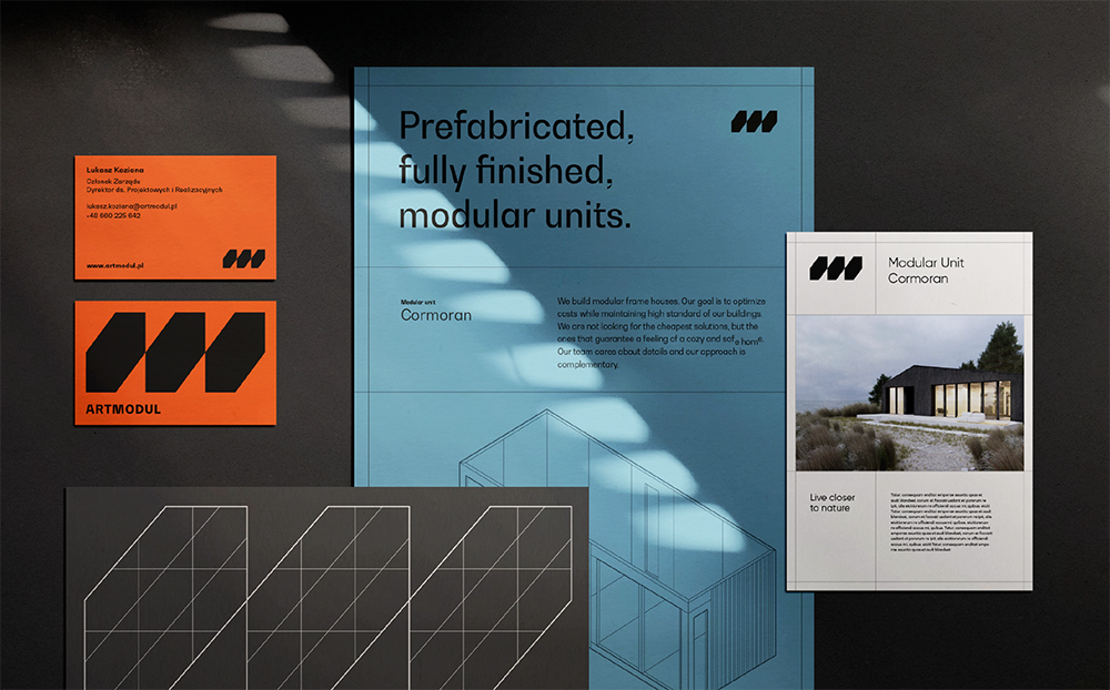
Created by Meteora Agency | https://www.behance.net/gallery/124227715/Artmodul-Branding
Being out in the market with varying competitors means that your brand should be different. It is one of the many elements of design that are used to distinguish one product from another. So, what makes your brand distinctive? That makes you need to figure out how to create a brand identity for products.
What is it? It is a term that explains the identity of the brand using a set of visual elements. You can use color, logo, typeface, image, etc. So, your options are endless. However, the current bandwagon is on the minimalist brand identity. The design idea goes around the minimalist details while still representing the product. Read further to learn how to create one.
1. Find Great Minimalist Brand Identity References
Starting with references is the basis of many fundamental design projects. Your client brand might have definite details or aspects that make an identity. But, when you are not sure how to state it in a simple model, it is better to look for references. There are tons of options and places where you can look for minimalist concepts in every design medium.
You can find minimalist posters, cards, logos, packaging, and brand identity. Determining the focus and the goal helps you filter the great number of options. How about a natural cosmetic brand? What kind of identity does that feminine teenage brand have? You will find endless ideas for your branding with minimalist design.
A minimalist is a very definite concept in design words. It has a tidy, minimal color, elements, and clear appearance or message. Thus, making the minimalist style something that has its particular fans. However, is it good for brand identity? Yes, it is. The marginal component highlights a certain center or stage, which makes it feel more aesthetic.
So, what kind of design references do you need? In this case, the answer is unlimited. Remember that minimalist does not mean one thing, such as black and white, muted color, or very simple image. No, it is different. Try to look at many different industries and also fields.
Sometimes, you will find how the minimalist is not lacking in options. The concept design poses great length possibilities. It means that you can create ranges of minimalist brand identity with certain elements. Thus, don't stick with a very generalized idea. Find more references and get more edified about the concept designs.

Created by OTRE | https://www.behance.net/gallery/111086957/ACDigital-Branding
2. Ask Your Client About The Design Requirement
As you meet the client, it is the best time to talk about the design requirement. In this case, you have to ensure what the client wants and the satisfaction level they have. At some point, you can also find out all of the technical specifications about your project drawing. It is very vital to learn beforehand since you are working with an identity that represents the whole business.
Thus, you have to ensure every aspect will hit the mark. It is pretty much the fundamental details about your design project. What do they want about the brand? What kind of image or impression does the client want as an identity? At some point, you might even work further to compose the best ideas into the features.
If you learn further, the design requirement itself is one of the many initial steps in the product development process. It is especially true for market-related cases, such as your branding project. The function is not only giving a guideline but also providing a clear view of the sources. Thus, your design will fulfill the client's satisfaction and requirement.
For the minimalist design, this stage might sound a bit overstretched. But you are not only working with a minimalist concept, and you are trying to make a brand identity for the market and make a distinguishable product. So, you have to ensure you got all of the required information before going to the next step.
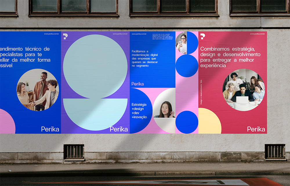
Created by Mateus Sato | https://www.behance.net/gallery/124403033/Perika-Brand-Design
3. Clearly Understand The Design Brief
In brief, you got almost all of the development guidelines. It is the most vital media that help you develop the perfect minimalist or simple branding. How so? Try to look at all of the information laid out in brief. It will give you all of the details about the design, the project, and the client's needs.
As an example, the brand, the product, or the company information. Learning about the client's business will be the grounding details you got to work with. Maybe the company has certain elements that fit as an identity? For example, the client's business is natural mountain lodging. Due to its product details, you can start developing a brand identity.
How about a dark green color and a rectangle shape? The simple green color represents the mountain setting. Meanwhile, the rectangle helps embody the mountain and lodging. How about a sophisticated layout to fit the high-end adult audience? These minimalist brand identity ideas and information are always laid out in brief. And you have to study it to work on the project.
Other than the graphic or design guideline, the brief also gives you information about the project details. It includes the project duration, deadline, milestone, and also cost details. That information will indirectly affect your minimalist design project, such as the budget restriction to avoid you doing unnecessary work.
While it helps you avoid the unnecessary, it also tells you all the needs. The milestone or the deadline will be your reminder of the work duties. You need to finish the project on time and present it at the end. It also tells you what kind of the best finish material or options to work at the final stage.

Created by VISEE Design | https://www.behance.net/gallery/97844337/Pitchnext-Branding
4. Get Yourself a Minimalist Typeface
With all of the identity and product information you found in brief, your first challenge is the typography. You got a range of typefaces to choose from. So, ensure you can find the perfect style that fits both the minimalist and the company. In this case, your options are not always limited to the simplest style, such as serif or sans serif.
Many minimalist brand identity examples go beyond the simple model and create a distinctive design. The key point of nailing the typeface or font is suitability. The serif font exudes an identity that fits a traditional, trustworthy, or old-school brand. It is simple, clean, and also tidy when applied.
The sans serif has a more casual impression as to its identity. Most minimalist designs use sans to present smooth, modern, and sleek impressions for the brand. Even though the two of them are very grounding for minimalist concepts, you can always experiment. Try to use script typography that resembles cursive handwriting.
The project with script font tends to have a luxurious impression. But it is also very dominant with a feminine feel for your brand. The identity through font needs further research and references. You can use the basic fonts or get a strong identity through display fonts with their special elements.
Sometimes, a distinctive font helps you create a memorable brand identity. The display font can help you reach the idea. It can look bold with its unusual shapes, shadows, curves, or anything. As long as you can balance the font and other design elements, you can always nail the minimalist concept. Below are some unique typefaces for your design.

Created by LogoBuy | https://creativemarket.com/LogoBuy/2309941-Orborn-Round-Futuristic-Font

Created by Ellen Luff | https://creativemarket.com/EllenLuff/5342124-Larken-A-Beautiful-Serif

Created by Greg Nicholls | https://creativemarket.com/helloimgreg/1465426-Westmount-6-Sans-Serif-Fonts
5. Play Around With Typography
Many said that typography is a powerful tool in design. Choosing the best typography will be one of the ways to create harmony in colors or logos. For the brand identity itself, you got to know that the font and letterform might help you have a distinctive element. How so? Because you can play around with it and make something memorable.
One of the best minimalist ideas using typography is logotype. It might lead you to work with a logo for a bit, but it is also a great way to represent the brand. As an identity, your logotype design can also have the same minimalist concept. Thus, you got a wholesome pack of minimalist brand identity.
At some point, the branding might appear in the form of distinctive packaging. In this case, you can play around with your letterform to create uniquely designed minimalist packaging. For example, use the letterform to make a connected word from a packaging series. How about playing with the color and shape? You are free to experiment.
However, if you want to avoid clutter and stupid-looking typography mistake, try to get the beginner guide. The primary point of the guide is to avoid fancy fonts, except you know how to use them for minimalist design. You can also consider the default font with a unique arrangement. They make your design readable and form a memorable minimalist identity.
Some other ideas that you need to avoid for your minimalist brand identity are mixing more than two font families and contrasting typefaces. Those ideas will not work with any kind of elements, such as logo, packaging, or copy. It is also good to avoid the all-caps text. If you want to highlight certain text, use color or text hierarchy.
Some unique copy might also help you play around with typography. Sometimes, the fun jargon, moto, or copy help create a distinctive identity. All you need is to follow the brand and make them fit together. If you look at many examples, most minimalist designs pay more attention to their typography and copy.

Created by Ellen Luff | https://creativemarket.com/EllenLuff/5342124-Larken-A-Beautiful-Serif
6. Use Suitable Minimalist Graphic Elements
Even though you can use and play around with text or copy, adding images is a must. Minimalist design can work either with or without a graphic element. However, to make a distinctive identity for your client's brand, adding an image will be the icing on the cake. It completes the whole design.
This is the thing. When you are trying to make a brand identity, the design and form can vary. You might work to make a logo and create other related elements such as packaging or pattern. In this case, you got everything in your hand. You can use text to help deliver the message and emphasize your brand.
However, image identity gains more attention. You can see how a typeface focus minimalist design can be heavily overshadowed with simple graphic minimalist brand identity. For example, a small translucent pattern for the background that fits the brand is easy to remember. It also elevates the recognition aspect toward the brand or product identity.
There are also many graphic elements that you can choose from. It does not have to be the mainstream ideas, such as calm, warm, or muted tone graphics. A striking image emphasizes the brand identity. As long as you know how to balance and create a clean or tidy detail, it is always a good idea. You can check out some of our recommended ideas below.

Created by Twinbrush Image Forge | https://creativemarket.com/Twinbrush/2940056-Seamless-Geometric-Patterns-Bundle

Created by Vanzyst | https://creativemarket.com/Vanzyst/1766835-100-geometric-shapes.-Part-2

Created by Marietta.co | https://creativemarket.com/Marietta.co/5222222-500-Boho-Geometric-Elements
7. Create Balance Between Texts & Graphics
The essence of minimalist work is to avoid overwhelming and cluttering design. When it comes to this kind of project, your goal is to make a definite point that leaves a long-lasting impression. So, what do you want to highlight? Do you want to focus on the text or the graphic? Even though you can focus on one element, your brand will have a better identity with balance.
You need to go back on the brief and the design requirement. Try to understand what kind of brand identity design that your client wants. Can you fit some of the identity elements in one product or not? Sometimes you gotta go back to the fact that minimalist concepts need a minimal element. So, do you need to eliminate some of the superfluous brand details?
In minimalist brand identities, it is safe to work with balanced text and graphics. Some people highlight the 50-50 proportion. It means you can emphasize all of the information in the text while also creating sophisticated points through images. And don't forget about white space to avoid clutter or overdone design. Thus, your minimalist concept is on point.

Created by Mateus Sato | https://www.behance.net/gallery/126334605/Massa-Brand-Design
8. Use Minimal Color (2 or 3 colors)
If you are trying to add color, do not limit yourself to muted tones or simple shades. It is minimalist, but being too standard will only understatement your brand identity. Thus, try to experiment with color. A minimalist design mostly works with minimal color selection, which is about 2 or 3 colors.
If you want to fit the theme, brand, and create a definite identity, learn the color palette meaning. Some of the rainbow shades have different meanings. If you are working with a wide demographic, blue is the universal shade for design. To turn the mainstream color into a minimalist brand identity, use different shades.
You can use contrast color to emphasize some of the brand information. Add a darker or lighter shaded logo as the product identity. Then, create something that leaves an impression with the same or opposing color palette. In the end, you can make a thorough branding design with a minimalist design.

Created by Rahul Bhogal | https://www.behance.net/gallery/115192241/Spline-Group-branding
9. Find A Minimalist Brand Guideline Template for Subtle Presentation Looks
In this stage, you are already learning about all of the possible brand identity designs. The minimalist concept is the key. It can affect your color choice, design arrangement, font pick, and graphic element. So, to ensure you are not losing the same streak, you got to create a brand guideline. Brand guidelines help you explain to the client about the design identity and ideas.
It not only helps you to show your minimalist ideas but also helps the future or next designers by starting from the color, the logo design, the typography, the brand voice, etc. It is a vital tool that you get to present at the end of the day. To help you work easier, below are some of the best guideline templates you pick and help create a subtle minimalist presentation.

Created by Typefool's Shop | https://creativemarket.com/Typefool2020/6173358-Branding-Guidelines-Template

Created by Occy Design | https://creativemarket.com/Occy/5450741-Brand-Guidelines

Created by Circular | https://creativemarket.com/circular/4680939-ODESSA-Brand-Guidelines
10. Present It To Your Client By Using Minimalist Brand Identity Mockups
Along with the mockup, you will need to show the final design to your client. In the case of branding, you probably have to present more than one idea. Maybe you make the identity in the form of a logo, color palette, small graphic illustration, or unique typeface. With that number of products, you have to consider the production budget.
Most of the time, you can exhibit the final design using a mockup. You can choose many kinds of mockups that fit your minimalist brand identity design. If you are working for a high-end corporation, choose the one that fits the theme. If you are working with a brand with a younger audience, pick accordingly. With all that said, here are some mockups you can use for the final.

Created by Mockup Cloud | https://creativemarket.com/MockupCloud/3690108-Blck-Branding-Mockup

Created by Momogi | https://creativemarket.com/Momogi/2558823-Stationery-Branding-Mock-Up

Created by Mockup Cloud | https://creativemarket.com/MockupCloud/5610746-MNML-Branding-Mockup
Conclusion
When you are working with branding, you get more than just a logo or color swatches. Branding comes with more complex details since it should be an identifier for certain products. Identity creation mostly starts from preferences. Consulting the client and learning the brief is next. After that, you need to design, consider the print, and make a presentation.
Related Articles


Leave a Comment