Proper Logo Design Placements on Business Cards
Learn tips to make your business card stand out. Elevate your designs and impress clients!

Created by Rafael Silveira | https://www.behance.net/gallery/170788209/Mustache-DJ-Brand-Identity
Welcome, fellow design enthusiasts! If you're here, it means you understand that the design is more than just pretty pictures—it's an effective communication tool. Today, we're honing in on a specific, and sometimes underestimated, aspect of graphic design: Logo design placement on a business card.
In the hustle and bustle of networking events or casual encounters, business cards act as silent ambassadors, silently shouting out your brand's identity. The cornerstone of that identity? Your logo. It's not just about having a sleek, memorable logo. Where it sits on your business card—the logo design placement—can make all the difference in how your brand is perceived.
As creatives, we know that every pixel counts. A shift to the left, or an ascension to the top, can alter the entire dynamics of the design. The question then is—where should your logo be on the business card to catch the viewer's eye and leave a lasting impression?
Stick with us as we navigate the exciting world of logo design placement on business cards, and together, we'll ensure that your business card isn't just glanced at, but remembered. Let's dive in!
I. The Power of a Logo
Before we delve deeper into the specific concept of logo design placement on a business card, it's essential to first grasp the power held by a logo. It's more than just a doodle or an attractive emblem—it's a symbol that embodies the essence of a brand, making it easily recognizable amidst the sea of competitors.
Think of any big brand—Nike, Apple, or McDonald's, for instance. One glimpse at their logos, and what comes to mind? A barrage of thoughts, memories, emotions, and perceptions about their products, right? That's the sheer power of a logo. It's an encapsulation of the brand's story, values, and promise in one visual symbol.
A logo's strength lies in its ability to generate instant brand recognition. Imagine you're in a foreign country, surrounded by signs in a language you don't understand. Suddenly, you spot those famous golden arches. Relief washes over you—you've found a place to eat. You recognized McDonald's just by its logo, even without any textual prompting. That's a testament to the effectiveness of a well-designed and well-placed logo.

Created by YNL Design | https://www.behance.net/gallery/136689927/SERENU-Brand-Identity
However, an impactful logo isn't purely about the design—it's also about where and how it's presented. Just as a chef presents their dish artfully to enhance the overall dining experience, your logo must be positioned in a way that accentuates its impact. Hence, logo design placement on a business card becomes crucial.
Why a business card, though? In today's digital age, some may argue that the humble business card is becoming redundant. But those immersed in the world of business and networking know that it's still very much alive. Despite our lives being punctuated with social media notifications and email pings, there's something about physically handing over a business card that feels inherently more personal and professional.
When you give someone your business card, you're handing over a slice of your brand's identity. Your logo, taking pride of place on this card, then becomes the ambassador of your brand. Its job? To leave a strong impression that's just as strong as a firm handshake or a direct, confident gaze.
The power of a logo becomes exponentially influential when coupled with strategic placement. Your logo's position on your business card can influence how the viewer's eye moves around the card, which information they process first, and most importantly, how they perceive your brand. Therefore, logo design placement on a business card is not an afterthought—it's a strategic decision that can significantly impact your brand's perceived value.
In the upcoming sections, we'll delve deeper into how to master the art of logo design placement on a business cards. This skill, when honed, can elevate a simple card to a memorable tool for connection, networking, and brand recall. As designers, our role is to maximize this potential and create a symphony of colors, text, and imagery—with the logo conducting the show.
II. Understanding Business Cards
Before diving deep into the world of logo design placement on a business card, let's take a step back and understand the humble business card itself. Despite the digital revolution and the rise of online networking, this physical, tangible piece of paper has endured, maintaining its significance in the world of business and beyond.
Business cards are often the first tangible piece of your brand that potential clients or partners hold in their hands. It's not just a way to share your contact information—it's a physical extension of your brand identity. When designed well, a business card can leave a lasting impression, create a sense of professionalism, and differentiate your brand from the crowd.
A business card is usually the size of a credit card—small enough to fit in a wallet, but big enough to make an impact. The compact size of the card is a blessing and a challenge—it gives you a confined canvas to work with, which requires creative ingenuity to make the most of. The way you arrange elements on this space, especially the placement of the logo, is crucial in dictating how the information is absorbed.

Created by Arron Goh | https://www.behance.net/gallery/93763625/CHARIOT-Branding-Design
Imagine a business card as a mini billboard, with just a few seconds to catch the viewer's attention. Now, think about billboards you've seen and remembered. What's the one thing they all had in common? Probably a prominent, well-placed logo. This is why understanding logo design placement on a business card is pivotal. Your logo, placed strategically, will help create a focal point that guides the viewer's gaze around the card.
And then there's the back of the business card, often an overlooked space. Some prefer to keep it blank, while others use it for additional information or design elements. However, it could also be a prime location for your logo, especially if you're opting for a minimalist front. It all ties back to the concept of logo design placement and understanding how to utilize the space effectively.
The way you organize your logo, contact details, brand name, and possibly a tagline or website, determines the hierarchy of information. And the hierarchy isn't just about importance—it's about guiding the viewer's gaze fluidly through the card, making sure they soak up all the vital information without feeling overwhelmed.
By understanding the dynamics of a business card, you'll appreciate the necessity of strategic logo design placement on a business card. It's about creating a balance of visual appeal and functional value, which elevates a business card from a mere contact-information holder to a powerful branding tool.
In the next sections, we'll explore the key areas for logo placement and delve deeper into how to create harmony in your design. Remember, our goal is to ensure your business card isn't just another piece of paper—it's a memorable, tangible representation of your brand's identity.
III. Why Logo Placement Matters
Now that we've gained an understanding of the power of a logo and the dynamics of a business card, let's zero in on the intersection of these two concepts: why does logo design placement on a business card matter?
First off, let's state the obvious: your logo is not just an aesthetic addition to your business card. It's the visual representation of your brand's identity and values. Just like how your personal image can be influenced by your body language and positioning in a room, your brand's perception is influenced by your logo's positioning on your business card.
If you were at a networking event, would you quietly stand in a corner or position yourself in the center where you can interact with everyone? Your logo should do the same. The placement of your logo can dictate the flow of information, the overall aesthetic appeal, and the viewer's first impression of your brand.

Created by anastasia malardyrova | https://www.behance.net/gallery/171994969/Kiyomi-logo-brand-identity-cosmetics
Logo placement is an integral part of visual hierarchy in design. The visual hierarchy is how we, as viewers, process what we see. The logo, usually the most recognizable part of a brand's visual identity, should take a prominent position in this hierarchy. Proper logo placement can guide the viewer's eyes across the card, ensuring all vital information is absorbed.
Remember, the goal of your business card is not just to inform, but also to impress. When someone walks away after meeting you, your business card remains as a tangible reminder of your interaction. The logo, being the key element, should be placed in such a way that it leaves a lasting impression.
Strategic logo design placement on a business card can also play a significant role in differentiating your brand. Your card will likely be one among many in a person's collection. A unique and thoughtful logo placement can make your card stand out and be easily recognizable among the sea of traditional designs.
Let's not forget the back of the card, which can often be an underutilized space. While some choose to keep it blank, it can also serve as a secondary canvas for your logo. This doesn't mean you should replicate the logo on the front and back, but perhaps use a different version or a complementary design element that ties back to the logo.
Logo placement goes beyond just where to put the logo on the business card—it involves understanding how the logo interacts with other elements, how it influences the flow of the design, and how it impacts the viewer's perception of your brand.
In the following sections, we'll look at different strategies for logo design placement on a business card and how to avoid common mistakes. So stick around, fellow creatives, because we're about to dive deeper into the art and science of logo placement. Because it's not just about where your logo goes—it's about where it takes your brand.
IV. Where to Position Your Logo: Key Areas
So, you've got your sharp-looking logo and a business card layout ready to go. But where does the logo belong? The importance of logo design placement on a business card can't be overstated, and there are some key areas to consider.
1. Top Left Corner
The top left corner is often the first place our eyes drift to when looking at a design, thanks to our instinct to read from left to right. Placing your logo here can ensure that it's the first thing people see, setting the tone for the rest of the card.
2. Top Right Corner
This is an unconventional spot and can make your card stand out from the stack. The top right corner is a great option if you want to create a sense of balance with other elements positioned on the left side of the card.
3. Centre
Placing your logo at the centre of your business card can give it maximum visibility. It creates a strong focal point and can evoke a sense of importance and balance. Remember, though, this could leave less room for other elements, so your design needs to remain uncluttered and readable.

Created by Musa WorkLab | https://www.behance.net/gallery/124824613/BlueCrow-Brand-identity
4. Bottom Corner (Left or Right)
These are often underutilized spaces, but placing your logo in a bottom corner can give your business card a unique edge. It's unexpected and can provide a sense of stability and grounding to your design.
5. Full-Background Design
This is a bold and innovative choice for logo design placement on a business card. It involves using your logo as a full-background design element, usually with a reduced opacity. This approach can create a visual impact and a strong brand identity. Be careful, though: the background logo shouldn't overpower or interfere with the readability of the card's information.
6. Back of the Card
Don't forget about the back of your business card—it's prime real estate for your logo. The backside can hold a secondary, complementary design or an alternate version of your logo, leaving the front for important contact information.
Each of these logo placement options has its own strengths and can shape the overall aesthetic of your business card. However, there's no one-size-fits-all answer to where your logo should go—it largely depends on your overall design and what message you want to convey.
Keep in mind, strategic logo placement isn't just about visual appeal. It's a decision that can influence how your brand is perceived and remembered.
So, experiment with different positions, take a step back, and see how your logo interacts with other elements on the card. Remember, the goal of effective logo design placement on a business card isn't just about filling space—it's about creating a balance between aesthetics, readability, and brand identity. Now, let's venture further into the art of creating harmonious designs. Stay tuned!
V. Avoiding Common Mistakes
As we navigate through the thrilling world of logo design placement on a business card, it's important to steer clear of some common pitfalls. Despite our best intentions, we can sometimes find ourselves drifting towards these errors. But fear not, fellow creatives—we're here to keep you on the straight and narrow.
1. Cluttered Design
One of the most frequent mistakes in business card design is overloading the card with too many elements or information. Remember, a business card isn't a brochure—it's a brief introduction. Your logo, contact details, and maybe a tagline or website should suffice. Aim for clarity and simplicity over excess.
2. Poor Quality Logos
Nothing screams unprofessional like a pixelated logo. Always use high-resolution images for your logos. This will ensure that your logo looks sharp and clean, even when printed.
3. Overlooking the Back
The back of your card isn't just wasted space. While some prefer the minimalist appeal of a blank back, this area can be a prime spot for your logo, a tagline, or additional information. Don't overlook this area when considering logo design placement on a business card.

Created by The Upturn Studio | https://www.behance.net/gallery/140170227/ST-T-Rebranding-Corporate-Identity
4. Wrong Logo Size
Size matters when it comes to logos on business cards. Too big, and your logo may overpower other elements and make the card feel unbalanced. Too small, and it may get overlooked. Strike a balance—your logo should be easily visible and proportionate to other elements.
5. Lack of Contrast
If your logo blends into the background, it defeats the purpose of strategic placement. Ensure there's enough contrast between your logo and the background so it stands out.
6. Ignoring Brand Identity
Your business card and logo placement should align with your overall brand identity. If your brand is all about creativity and thinking outside the box, a conventional logo placement might seem out of character. Conversely, if your brand is about tradition and reliability, an unconventional logo placement might send mixed messages.
7. Inconsistent Design
Remember, your business card is a physical extension of your brand. The design, including logo placement, should be consistent with other branding materials like your website, brochures, or social media profiles. This consistency reinforces your brand identity.
Being aware of these common mistakes can help you make smarter decisions when it comes to logo design placement on a business card. It's not just about making a business card look good—it's about creating a memorable, effective piece of your brand identity.
Don't worry if you find this overwhelming at first. Like all aspects of design, it takes a little experimentation and a lot of learning. The key is to keep refining and improving, always with your brand and audience in mind.
In our final section, we'll wrap up everything we've discussed and set you on your path to creating incredible, effective business cards with perfect logo placement. Let's bring it home, designers!
VI. Practical Tips and Tricks
We've explored the importance of logo design placement on a business card, delved into key positioning areas, and navigated common pitfalls. Now, let's tie it all together with some practical tips and tricks to elevate your business card designs.
1. Think in Grids
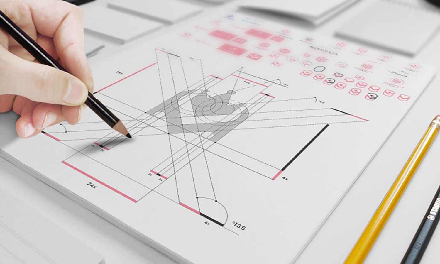
Using a grid can be an extremely helpful tool when planning your business card layout. Grids can provide structure, guide your design process, and ensure balance in your final design.
2. Experiment
Don't be afraid to try different logo placements. Move your logo around the card and see how it interacts with other elements. This experimentation can lead to unique designs that wouldn't have emerged from sticking strictly to conventional placements.
3. Keep it Simple
As tempting as it may be to fill every space, remember the beauty of simplicity. Allow your design, and especially your logo, some breathing space. It's not only about where you place your logo, but also about the space you leave around it.

Created by VASK® Studio | https://www.behance.net/gallery/138352549/Harone
4. Consider Texture and Material
The material and texture of your business card can add an extra layer of interest and interaction. For instance, you can consider using embossing or spot UV coating to make your logo stand out.
5. Balance is Key
Balance doesn't necessarily mean symmetry. It's about distributing elements so that no area feels too heavy or too light. Even if your logo is off-centre, balance can be achieved through the use of color, typography, and other design elements.
6. Stay True to Your Brand
While it's fun to experiment, remember to stay true to your brand's essence. Your logo design placement on a business card should reinforce your brand identity and create a cohesive look across all your marketing materials.
7. Digital and Physical Mockups
Creating a mockup of your business card can save you from costly printing errors. It can help you visualize how the card will look in real life and how people will interact with it.
8. Feedback Loop
Seek feedback on your designs. Other people might notice things that you've overlooked or provide new perspectives. This feedback can be invaluable in refining your business card design and logo placement.
There you have it, folks! While there's no definitive guidebook for logo design placement on a business card, understanding these principles and tips will set you on the right path. Remember, every brand and every design is unique—don't be afraid to break the mold and create something truly unique.
Conclusion
Well, there you have it, creative minds! An exploration of the art and science behind logo design placement on a business card. Remember, your business card is a mini billboard for your brand, and the logo placement plays a key role in making it impactful. Stay true to your brand, keep experimenting, and most importantly, have fun with it. The world of design is a playground—so swing high and slide fast. I hope this guide leaves you feeling empowered to create business cards that not only inform, but also inspire. Until next time, keep designing the extraordinary!








Leave a Comment