The Golden Ratio in Action: Innovative Logo Design Principles

Created by Davit Chanadiri | https://dribbble.com/shots/14016879-German-shepherd-grid
In the realm of graphic design, the golden ratio is more than just a mathematical concept—it's a cornerstone of aesthetic appeal that has influenced artistic expression for centuries. This fascinating proportion, approximately 1:1.618, is found in nature, architecture, and art, symbolizing harmony and beauty. When this principle is applied to logo design, it transcends basic visuals, giving brands a foundation in visual excellence that resonates with viewers on a subconscious level.
The utilization of the golden ratio in logo design ensures that each element is proportioned perfectly to create a cohesive and visually pleasing brand mark. It's not merely about making a logo pleasing to the eye; it’s about imbuing it with a sense of balance that speaks to our innate sense of order and proportion. As designers, leveraging the golden ratio enables us to craft logos that are timeless and effective, resonating with audiences and standing out in the competitive market.
This article delves into the innovative principles of logo design through the lens of the golden ratio, offering insights into how this age-old formula can give rise to logos that are not only iconic but also rooted in a science that's as old as nature itself. Join us as we explore the golden ratio in action, where mathematics meets creativity to birth designs that are truly innovative.
The Historical Significance of the Golden Ratio
The golden ratio has long been the silent orchestrator of beauty and harmony, a mathematical phenomenon deeply ingrained in the tapestry of design history. Its legacy transcends mere aesthetics, holding a mirror to the universe's intrinsic order. This enigmatic ratio, often denoted by the Greek letter Phi (φ), has influenced not just the domains of art and architecture but has also been a cornerstone in the evolution of logo design.
Tracing back to antiquity, the golden ratio was keenly observed in the proportions of the Parthenon in Greece, the Great Pyramid of Giza, and even in the works of Leonardo Da Vinci. His iconic illustrations in 'De Divina Proportione' explore the golden ratio’s presence in human anatomy, asserting its role in creating divine proportion. These historical applications underscore how deeply the golden ratio is woven into the fabric of human cultural and artistic endeavors.
Fast forward to the modern era, the golden ratio continues to hold its sway in the art of crafting logos. It is not just a vestige of a bygone artistic doctrine but remains ever-present in the DNA of contemporary branding. The allure of the golden ratio in logo design lies in its ability to bestow a visual equilibrium, forging a silent yet potent dialogue with the audience. Its application in the logos of companies like Apple, Twitter, and Pepsi exemplifies how it subtly shapes consumer perceptions and brand identity.
Delving into the golden ratio's blueprint within logo design reveals a deliberate and intricate dance of geometry and artistry. Designers who harness this ratio tap into a legacy of balance and beauty that resonates on a nearly instinctual level. The golden ratio allows for a structured approach to design, creating logos that are not merely memorable but also inherently pleasing to the human eye.
Discussing the golden ratio in the context of logo design is essential for capturing the intersection of interests among design professionals, brand enthusiasts, and those intrigued by the blend of art and science. It also emphasizes the time-tested relevance of the golden ratio, affirming that even in the age of digital design and rapid technological advancements, some principles remain perennially effective.
The golden ratio is a testament to the timelessness of certain design principles, and its application in logo design offers a bridge between the past and the present, between aesthetics and function. It endures as a testament to design's capacity to borrow from history, ensuring that the logos we create today carry a piece of the legacy that has been admired and studied for centuries.

Created by Daniel Rotter | https://dribbble.com/shots/19393662-ASCAN-Logo-construction
Decoding the Golden Ratio: A Designer's Perspective
The golden ratio, an enigmatic figure that has fascinated scholars, artists, and designers for generations, represents an ideal of balance and aesthetic that transcends time and culture. This mysterious ratio, often approximated to 1.618, is not just a mathematical curiosity—it's a fundamental building block in the universe of design, particularly in the creation of compelling and memorable logo designs.
From a designer's lens, the golden ratio is more than a numerical value; it's a visual language that speaks of proportion, harmony, and connection. In the context of logo design, the golden ratio is not merely applied for its visual appeal but for its ability to create a sense of unity and coherence within a brand's visual representation. A logo crafted with the precision of the golden ratio invites the viewer's eye to travel across the design in a natural, uninterrupted flow, thereby enhancing brand recognition and recall.
The application of the golden ratio in logo design can be seen as a dance between form and function. It allows designers to establish a visual hierarchy and emphasize certain elements of the logo over others, guiding the viewer's perception towards what is most important. By using the golden ratio, designers can create logos that are not only aesthetically pleasing but also communicate the essence of the brand in a subtle yet powerful manner.
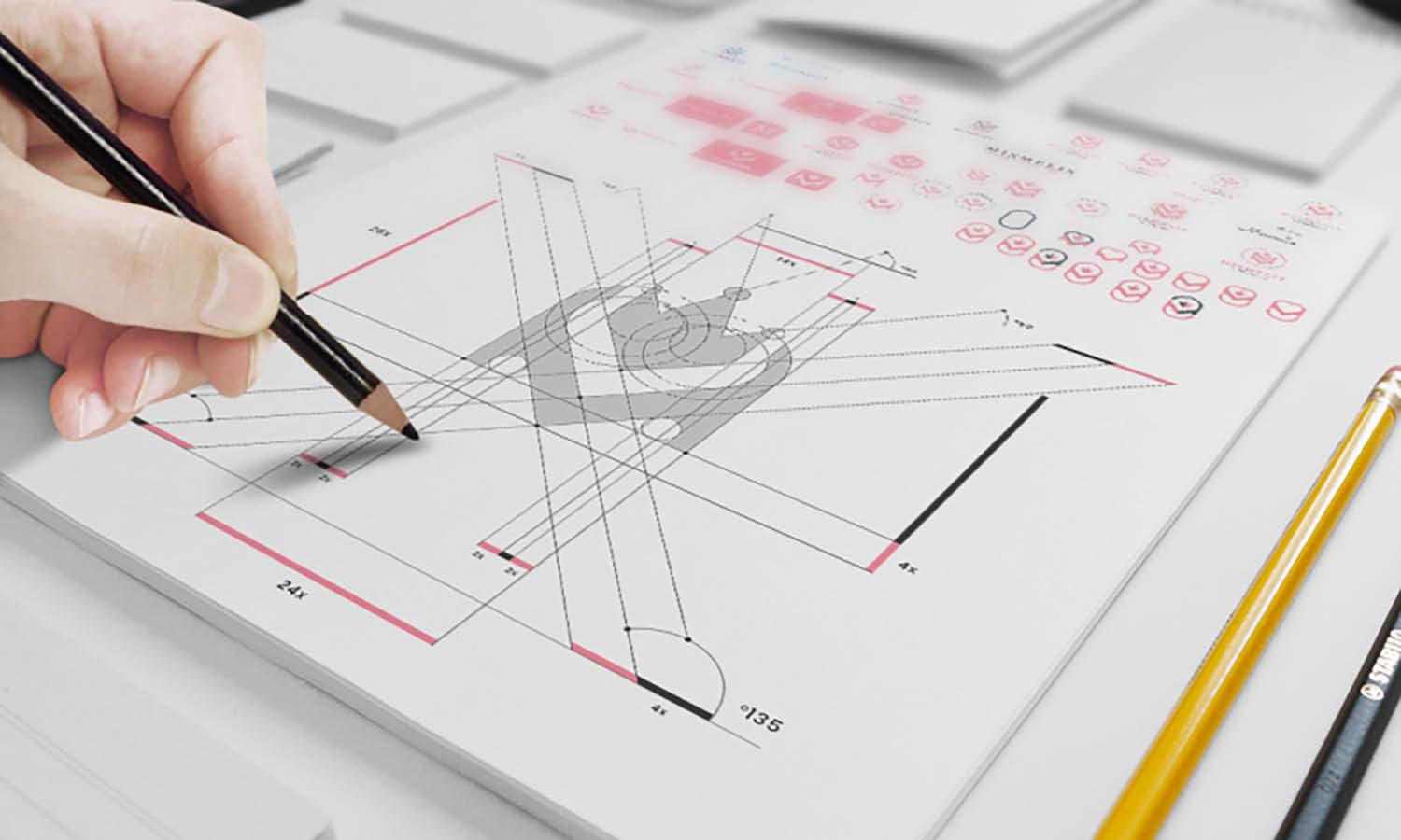
Understanding how to decode and apply the golden ratio requires a blend of mathematical accuracy and creative intuition. It's about breaking down a logo into segments that adhere to the proportions of the ratio, ensuring each part of the logo is in visual harmony with the whole. This could mean scaling icons, adjusting the spacing of letterforms, or determining the overall shape and layout of the design. The outcome is a logo that feels both organic and meticulously crafted, a quality that resonates deeply with viewers.
Ggolden ratio in the realm of logo design taps into a rich vein of interest for those who appreciate the intersection of mathematical precision and creative design. It emphasizes that behind every great logo is a thought process rooted in age-old wisdom that still holds significant relevance in today's digital age.
Incorporating the golden ratio in logo design is not just about following a trend; it is about embodying a principle that elevates the design to something that is fundamentally more engaging. As designers, we leverage the golden ratio to construct logos that are not only functionally distinctive but also have an intrinsic aesthetic value—one that speaks to both the mind and the heart. This balance of elements, guided by the golden ratio, ultimately defines the essence of a truly timeless logo.

Created by DAINOGO | https://dribbble.com/shots/15964056-Owl-Logo-Grid
Step-by-Step: Applying the Golden Ratio to Logo Design
Embarking on the journey of logo creation with the golden ratio at the helm is like following a map to buried treasure; it guides the design process towards a result that's both aesthetically rewarding and timelessly effective. This section unveils a step-by-step guide to integrating the golden ratio into logo design, providing a blueprint for creating visuals that are as compelling as they are harmonious.
Step 1: Understand the Golden Ratio
Begin by familiarizing yourself with the golden ratio's properties. This ratio, often expressed through the Fibonacci sequence, creates a series of rectangles and spirals that can guide the proportions of your design elements. A clear understanding of how these forms can be derived and utilized is essential before they can be translated into a logo concept.
Step 2: Create a Golden Rectangle
The golden rectangle, which is a rectangle whose sides are in the golden ratio (1:1.618), serves as the foundational grid upon which your logo will be based. Use this rectangle to start shaping the main structure of your logo, ensuring that each part aligns with the edges of the rectangles or squares within the grid.
Step 3: Design with the Golden Spiral
From your golden rectangle, you can create a golden spiral—a logarithmic spiral that grows outward by a factor of φ with every quarter turn it makes. Apply this spiral to your design to determine the flow and focal points of the logo, allowing the natural progression of the spiral to guide viewers' eyes through the design.
Step 4: Proportion Elements Correctly
Every element within your logo should relate to one another through the golden ratio. This can mean scaling icons, text, and other components so that they each hold a visual relationship, creating a sense of unity and cohesion in the overall design.
Step 5: Balance Symmetry and Asymmetry
While the golden ratio can guide you towards symmetry, it's also important to balance this with asymmetrical elements where appropriate. This ensures that the logo is dynamic and engaging, rather than appearing too static or rigid.
Step 6: Refine and Adjust
The golden ratio should serve as a guide rather than a strict rule. Use it to refine the balance and proportion in your logo, but allow for adjustments that may enhance the design’s readability and impact.
Applying the golden ratio to logo design is a blend of science and intuition. It requires a disciplined approach to composition, but also an appreciation for the way humans perceive and interact with visual elements. Incorporating the golden ratio into logo design is a testament to the designer's commitment to crafting a brand identity that is both impactful and enduring. By adhering to these steps, the logo not only achieves visual beauty but also resonates with the psychological underpinnings of harmony and proportion—attributes that are universally recognized and appreciated.

Created by DAINOGO | https://dribbble.com/shots/8069011-Flight-Radar-Bird-logo
The Psychology Behind the Golden Ratio in Branding
The influence of the golden ratio in branding extends far beyond physical symmetry and aesthetic appeal—it taps into the very psyche of the observer. As a universally revered principle found in nature, architecture, and even the human body, the golden ratio, when employed in logo design, resonates with the subconscious mind, fostering a sense of familiarity, balance, and beauty. This intrinsic appeal is why the golden ratio is not just a tool for designers but a psychological trigger within branding.
Innate Attraction to Balance
Humans are innately attracted to balance and proportion. The golden ratio appeals to this predilection by offering a visual experience that is naturally pleasing. Logos designed with this ratio in mind often evoke a sense of calm and order, making a brand feel more reliable and trustworthy in the eyes of consumers. It's a silent communicator of stability, a quality highly sought after in the corporate world.
Perceived Value and Quality
Incorporating the golden ratio in logo design can also subtly imply a higher level of sophistication and value. The visual harmony it creates suggests precision and attention to detail, qualities that can elevate the perceived quality of a brand. Customers often associate well-designed logos with professional excellence, and the golden ratio serves as a benchmark for such design finesse.
Memorability and Recognition
The natural structure provided by the golden ratio aids in creating logos that are not only memorable but also easily recognizable. A logo that is both distinctive and proportionally harmonious is more likely to be remembered and associated with the brand it represents. This connection is vital in an overcrowded market where brand recognition can significantly impact consumer choice and loyalty.
Emotional Connection
The golden ratio also plays a role in the emotional connection a logo can forge with its audience. There's a certain allure to a design that feels intuitively 'right', and the golden ratio's presence in a logo taps into the emotional responses that drive consumer behavior. Brands that harness this can create deeper, more meaningful relationships with their audience, transcending the transactional nature of business.
The golden ratio in branding is more than a design choice—it's a strategic psychological tool. When used effectively in logo design, it can enhance a brand’s image, ensuring that the first point of contact between a company and its customers—a logo—is impactful and enduring. Understanding and applying the golden ratio allows designers to create not just a logo, but a sensory experience that aligns with the human psyche's preference for order, beauty, and symmetry.

Created by DAINOGO | https://dribbble.com/shots/8383145-Fish-logo-golden-ratio-grids
Balancing Innovation with Tradition in Modern Logo Design
In the realm of modern logo design, there lies a critical balancing act between pioneering innovation and honoring tradition. The golden ratio, a time-honored principle with roots deep in the annals of art and architecture, stands as a beacon of tradition in a sea of ever-evolving design trends. Yet, its enduring relevance is testament to its adaptability and the innovative possibilities it continues to inspire within logo design.
Leveraging the Timeless Principle
The golden ratio serves as a bridge between the old and the new, offering a framework within which innovation can flourish. While contemporary design often pushes the boundaries of creativity, integrating the golden ratio into logo design ensures that no matter how avant-garde a concept may be, it retains a core of visual appeal that is both classic and universally resonant.
Innovative Application of an Ancient Formula
The modern designer's toolbox is brimming with advanced software and technologies that offer infinite possibilities for creativity. The golden ratio does not constrain this innovation; rather, it provides a mathematical foundation from which designs can diverge and evolve. Using the golden ratio as a starting point, designers can experiment with complex geometries, abstract shapes, and bold typographies, knowing that the underlying structure will maintain visual coherence.
Harmony and Disruption
Balancing tradition with innovation also involves a calculated measure of disruption. In the context of logo design, this means playing with the golden ratio's proportions to create something unexpected while still retaining an underlying sense of harmony. A slight deviation from the golden ratio can result in a design that is both fresh and edgy but still maintains an air of classicism.
Forward-Thinking yet Rooted in History
The future of logo design lies in the ability to foresee emerging trends while staying grounded in principles that have stood the test of time. The golden ratio represents just that—a constant in a variable equation of design. As we propel into the digital age, the golden ratio remains a touchstone of balance and beauty, proving that some traditions have the power to ignite rather than stifle innovation.
In summary, the golden ratio is not just a relic of the past but a conduit for future creativity in logo design. Balancing innovation with tradition through this principle enables designers to create logos that are both groundbreaking and grounded, ensuring they resonate with audiences today and remain relevant in the years to come.

Created by Muhammed Sherwan | https://www.behance.net/gallery/158488975/ARCO
Challenges and Critiques: Not All That Glitters Is Gold
The golden ratio is often heralded as the epitome of design excellence, especially in the sphere of logo design. However, as with any principle that gains a following, there comes a slew of challenges and critiques. It is essential to address these not to detract from the golden ratio's value, but to paint a comprehensive picture of its role in modern design—a role that, while significant, is not without its complexities.
Navigating the Hype Versus Reality
There's a fine line between appreciating the golden ratio as a design tool and venerating it as a magic formula. The truth is, many iconic logos touted as examples of the golden ratio's application do not strictly adhere to its proportions. Designers often face the challenge of distinguishing between creating a logo that is inspired by the golden ratio and one that is dictated by it. This distinction is crucial because design, at its core, is about innovation and originality, not just mathematical precision.
The Pitfalls of Overemphasis
While the golden ratio can provide a strong structural foundation, an overemphasis on its importance can stifle creativity. Not all successful logo designs conform to its rules, and there are numerous examples of effective logos that defy its proportions. When the application of the golden ratio becomes too rigid, it risks turning logo design into a formulaic exercise, devoid of the unique character that brands crave.
The Golden Ratio as One Tool Among Many
The golden ratio is one of many tools at a designer's disposal, and it's vital to remember that it's not a panacea for all design challenges. While it can contribute to a logo's balance and appeal, it does not guarantee brand success on its own. A successful logo is the synergy of concept, execution, and market relevance—all of which may not always align with the golden ratio.
By providing a balanced viewpoint that acknowledges the critiques while recognizing the benefits, designers can navigate the golden ratio's use more effectively. The goal should not be to fit every design into a golden-ratio-shaped box but to understand when and how to apply it to enhance a logo's impact.
Ultimately, the use of the golden ratio in logo design should be approached with a blend of respect for its historical significance and a critical eye towards its practical application. It is a tool that, when used judiciously, can contribute to a logo's success—but it is not the sole determinant. As designers, our task is to employ the golden ratio wisely, ensuring that it serves the design, rather than constraining it.
Conclusion
In sum, the golden ratio offers a blend of mathematical harmony and aesthetic allure that can greatly enhance logo design. Its principles, when applied thoughtfully, can produce logos that are visually pleasing and profoundly impactful. However, it's the designer's insight and creativity, combined with an understanding of branding essentials, that transform the golden ratio from a mere mathematical concept into a compelling design strategy. By striking the right balance, designers can create logos that are not only memorable and effective but also timeless in their appeal, solidifying the golden ratio's place in the pantheon of design excellence.
Let Us Know What You Think!
These fantastic logo design articles are written and curated by Kreafolk's team. We hope you enjoy our information and remember to leave us a comment below. Cheers!









Leave a Comment