10 Tips to Create a Good Jewelry Logo Design
Here are some tips you can easily follow to create a good jewelry logo design for your project!

Created by Lindsay Graviet | https://www.behance.net/gallery/94756427/Anna-Monet
Create a Good Jewelry Logo Design - As a company in the luxury industry, your jewelry logo should look as polished as your stock. Like the diamond on an engagement ring, your logo is a symbol for your customers - that your business is professional, your merchandise is elegant, and you are the one to come when they want to buy a gift for that special someone.
If you are new to the world of cool design, don't worry. It's easy to improve on the subtle elements that make any graphic design sophisticated and luxurious - all you need is a working eye. To get started, you need to understand that a complex design needs to look easy and professional - however, don't let this fool you into thinking it's easy, just like how an elegant waltz looks easy but has years of training behind it on the part of the dancer, so too, the grandiose design looks simple, graceful, and ultimately unforced but has hours of sweat and blood, along with experience.

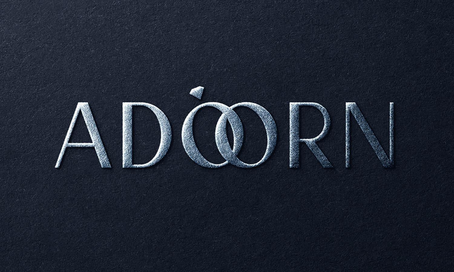
Created by Elena Popovichenko | https://www.behance.net/gallery/121178505/Logo-design-for-jewelry-house-Adorn
Whether you are a goldsmith or a diamond enthusiast, style and good taste are what set your business apart from the competition. A good brand will help you to communicate these traits to the audience, starting with your jewelry logo. Then, when you're ready to create a good jewelry logo design, scroll down for design best practices in your industry:
1. Icon
Icons are usually subtle in popular jewelry logo designs and are used to highlight (not confuse - the logo text). It is important to choose your icon based on the type of jewelry you are designing. For example, if you specialize in unique wedding rings, choose a symbol that represents engagement or marriage. Or use abstract symbols to let your audience fill in the blanks themselves.
The bridal jeweler himself, for example, might use the shape of a diamond to subtly hint at what your jewelry is without being flashy. A fashionista can work well with abstract symbols that include intricate thin lines for a luxurious and modern look. And if you are creating a custom jewelry design, using abstract symbols will help you avoid limiting your brand association to one specific type of jewelry.
On the other hand, a high-end store that wants to associate itself with luxury and intricate craftsmanship may want to use the timeless Victorian motif to express this quality. If you look at other jewelry logos for inspiration, you may see royal symbols, such as a crown or coat of arms, as well as classic diamond rings and bracelet icons in between. However, it is important to distinguish your business from the competition, so try not to choose icons that are overused or cliched. Instead, look for icons that say something unique about your business.

Created by Okaz | https://www.behance.net/gallery/146841051/BADWY-Jewelleries
2. Typography
In a jewelry logo, the font is the selling point. Fonts exude different moods and emotions, and you want to set your business name in the perfect typeface to attract your customers. Many jewelry brands choose fonts that convey luxury and luxury, such as classic serif and sans serif. However, as with icons, it is important that you try to differentiate yourself from other logos in your industry.
If you offer fine jewelry, consider using a script font to express elegance and sophistication. Fonts with a handwritten look are modern and elegant, so owners of a fashion jewelry logo may want to take this route. Or, for a jewelry brand with a simpler feel, try simple sans-serif. You can always play with fonts to create a good jewelry logo design that stands out from the competition.

Created by Pierfilippo Ariano | https://www.behance.net/gallery/105218071/Venetian-Mirrors
3. Color palette
Jewelry logos tend to use a simple color palette. Gold and silver are the obvious choices. However, you may want to focus more on color psychology and the emotions that different color palettes evoke when choosing your logo colors.
For example, purple and pink together are known to symbolize femininity, with pink in itself giving romance and charm, and purple alone edges towards royalty and power. Consider using this plate if your jewelry uses gemstones.
No matter what kind of jewelry you make (except for homemade beads), you can't go wrong with black in your logo, which exudes sophistication and luxury; Consider using black with a secondary color to accentuate your design, such as teal or maroon. For example, a luxury brand likes to use a black and gold palette for an elegant and luxurious feel, while a wedding jewelry logo might stick to classic black and white colors.
On the other hand, fashion jewelry can be best represented by a logo with multiple colors in the panel; the same is true for homemade jewelry. If you go this route, make sure that your colors convey a harmonious message to your audience and that the palettes do not conflict.

Created by Studio Born | https://www.behance.net/gallery/117572205/SELIN-KENT-NY
4. Simplicity or minimalism
Simplicity is the hallmark of any good logo. A simple logo is one with the fewest number of elements. It is only the number that is absolutely necessary to convey the message.
Clear lines, simple shapes, and just the right amount of color make a logo stand out, and it's no surprise that fancy graphic designs place great emphasis on simplicity or minimalism. What's the first thing you notice when visiting a high-end jewelry store? You will notice that the store actually has very few jewelry items on its display shelves, and the jewelry items will be carefully displayed all over the place.
You need to know that simplicity immediately gives the impression of elegance, charm, and luxury. Plus, simplicity and simplicity is always a safe route. You can never go wrong with them, and you'll always look great with them. Compare this to a highly detailed jewelry logo; while it may have the power to work, there's also more room to make it look tacky and second-rate.

Created by Daria Lekhner | https://www.behance.net/gallery/129109217/Jewelry-brand
5. Space
Another important element in creating a good jewelry logo design is space. This helps keep parts of your logo away from other elements so users focus on your brand and don't confuse it with other images. This helps users decode your messages and allocate appropriate combinations for the individual elements of your design.
One important area that requires a lot of attention is a negative divergence. Having a lot of negative space in your logo not only makes your logo look spacious and bulky but also conveys a very prestigious look. A space can certainly become a central element of a design when used to produce a specific frame or look. However, a large space is usually used with luxury and elegance; Therefore, using it efficiently may be a way to introduce this alliance into your designs.

Created by Rafael Almeida | https://www.behance.net/gallery/137393081/Margalit
6. Decorative elements
Simple or minimalist does not mean that your jewelry logo should not or should not contain decorative elements. In fact, the decorative and embossed elements help distinguish any minimalist logo from a cool minimalist logo. If you really think about it, luxury is more than a necessity - at its core, luxury is decoration. This is why it is so important that your jewelry logo contains some decorative elements. This can usually be done in several ways, for example:
- Lines and Borders: Intricate and thin lines and borders instantly give the logo a cool feel. It can be used in many creative ways - for example, if you want to have a logo or slogan, it can easily incorporate thin borders and lines. It is important to keep the quality of the lines smooth because otherwise, the design will look heavy and exaggerated. Lines and borders can also appear hand-drawn - which is also a defining characteristic that looks instantly luxurious.
- Texture: Some decorations make the logo look more luxurious. For example, if you choose a metallic texture, the brilliance and quality of that texture will make your logo look sophisticated. When you want a printed logo, you can go further and include the touch element in these textures as well - who says you need to limit yourself to visuals?
- Other Effects: There are many graphic effects that can be used to add a touch of sparkle to your jewelry logo, for example, an embossed look, even if it's just a visual engraving, gold foil look, or calligraphy and calligraphy. Effects can also be added. Likewise, you can also search for high art offers.

Created by Baianat | https://www.behance.net/gallery/131992813/Madenia-brand-design
7. Abstract Jewelry Logo
Incorporating abstract designs is another great idea that jewelry brands should consider in their logos. Creating abstract shapes or symbols out of distinctive jewelry will give your logo an interesting touch, and this was clearly demonstrated by the amazing Ciiner Jewelry logo above.
Abstract design involves the use of shapes to create a unique design, and this style has been commonly used in many logos today. For jewelry work, you might consider making bare diamonds or prism shapes. In the Ciiner logo, for example, the designer used multiple circles to create a very clever diamond shape!

Created by iboeve SB | https://www.behance.net/gallery/124733935/Amlor-Jewelry-Project-Diamond-Branding
The logo is less ambiguous because consumers are still able to tell that the brand sells jewelry, and at the same time, the design is also not so prevalent. It does not use the diamond image commonly used by many other jewelry brands on the market, allowing this logo to stand out.
Additionally, adding golden gradients to the diamond shape lends a luxurious touch to the logo, making the brand appear more elegant in the eyes of its audience. Although this logo technically does not include any unusual design elements that are not common in jewelry logos, just applying an abstract style is what really helps this logo look so much different from the others. Thus, an abstract design can completely transform your logo and give it a new look.

Created by Frames Design | https://www.behance.net/gallery/34515711/Atolye-Gozde-Branding
8. Remember the unusual jewelry slogans
Most jewelry logos often use the same color scheme as their black, white, blue, and gold logos. According to color psychology, these colors are used because they give a calm, calm, and modern design touch, and this is the same feeling that consumers get when buying diamond jewelry.
However, contrary to popular belief, there are many colors that can evoke similar feelings. In this day and age, there is no need to always stick to the traditional way of designing jewelry logos, so why not try all the undiscovered colors to make your logo stand out even more? There is absolutely nothing wrong with that. In fact, this is what will make your logo even more unique.
In the Black Swan logo, you can see that the designer has incorporated colors like violet and pink into the logo design, two colors associated with femininity. Purple is the color that symbolizes wealth, nobility, strength, and ambition, and it is a symbol that goes well with jewelry. On the other hand, the pink color highlights the romantic and charming atmosphere of the design. The combination of these two colors could not be more perfect for a jewelry company to create a good jewelry logo design.

Created by Digi Clovers | https://www.behance.net/gallery/101525629/Rasan
9. Initials provide comfort
Your name may be too long to be the only "face" of your brand, but you want to keep it simple and elegant. Where there is the will, there is a way - and solutions for logo design! Your initials which mean your brand's initials, can help. A jewelry branding agency that excels in the art of creative logo art will turn your initials into a logo that will look great not only on your store shelves but also on business cards, websites, packaging, and anything else of great advertising importance. /Brand.
Again, it is highly recommended not to be too flashy with your logo - don't decorate your initials with diamonds or sapphires. Let the connoisseurs find an outlet that exudes the allure of luxury. You didn't open a children's jewelry store, did you? A famous jewelry collection of names such as Brad Pitt, Shakira, David Yurman, and his wife Sybil has been making unique jewelry since 1980.

Created by Elizaveta Krivonosova | https://www.behance.net/gallery/134214463/MOTTO-Corporate-Identity
10. Talking about tradition
If there is one thing that jewelry associates well with, it is tradition. Have you watched your grandmother's ring pass from generation to generation? Your family must have said one day, "When you get married, wear your grandmother's ring. It's lucky for every woman who comes into our family." This was more common among the nobles. You will see Kate Middleton proudly flaunting the sapphire of Lady Diana or Meghan Markle as she wore her diamond ring. Now how does that relate to your jewelry brand logo?
People value tradition. Your brand can reflect traditional values. There is no need to serve kings to brag. You can build an emotional connection with your customers by providing a strong legacy of value in your jewelry brand logo and the jewelry brand itself. Now let's dive into what it means to design a jewelry brand logo so you can see how tradition can creep into a logo, creating a strong bond with your target customers.

Created by Valeria Parshina | https://www.behance.net/gallery/146482529/logotip-juvelirnye-ukrashenija-logo-jewelry-brand
Tanishq is the brand of the well-known Tata company in India. The Tata logo is a straight T. However, Tanishq has a symbol (yes, that's another one) where the letter T facing the opposite direction is slightly curved to create the illusion of a tree. The symbol or motif is closely related to Indian culture and shows the natural beauty and strength of the tree trunk.
The font itself depicts culture and traditions. The letter 'Q' in the shape of a peacock feather signifies wealth and serenity, while the darker dot above the letter 'I' represents a decoration known as the 'bindi,' which is mostly worn by Indian women. This bindi is a symbol of a strong Indian woman.

Created by Poe Lay Nyein | https://www.behance.net/gallery/90100689/Chit-Par-Jewelry
Final Words
To be a successful jewelry brand, you don't just need to design unique and special jewelry for your target customers. You also need the right branding to get your business off to a great start, and one of the best ways to do that is to create an amazing logo design.
When you receive a logo draft from a professional designer, make sure it accurately reflects your brand and that customers will respond well to it. To achieve this, be prepared to do several rounds of revisions. Your revision allows you to take your original logo idea and refine it to fit what you want your brand to represent. Use the disc to play the latest display of your logo through the focus group. You can also incorporate A/B tests to help fine-tune the final details.
These are just a few ideas to help you get started with a killer logo design for your jewelry store. Using these tips in your logo gives you an easy blueprint for a great design – however, one thing is always true. So while the tips for creating a good jewelry logo design above will get you started, the really easy design look stems from years of practice in luxury design.





Leave a Comment