
How To Create An Effective Poster Design
But how can we create an effective one? Let's find out!

Created by Jack Castro | https://www.behance.net/gallery/86513637/-Missions-Posters
A poster might be one of the design works that many people take for granted. In other words, they enjoy working and make it fancy. However, an effective poster is not only about grabbing people's attention. But it also needs to be effective and deliver the message as it is. But is it an easy project to nail? Of course, you got to plan everything.
One thing that makes this media pretty advanced to tackle is how vast and versatile it is. It can be part of many practices, such as events, sales, fundraising, vacancies, and many more. Thus, delivering the message is part of the key feature and purpose. So, an effective poster design will force you to work from the basics. Here is what you should know and start the project.
About The Project
So, what is so important and unique about the design project? One thing that you need to underline is the focus and function. The user and designer make the item to entice the audience. So, they will read or see the project, understand the meaning or message, and remember what is implied in the information.
The good and also the vital news about those purposes is your design project. Many people only put posters as a way to say something without paying attention to the design point of view. But a good poster design will help attract people's attention, provide a clean pop of color or focus, and deliver the real message.
So, it is clear to say that the design has a huge role in making an effective poster. The effect and the way it enhances the presentation will be one of its vital tasks. So, don't underestimate the importance of planning projects during the making process. Yes, it not only steps up the visuals but also gives a better interpretation plus the standing of society.
Most of the time, you can also see the effect of the design on the content and theme. Good detail and plan will make the project have every essential bit of graphic, text, and message without being too much. In other words, it is enough and sufficient to tell the message and story. Thus, people will get the same ideas or points of your poster design.

Created by Andrea Grimaldi | https://www.behance.net/gallery/126587817/A-month-of-music-posters
Programs To Create Poster
Yes, posters are very versatile, and you can make them manually or digitally. The point is to make sure you can put all of the key features together, follow some tips, and make an effective poster design. Nothing is more important than doing a project that nails the purpose and the focus. So, what kind of program to make a poster? There are a lot.
You can make it literally from every program that allows you to work with text and pictures. The free option will be LaTeX, which is a free document preparation program. It is also possible to work with PowerPoint, which is surprisingly capable of handling some challenging design quirks.
If you are a person that is into design, try some programs that cope with the focus. In this case, some popular programs that offer such variance and wizards are InDesign, Illustrator, Inkscape, or any drawing and graphic program. If you are stuck with ideas, it is also okay to check out PosterGenius or some sort for inspiration and templates.

Created by Anthony Lam | https://www.behance.net/gallery/133191903/Poster-Collection-2021-HKU-Architecture
The Tips And Tricks
1. Determining The Goal And Target Audience
Before you get into poster design making, there are some tips and tricks that will help you gain effective work. The first thing is the target audience's consideration. No matter what kind of program you will work with, you should know who you want to reach. If you work with a hazy target, your design progress will be full of questions and unpredicted flaws.
How important is the audience? It is very significant to the point that it will shape your design altogether. Why so? Because you know what to show and how to present the information to the right person. As an example, a business poster will not fit with such a cheery and fun emoticon. You need a more formal approach to appeal to the right reader.

Created by Nick Barclay | https://www.behance.net/gallery/125184223/Familiar-Branding
2. Choosing The Text
Text will be the element that you can use to explain and show the real message of the poster design. However, it does not mean you can put the text just the way it is. In some cases, the best effective poster design will use fonts to enhance the readability and understandable content. To do this, you have some points to consider.
The best way to start is the "max of two fonts" code of conduct. After that, you can use some basic fonts such as Calibri, Arial, or the Helvetica to make it easier to read. Not only that, pay attention to your context and the size. Remember the margin and the kerning, so everything is readable and comprehensible.

Created by Nick Barclay
3. Trying Pre-Made Poster Template
When something is out of your world or ideas, you have to consider looking at poster design templates. Remember that you can use digital programs, so you get the chance to try some models for your work. However, to help you improve design proficiency, try to not only use it but learn from it.
The idea is that posters can come and envelop many fields of human life. It has varying purposes and uses, which explains that using one template is not enough. You need to explore and eventually make your design signature. With that, you can make a more effective plan and work that entices people's attention or understanding.

Created by YAAN W | https://www.behance.net/gallery/102840079/CUPID-BLUE-POSTER
4. Adding Call To Action
Even though many posters are designed, paying attention to the visual and context, there are also some points where you need to emphasize action. A poster with all of its functions is bound to have a purpose of enticing and asking people to follow. So, an effective poster design should be one that can show what people need to do next.
This is where a call to action or CTA surfaces. Every poster, regardless of the model, design, audience, or field, will always need CTA. While it helps people to know the next step, it also makes the designer or the content get their main objective. If you are selling or promoting something, of course, you want to make people buy it.
That is why a call to action is a must for your poster project. Pay attention that it can be one of the focus or the focal point of your project. So, sometimes it is worth it to make it clear and stand out from the rest. The best way to do it without destroying the whole arrangement is to use a unique font and highlight it.

Created by Huong Nguyen | https://www.behance.net/gallery/123577791/OLIPOP-POSTER-DESIGN
The Key Features
After you know what to do and what kind of poster you are going to work on, it is time to start building effective poster design. At its core, the design will force you to put some key features in it. The idea is not only to make it appealing but also an effective piece of art or information. So, to start your work, here are some of the features you should have to do.
1. The Text
The first thing that you will need to pay attention to is the text. Poster design will never miss any text in it, no matter how much the picture or the focal element. In many cases, you can also find a full design that only consists of some text or copy in it. Many designs, in general, will have around 800 words of text. So, you should never forget to put some alphabet in it.
But, how to make it efficient? When you are doing a design project with text, the best point to consider is readability. Pay more attention to the font selection and works. Use a maximum of two typefaces with fonts that are easier to read. At the same time, you also need to consider the size and the context.
If you are going to put a narrative text in it, the best effective poster design font should be 30-36 points. It would look rather big and easier to read. At the same time, please mind the margins, space between columns, and the white space. The minimum space should be roughly about 2.5 inches.
However, as you work and consider the font, it is also best to organize the text. In poster design, you can put it in labeled sections. Thus, every content is clear, and you can clearly describe the objective of the message. The idea of using sections also helps the design's layout in general.
But, one of the most beneficial uses of sections is to pinpoint the focus or note. You can describe the objective of your study, the progress or procedures, and put the result in a separate section. Don't forget to explain the conclusions as well. When you can nail the sectioned practices as well as the font, your poster design will have good readability.

Created by Tory Hoffman | https://www.behance.net/gallery/103485375/UNKNOWN-FILM-FESTIVAL
2. Taking Care of The Title
Your poster title holds a huge role in creating a descriptive indicator for your content. You can call it an introduction. Thus people can predict or understand what they will read from your poster design. While it is tempting to make a huge, captivating, and inviting title, you should make it more effective. The key to the idea lies in your font size and line of text.
Doing a title does not always mean huge and impactful work. The best way to make it effectively stand out without disrupting any other element is to use bold and 48-point font size. You can also use the larger one, but remember to put the layout and design balance as consideration. How about the front line? Two is the max, and don't make it more, or it will look too much.

Created by Studio Carreras | https://www.behance.net/gallery/108810453/Google-For-events
3. Use White Space
The magic of design in many fields is the white space. It is one of the key features of an effective poster design that will help you put anything in necessary. The focal point, the text, graphic, layout, arrangement to the design as a whole are possible to look better with proper use of white space. It is because of the function of white space as the presentation border.
The poster, in general, will never have a singular focal point. You will find that it can consist of graphics, text, color, shapes, and many more. Implementing perfect whitespace will help you make breathing room between all of those poster design elements. So, your work will not overwhelm or make them feel reluctant to read.
The best way to consider the design balance is pretty simple. And the unique point goes to the fact that your white space should at least have roughly about 30% of the poster. It is safe to say that the percentage is around 40% for the title and text, 30% for the white space, and the last 30% is for your graphic.

Created by Studio le_m | https://www.behance.net/gallery/109420865/PLOUF-Visual-Identity-Design
4. Consider The Graphic
As said on the previous key feature of an effective poster design is 30% graphic. The number is not too lacking or overwhelming. In this case, the thing that you need to underline is the context. Nothing is more important than adding an element that is coherent with the main text. If you are going to introduce an AC, then use an AC graphic, not a phone or irrelevant things.
So, the point is to always use any illustration or picture that is relevant and in context with your main copy or title. While it is vital to put something that is in line with your poster design, you also need to consider the quality. Using a high-quality or high-resolution graphic is the key. But, how big is it? The best consideration is to always use one with 300 dpi or higher.
Another good point of consideration is that the image or graphic is a large image for your effective poster design. The idea is to make sure that people can recognize the picture even from standing 5 feet away from your work. In this case, you can always avoid any kind of low-res images from the web. It is also better to add captions for your table or figure.
Paying attention to your picture will help you take care of the layout in general. Again, it will be the key to your design. Which later will force you to make consideration upon graphics as a focal point, background, or some particular highlight. It is mostly necessary if you are going to enlarge the poster or have a plan for a bigger medium.

Created by Cameron Humphries | https://www.behance.net/gallery/136296015/OFF-WHITE-x-NIKE-POSTERS
5. Taking Care of The Layout
It might sound pretty basic, but working with templates helps you learn about the proper layout. In this case, your layout can affect your poster flow, text arrangement, hierarchy, and many more. However, your layout might also get affected by some other elements such as graphics and focal points.
So, the layout is a sensitive point that you should put in mind. If you are new to it, use templates to learn how to make contrasting fields, vertical columns, or focal designs. The key takeaway is that your poster layout should help deliver the purpose of your report, message, information, or ideas. Thus, try and find the one that fits your effective poster design theme.
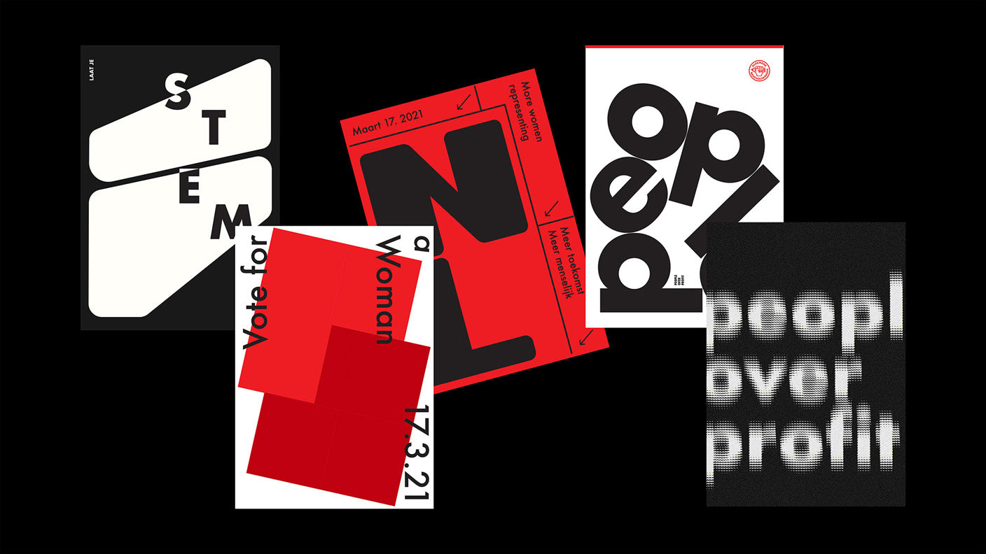
Created by Flora Engel | https://www.behance.net/gallery/123902641/People-Over-Profit
6. Mind The Flow
The poster flow refers to how you want the reader's eyes to move around on every section. The flow itself highly relates to the poster layout. Such as vertical columns or graphic-centered layouts. To make it easier, you can start the design by determining the layout and label. Put numbers from each section, so your reader knows what to read first.
The point and the purpose of the flow are to help your reader get the information as clear as possible. Putting a number or point might help them know, but you can also make it happen with a proper poster layout. Again, you should figure out how to connect every dot on your section. So, the message will reach as it is. Not something hard to learn.

Created by Miloš Nikolić | https://www.behance.net/gallery/108595575/FMK-Posters
7. Determining The Color
Your poster color helps reach the right audience, set the mood, tell the story, attract attention, and many more. It is also a magical element that can help create the flow or direct the reader's gaze. However, it is also as crucial as image. You need to ensure it is in context with your effective poster design, follow the theme, fit the brand, and no more than three.

Created by Andrei Merkulov | https://www.behance.net/gallery/130399545/Residents-Casting-2022-Event-Identity
Final Words
Working with poster design does demand more than just a simple job. It is especially true if you want to convey and deliver a message effectively. You need to consider some of the tricks and ensure all of the key features are spot on. If you can make every aspect work together, surely it will end with people's ways of understanding the information and details.
Related Articles


Leave a Comment