
9 Easy Steps to create a Stunning iOS icon design
But, we have found some easy steps to build and stand out from the others. Find out more!

Created by Ahmed Kamal | https://www.behance.net/gallery/101678987/App-Icons-Logo-Symbols-Pack
The design world probably has no ending line. No barrier limits in this particular field of job. From the printed items, digital, physical, to a very specific design function such as iOS icon design. You got everything. Let's talk about the opportunity to work under the rising popularity of smartphones, in particular the iPhone.
As one of the biggest smartphone companies, Apple's iPhone uses iOS as its operating system. This particular operating system can use a lot of applications. With the growing number of users, app developers will look for the best icon design that helps them gain more users. Here is when your opportunity appears. If you are interested in joining, take a look at this humble instruction.
Here Are What You Should Do And Know
1. Do You Know What Is an App Icon?
Starting from the most basic is understanding what you are going to work with. In this case, you will work under the opportunity to make money by creating an iOS icon. So, you need to underline that icons are not logos. This is a big misconception that people tend to make. While it does have the same thing as brand identity, there are big differences between the two terms.
Long a short story, you can call icons a representation or identities that are only significant for a single application. It can be from a company or individual application, but it becomes the face of the iOS app. Assuming you are here, then there is a high chance you are an iPhone user or a designer that gets this particular request. So, those little app symbols in your phone are icons.
In this case, iPhones or any other Apple-related device will have many applications from its App Store. The rectangular graphics that represent or appear in particular iOS applications are what you called as icons. From that information, you can take the underline that it just represents the particular software, not the whole company or brand.
That kind of detail explains that the iOS icon is different from the logo. Yes, at some point, some applications use the same design as their company logo. It can turn into a misleading detail as well as unattractive detail. Here is where your skill to make an icon will be needed. You will need to make a visual anchor that represents a product (app).
So, the main distinctive difference is that android or iOS icons both have the function to communicate the primary essence of your application. It also has a lot of restrictions, such as specific context, size, and how it should look good within a square canvas. Meanwhile, the logo has more freedom in its design. It is even used for many media, from paper to billboards.

Created by Song Hojong | https://www.behance.net/gallery/100752659/Neumorphism-icons
2. Understanding The Current iOS Standard And Trend
If you have the iOS icon design project but are stuck with the idea, then snoop around to find some inspiration. Icons are like a fashion brand that keeps on changing. This idea is one of the best to find the current bandwagon, make it your guideline, and do something with your project. In this case, you have two options, follow them or make something new.
Underline that you don't necessarily have to follow the iOS trend or rules. However, by joining the bandwagon, you can easily gain more relevant points. Your design will look cohesive and relevant, thus making it have the potential to receive more attention and download. This is what you should target. Your client will be happy with a lot of downloads.
So, what should you pay attention to? In the case of the iOS icon, you can start by taking a look at the visual trend. Jot down some design elements that are getting more apparent in the App Store. As you search and explore, you will eventually find a specific bandwagon. Make sure you got the same theme and purpose of the app, so your icon will not look out of place.
As you do the visual research, you can also start the work by taking a look at the Apple Human Interface Guidelines. This particular information will give you some information on how your iOS icon should look and what to consider. It includes the proper measurement, size, pixels, and probably many other specific rules for iOS.

Created by Ahmed Kamal | https://www.behance.net/gallery/101678987/App-Icons-Logo-Symbols-Pack
3. Aim To Make A Stands Out Icons
Other than following the guideline or the bandwagon, you can go wandering. The idea is not to move out from the same spot but rather make a unique model. Just like many other branding elements, recognizable, stands out, and distinctive will help your product gain more attention. In this case, creating an iOS icon might become something challenging.
The thing is, you can call it recognizable as a primary key of a great icon design. The competition is hot, and you will need to think harder to make your app recognizable in a good way. To do it, you should play with color, ideas, and shapes carefully. Make an iOS icon that connects both emotional and functional levels. Thus, people can feel the urge to try.
Since you are going into a very noisy iOS market, App store, then you need something that makes your product stand out. Uniqueness can be one of your weapons. It is the opposite of the previous point. You need to make your design look different but still relevant. The idea is to play around with color, the iOS background and be creative.
However, uniqueness is pretty tricky to pull off. It tends to be hit or miss, which is why you should be smart in doing so. Your skills and experience in designing might have a big effect on your project. It can be intimidating at some point, especially if you are new to creating iOS icon design. Understand that everything needs research, so do your job and make sure you know what the best is.
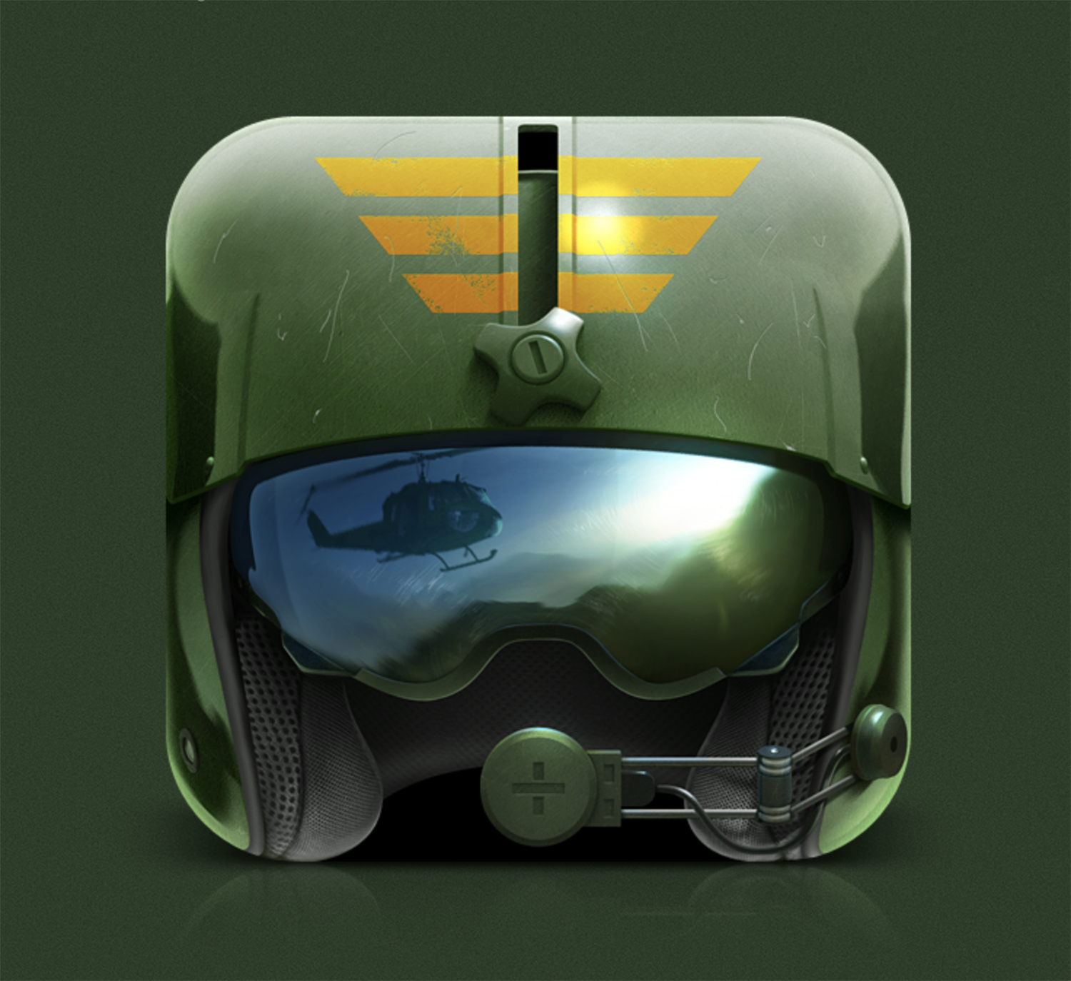
Created by Aleksandr Novoselov | https://www.behance.net/gallery/8473545/Pilots-Path-iOS-Game
4. States The Function
One trick that helps iOS icon developers in doing their job is by stating the function. The main idea is to make your design play a role in giving the app as a whole experience. The best example that you can take a look at is the utilization of apps on the iPhone or any device. Most of the time, it's corporate the visual cues or characteristic of its function.
Just like how an iOS clock app icon appears as digital numbers or traditional hand clocks. Some calendars or calculators also appear with their literal depiction. The idea of using a cultural utility can help users to recognize the content without even need to read the name. This idea will greatly help to create an iOS icon design.
This kind of idea is also applicable for wider use, including iOS games. In this case, using the imagery provides not only insight but also a glimpse of its world. It will help create a more interesting and exciting design that tells how good the game is. The imagery itself can range in many varying models, including the smart and eliciting bowling balls or slashed watermelon.
As you create a more function-focused design, keep underlining the need for an attractive and attention-grabbing aspect. There are a lot of game apps you can find on iOS, and it can make the competition higher. In this case, playing safe with a stationery design such as a simple bowling pin will not be enough to grab attention. Try to add some other elements that will make it appealing.

Created by Webshocker | https://www.behance.net/gallery/85435229/ShiftBookd-app-icon
5. A Snippet Of The Content
When it comes to the content snippet, you do not necessarily need to tell the real insight. You can make and reflect the look or its feel through your iOS icon. The best way to make it is by using a perfect analogy of what you see outside is what you will get inside. That is also a great way to avoid any kind of iOS click-baiting acts.
But how do you do it? You can make a bit of a snippet by adopting the same texture, color, or imagery style from the content. If you are working with a modern cyberpunk-designed game or app, do so with the iOS icon. You can use the main character or what is the focus of its content. Make a cool robot design or take a glimpse of the modern world of the game.
Just like the previous point, you want to make something along with the content that looks attractive. No matter what the game or how simple the application could be, you can make an icon design that looks more attractive. Rather than just a simple cool detail, add some other elements that signify the iOS content. Plus, it will create visual interest.

Created by Vella Ri | https://www.behance.net/gallery/62783541/App-Icon-collection
6. Try To Make It Scalable
One thing that everyone needs to consider when doing iOS icon design is the size and its scale. While you need to go along with the already settled rules, you can also make your icon scalable. The idea of scalability itself helps the design to be versatile. High chance that several devices have different settings and requirements, which means your icons will change.
On several platforms, there might be some different configurations. With that in mind, make sure you got some icons in several sizes. Give attention to its uniqueness and legibility, which is pretty much the focal point for your icons. It will be better if your icon design is available for many platforms and still looking the best in the App Store or Play Store.
Another thing that might help you create a more scalable icon is the details. If you want to make sure the visual is easy to recognize and to look at, try not to overly complicate the design. When you make an iOS icon in too many intricate details, it will look too much on a smaller scale. At some point, it is even possible that your design is harder to understand.
A huge part of the iOS icon design that often relates to the conceptualized part is scale. Pay attention or even dedicate yourself to think about this aspect. It is because making one is quite tricky. If you are playing with 1024 x 1024 px canvas, the chances are that you will need to try out the design. All go for the reason that each device might have a different resolution.
Another good thing that you will need to embrace is simplistic design. Use this idea, and you will get one of the scalable designs. At this point, you can even play around with a single visual touch. Use multiple iOS devices to see how it looks in the other media. Other than scalability, you can also make sure that the design will look good in every iOS background color.

Created by Sergei Shilo | https://www.behance.net/gallery/100318769/GoDog-iOS-Application-for-dog-training
7. Use The Correct Configuration For iOS
Please understand that you are going to make an iOS icon design. It means that you will need to make a proper design with the exact configuration. Worth noting that iOS and Android devices have different settings, which is why you need to jot them down. For this particular operating system, you will need to work on 1024x1024 pixels.
What size is the standard rule for iOS icons? It is contrasted with android since they prefer designers to make launcher signs with 36x36, 48x48, 72x72, and 96x96 pixels. However, android also recommends the use of an 864x864 pixels design. But why a lot of different sizes? The reasons are to make a save file that fits with device screen identity and directory.
In other words, android app launcher icon designers should make several versions to match every single different setting. The good thing is that iOS will not demand you to do all of the hassles. iPhones or any relevant device only prefer one size. When there is a need to resize for a variant device or context, Apple and iOS will do all the complicated work.
However, there are the same regulations for both operating systems. You will need to save the iOS icon as PNG files. Those are pretty much everything you will need to consider about the configuration. Just make sure you use the correct rules. From a practical standpoint, it is not a bad idea to make multiple sizes. So, it usable for the App Store or Google Play.

Created by Bhanuka Dushyantha | https://www.behance.net/gallery/116227913/iOS-app-icon-folio%20
8. Try To Avoid Using Words
There is one idea to make a more outstanding design by opting out words. You might have seen some designs that consist of words or letters, just like Facebook. In this case, Facebook only uses F as its iOS app icon. It is just a single letter, which is unique in such away. It is better than creating a wordy design by stating the name, which makes it rather dull.
Using single letters is an exceptional rule that can work well for your iOS icon design. Only on small occasions does that word work like a charm. Doing so will only considerably decrease your chance to get creative with a pictorial arsenal. In which case, choosing one (either word or picture) is the best way to avoid clustered design.
What you should underline is the fact that iOS icon designs can appear in varying sizes. The reason to avoid words is to make a more recognizable appearance. The smaller its size or scale, the harder it is for people to read it. That is why pictures will bring a better way to visualize the application. It also still represents and looks clear even with tinier scales.
Another reason not to use words comes from unnecessary uses. Most of the time, your icon will be accompanied by the iOS interface labels. Thus, you don't need to mention names on your iOS icon design. You can focus on creating something new as your concept or adopt some of your logo elements. Maybe you got some distinctive mark or glyph in it? Try it.

Created by Natalia Serebryakova | https://www.behance.net/gallery/102184077/iOS-app-icons
9. Be Consistent
The last thing that is pretty much the primary key is consistency. No matter how fancy or cool your iOS design is, it will look like a mess when you are not consistent. Creating consistency in your design can be such a tricky idea. You have to make sure that the user can get the same experience for both the icon and the application. Make sure that both come hand in hand.
If you are trying to pull off this idea, do it by accentuating the color palette. Do the same tone for your iOS icon design elements, including the line, the language, interface, the detailing. You can also make a more related and consistent symbolism between the two objects. The underline is that you need to make an icon to represents the functionality, essence, and design of the app.

Created by Natalia Serebryakova | https://www.behance.net/gallery/102184077/iOS-app-icons
Conclusion
To be honest, how many times have you found an application that looks interesting, appealing, and attractive due to its icon design? It is one of the reasons why this kind of project gains quite a lot of attention, especially with the growing number of app developers. The iOS platform itself has different configurations and markets. Thus, make sure you do all the steps to perfect your project.
Related Articles


Leave a Comment