30 Best Minimalist Logo Design Ideas You Should Check

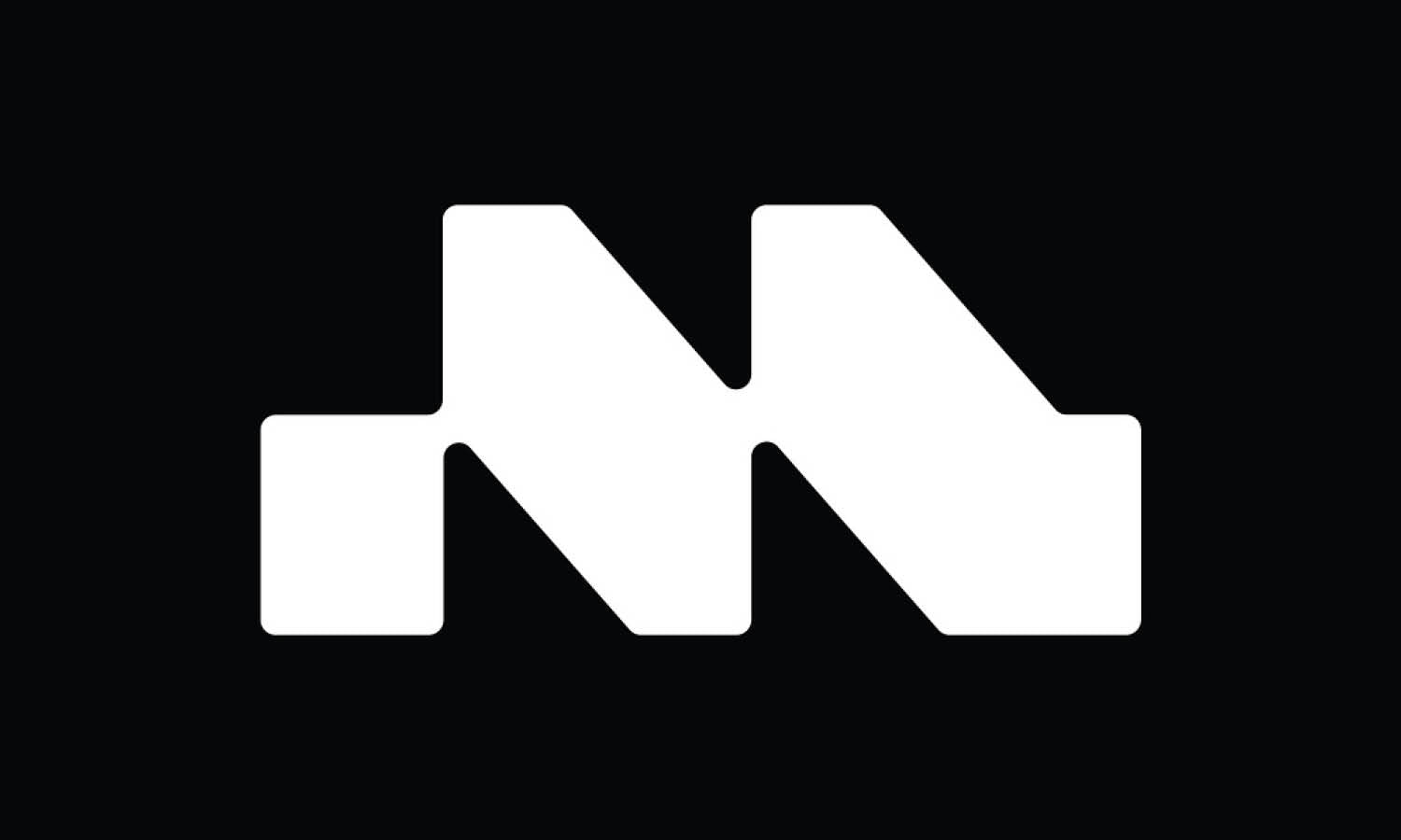
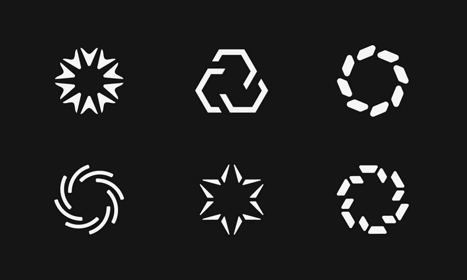
Created by MEDUZZA | https://www.behance.net/gallery/143878531/Modelari-Odontologia
In the bustling world of branding, where every detail counts and less often means more, minimalist logo design stands out as a beacon of elegance and simplicity. This art form champions the "less is more" philosophy, crafting visual identities that are as compelling as they are clean. As we dive into the realm of minimalist logo design, prepare yourself for an adventure into the world of understated sophistication, where every curve, line, and color is a deliberate choice reflecting the essence of a brand.
Embracing minimalist logo design is not just about jumping on a trend; it's about making a timeless statement. These designs cut through the noise, delivering a message with precision and clarity that resonates with audiences across the globe. In this article, we're set to explore some of the best minimalist logo design ideas that have not only set the standards but have also pushed the boundaries of creativity and innovation.
Our journey will take us through a curated selection of logos that exemplify the beauty of minimalism. From sleek and simple to clever and conceptual, each example serves as a source of inspiration for businesses and designers alike. Whether you're in the process of rebranding or just a fan of aesthetic excellence, these minimalist logo design ideas are sure to spark your imagination and perhaps even ignite a creative revolution in your own projects. Let's embark on this exciting exploration with an open mind and an eye for the elegantly simple.
Minimalist Logo Design Ideas
1. JDI Broker

Created by Solar Digital | https://www.behance.net/gallery/116442369/JDI-Brokers
2. Fice Acts

Created by Walter Mattos | https://www.behance.net/gallery/110145561/Five-Acts
3. PATS

Created by Marcio Nascimento | https://www.behance.net/gallery/137133199/PATS-Engenharia
4. Conta 48

Created by Rafael Silveira | https://www.behance.net/gallery/131542215/Conta-48-Brand-Identity
5. Brila

Created by DEBUT | https://www.behance.net/gallery/118791033/Brila
6. Kenchi

Created by Jessica Strelioff | https://www.behance.net/gallery/145663009/Kenchi
7. Fammi

Created by Fammi Digital Creative | https://www.behance.net/gallery/140426433/Fammi
8. Yaza

Created by graphicstock bd | https://www.behance.net/gallery/141892785/Y-Letter-Logo-Design
9. The Green Dot

Created by Raz Keren | https://www.behance.net/gallery/142005033/The-Green-Dot
10. Planalize

Created by Taymoor Ilyas | https://www.behance.net/gallery/131375839/Planalize
11. Reech

Created by Aleksey Busygin | https://www.behance.net/gallery/102548367/Reech
12. Technopodium

Created by Aleksey Busygin | https://www.behance.net/gallery/109227201/Technopodium
13. Fresh Brands

Created by Symbol Studio | https://www.behance.net/gallery/86370161/FreshBrands
14. Liggo

Created by byhaus studio | https://www.behance.net/gallery/115019369/Liggo-identity
15. Modelari

Created by MEDUZZA | https://www.behance.net/gallery/143878531/Modelari-Odontologia
16. Rede Arquitetos

Created by Walter Mattos | https://www.behance.net/gallery/144925981/rede-arquitetos
17. Keyko

Created by Yana Ivanova | https://www.behance.net/gallery/140886111/Matcha-tea-logo-design
18. M. Patisserie

Created by Vincdesign | https://www.behance.net/gallery/136049695/M-Patisserie-Branding-Design
19. Folk

Created by iframe design studio | https://www.behance.net/gallery/108385239/Folk-Local-Street-Food
20. Linka

Created by Logo awesomme | https://www.behance.net/gallery/145184787/L-letter-Logo-Brand-Guidelines-Simple-Branding
21. TechTronic

Created by Maro Studio | https://www.behance.net/gallery/136354183/TechTronic
22. Sam LLC

Created by Essam Eldin Saad | https://www.behance.net/gallery/145087625/SAM-LLC-REBRANDING
23. Facto

Created by Eduardo Grunow | https://www.behance.net/gallery/127208959/Facto-Brand-Design
24. ICC

Created by Mateus Cardoso | https://www.behance.net/gallery/116714589/ICC-International-Christian-Center-%28Proposta%29
25. Blue Core

Created by Tu Nga Nguyen | https://www.behance.net/gallery/126053101/Blue-Core-surf-dive-fish-rebranding
26. Vedfox

Created by Nayeem Mondol | https://www.behance.net/gallery/145639917/V-with-fox-logo
27. Avantguard

Created by Andrey Tifanof | https://www.behance.net/gallery/115411207/AVANTGUARD
28. Jonathan Filmiano

Created by Jonathan Filmiano | https://www.behance.net/gallery/133120009/Jonathan-Filmiano
29. Paulo Martins

Created by Paulo Martins | https://www.behance.net/gallery/134003593/Paulo-Martins-Personal-Branding
30. Tradex

Created by Lipon Rayhan | https://www.behance.net/gallery/134813099/Tradex-Modern-logo-and-Brand-Identity-design
How to Create Minimalist Logo Designs for Beginners
Diving into the world of minimalist logo design can feel like embarking on a quest for the Holy Grail – thrilling yet daunting, especially for beginners. But fear not! Transforming complexity into simplicity is an art, and with the right approach, anyone can master it. Here, we'll break down the process into five digestible steps, ensuring your journey into minimalist logo design is as smooth as a well-polished brand emblem. Let's unravel the mystery with a dash of fun and a pinch of uniqueness, shall we?
Embrace the Power of Less
The first step is to internalize the core principle of minimalist design: less is definitely more. This doesn't mean your design should be bare or bland; rather, it's about achieving more with less. Think of your canvas as prime real estate. Every element (color, shape, line) should earn its place. Ask yourself, "Does this add value or convey the brand's message?" If the answer is no, it's time for it to go.
Understand the Brand Inside Out
Before you even sketch a line, immerse yourself in the brand's world. What's their story? Who's their audience? What makes them tick? A minimalist logo design isn't just a chic symbol; it's the brand's heart and soul in visual form. This understanding will guide your design choices, ensuring they're meaningful and aligned with the brand's essence.
Play with Negative Space
One of the coolest tricks in minimalist design is the use of negative space. It's like telling a joke without delivering the punchline, yet everyone gets it. The famous FedEx logo and its hidden arrow is a classic example. By cleverly utilizing the space around and between elements, you can create dual imagery or hidden messages that add a layer of sophistication to your design.
Focus on Typography
Often, in minimalist logo design, the magic lies in the typeface. Choosing the right font can make or break your design. Simple, clean fonts work best, but don't be afraid to experiment with spacing, weight, and case. Sometimes, customizing a font or creating a unique typographic logo can encapsulate a brand's personality perfectly, without the need for additional graphics.
Iteration is Key
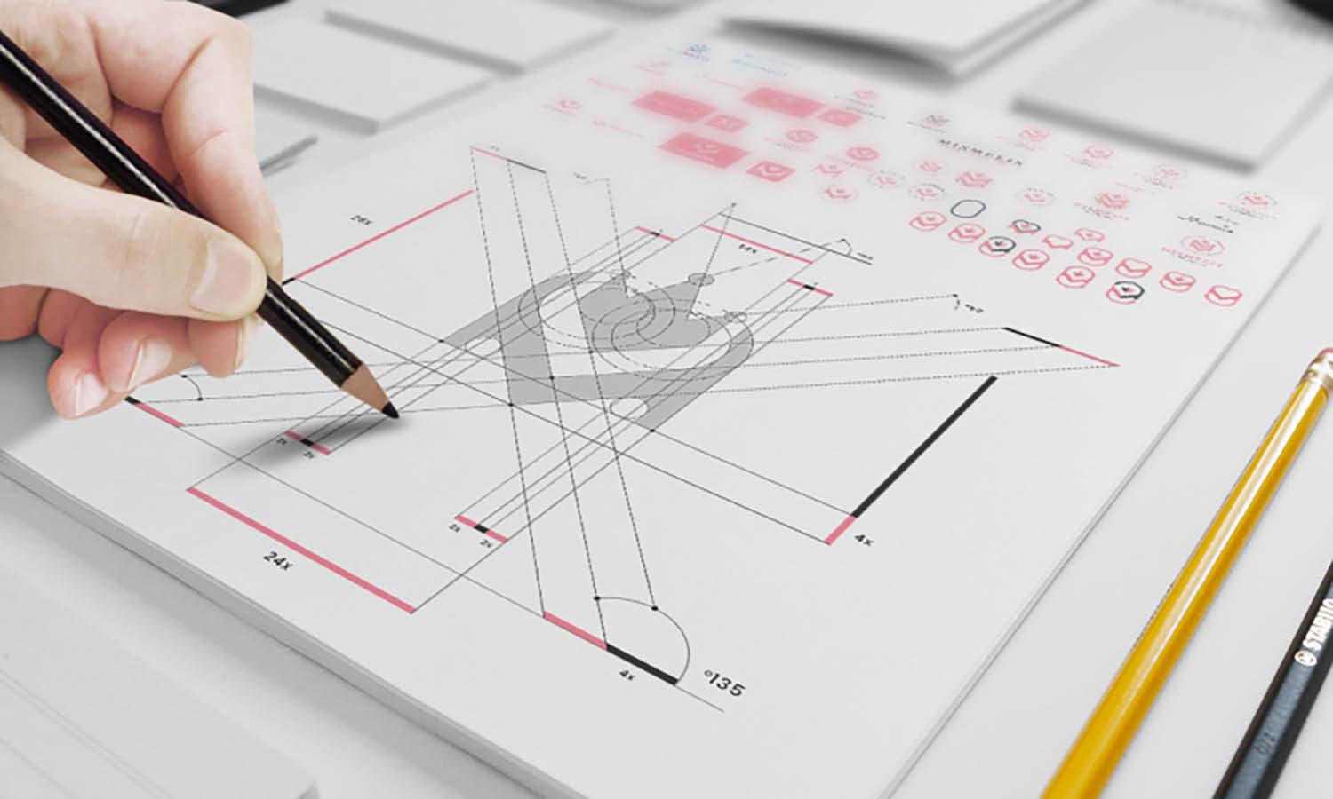
Rome wasn't built in a day, and neither is a stellar minimalist logo. Prepare to sketch, revise, and refine. With each iteration, strip away unnecessary elements and refine those that add meaning and value. Seek feedback, not just from peers but from individuals within your target audience. Their insights can be invaluable in honing a logo that resonates well and stands out.
Creating minimalist logo designs is an exciting challenge that combines creativity, strategy, and restraint. By following these steps, beginners can embark on a creative journey that leads to crafting logos that are not just visually appealing but are meaningful representations of a brand. Remember, the goal of minimalist design is to tell a brand's story in the simplest yet most powerful way possible.
What Are the Challenges in Creating Minimalist Logo Designs?
Embarking on the journey of creating a minimalist logo design is akin to becoming a culinary maestro in the world of design cuisine. It's about concocting a recipe where every ingredient must be meticulously chosen for its essential contribution to the final masterpiece. Yet, as delectably simple as the end result might seem, the process is peppered with unique challenges. Let’s slice through the layers of this design onion, revealing the core challenges faced by designers, all while keeping our spirits high and our creativity flowing.
Striking the Perfect Balance
The tightrope walk of achieving balance in minimalist logo design is our first thrilling challenge. This isn't just about symmetry; it's about harmonizing simplicity with memorability. How do you ensure your logo is as easy on the eyes as a sunset but also sticks in the mind like the chorus of a catchy song? Too simple, and it risks being forgettable; too complex, and it contradicts the minimalist ethos. Finding that sweet spot where simplicity and memorability dance in perfect harmony is a delightful puzzle for every designer.
Conveying a Brand’s Essence
Next up is the challenge of distillation – not of spirits, but of a brand's core identity into a single visual symbol. This is storytelling at its most Spartan, where every line, curve, and color must carry the weight of the brand's story, values, and personality. It’s like trying to summarize an epic novel into a haiku. The challenge lies in peeling away the superfluous, focusing on what truly matters, and presenting it in a way that resonates with the audience. No pressure, right?
Making It Unique
In a world awash with logos, how do you make yours stand out while adhering to the minimalist creed? The challenge of uniqueness in minimalist logo design is akin to finding a new route to a much-visited destination. It’s about being innovative within constraints, crafting a design that’s distinctive and fresh yet blissfully simple. This often involves creative use of space, clever symbolism, or a twist on traditional imagery that makes people pause and ponder.
Flexibility Across Different Mediums
A minimalist logo must be a chameleon, seamlessly adapting to various mediums and sizes without losing its essence. From the tiny confines of a business card to the sprawling facade of a billboard, your design must maintain its integrity. This challenge is about foresight and adaptability, ensuring your minimalist masterpiece is as versatile as it is visually appealing. It’s about creating a design that’s not just a pretty face but also a functional asset across all brand touchpoints.
Evoking Emotion
Finally, the challenge of emotional connection. Can a minimalist logo, in its understated glory, stir the heartstrings of its audience? This is the art of evoking emotion through minimalism, where less must do more. It’s about finding that magical alchemy of shapes and colors that speaks directly to the soul, making the logo not just seen but felt. It’s a subtle, yet profound challenge that, when met, elevates your design from good to unforgettable.
Navigating these challenges in minimalist logo design requires a blend of creativity, precision, and a dash of daring. It’s a thrilling ride, filled with moments of both frustration and triumph. But the result? A minimalist logo that’s not just a visual treat but a beacon of brand identity.
What Symbolisms Can I Feature in Minimalist Logo Designs?
Minimalist logo design, the art of saying more with less! It's like being a visual poet, where every dot and line holds a universe of meaning. But in this world of sleek silhouettes and whisper-thin lines, what symbols can you use to convey the essence of a brand without turning your masterpiece into a crowded canvas? Let's embark on a whimsical journey through the land of symbols, exploring five fantastic emblematic elements you can incorporate into your minimalist logos. Grab your creative hats, and let’s dive in!
Geometric Shapes: The Building Blocks of Meaning
Geometric shapes are the superheroes of minimalist logo design. Circles, squares, triangles – each carries its own psychological weight and universal meaning. Circles suggest unity and harmony, squares denote stability and balance, and triangles can imply movement or direction. By playing with these basic forms, you can create a logo that not only looks sleek but also weaves in layers of meaning. It’s like a secret handshake; subtle, but speaks volumes to those in the know.
Negative Space: The Art of Hidden Messages
Negative space is the ninja of the design world – it’s there, but it’s also not there. Clever use of negative space can turn a simple logo into a riddle, inviting viewers to look a little closer. Remember the hidden arrow in the FedEx logo? That’s negative space wizardry at its finest. Incorporating negative space into your minimalist logo can add a layer of intrigue and sophistication, transforming your design into a visual puzzle that delights and surprises.
Nature Elements: A Whisper of the Wild
Incorporating elements from nature can infuse your minimalist logo with a breath of freshness and vitality. A single leaf can symbolize growth and renewal, while a mountain might represent strength and stability. These symbols connect your brand to the natural world, offering a serene and grounded vibe. It’s like bringing a piece of the outdoors into the digital age, creating a logo that resonates with the soulful side of technology.
Typography: The Voice of Your Logo
Who says words can’t be symbols? In the realm of minimalist logo design, typography becomes an expressive tool, transforming letters into visual anchors. A single letter can be stylized to reflect the brand's personality, whether it's the elegance of a serif font or the modernity of a sans-serif. Play with letterforms, experiment with spacing, and perhaps even create a custom typeface that becomes synonymous with your brand. It’s about giving your logo a voice, without it ever having to speak.
Color Psychology: Painting Emotions with Palettes
Colors are the emotions of design, each hue whispering a thousand words. In minimalist logo design, color choice is paramount. A dash of red can evoke passion and energy, while blue might convey trust and calm. Selecting the right color can enhance the symbolism of your design, creating an emotional resonance that complements the visual simplicity. It’s like a magician’s final reveal, where the color pulls the whole act together, leaving the audience spellbound.
Navigating the world of symbolisms in minimalist logo design is an adventure, filled with the thrill of discovery and the joy of creation. By weaving these elements into your designs, you create logos that are not just visually captivating but are rich in meaning and story. So, unleash your inner symbolist, and let your minimalist logos be a canvas for stories untold.
What Are the Common Mistakes in Minimalist Logo Designs?
Minimalist logo design, the art of whispering loudly in a world full of shouts. It's where the design's soul lives in the land of less. But, dear adventurers on this sleek, sparse journey, pitfalls abound! Let's embark on a cautionary tale, exploring the common faux pas that could turn your minimalist dream into a design nightmare. Fasten your seatbelts, and prepare for a ride through the "Oopsies!" of minimalist logo design.
Over-Simplification: The Vanishing Act
In the quest for minimalism, there's a fine line between "just enough" and "oops, where did the logo go?" The trick is not to strip away the essence along with the excess. An overly simplified logo risks becoming unrecognizable or, worse, forgettable. It's like making a smoothie and blending it into oblivion; you know there's fruit in there, but it's lost its zest. Balance is key; ensure your logo retains its character and uniqueness, even in its most stripped-down form.
Neglecting Brand Identity: The Identity Crisis
Imagine a logo that's as sleek as a new sports car but fails to embody the brand's spirit. That's a classic case of identity mismatch. Each minimalist stroke should be a reflection of the brand's soul, not just a pretty face in the crowd. A common pitfall is designing in isolation, focusing on aesthetics without anchoring the logo in the brand's core values and personality. It's like dressing a cat in a lion's costume; it might look fierce, but it's purring, not roaring.
Playing It Too Safe: The Wallflower Syndrome
The allure of circles, squares, and triangles! While geometric shapes are the bread and butter of minimalist design, relying too heavily on them without a creative twist can lead to a logo that's, well, a bit of a wallflower. It blends into the background, polite but unmemorable. The challenge is to infuse these basic shapes with a unique flair that captures the brand's essence. Think of it as adding a dash of exotic spices to a classic dish, transforming it from familiar to fantastic.
Ignoring Versatility: The One-Trick Pony
A minimalist logo must be a chameleon, adapting seamlessly across different mediums, from tiny smartphone screens to giant billboards. A common blunder is designing a logo that looks fabulous in one setting but loses its charm in another. It's the one-trick pony of the design world. Ensure your logo maintains its integrity and impact, whether it's embroidered on a hat or splashed on a website. Flexibility is the name of the game.
Skimping on Color and Typography: The Missed Opportunity
Colors and fonts are the secret sauce of logo design, adding depth and emotion to minimalism's clean lines. A common mistake is underestimating their power, leading to a logo that's as emotionally engaging as a teaspoon. Choosing the right color palette and typography can elevate your logo from good to unforgettable. It's about weaving a rich tapestry of visual and emotional cues that resonate with the audience. Don't miss the chance to make your logo not just seen, but felt.
Embarking on the minimalist logo design journey is an exhilarating challenge, filled with potential pitfalls but also boundless opportunities for creativity and innovation. By steering clear of these common mistakes, you can craft a logo that's not just minimalist but is also meaningful, memorable, and magnificently aligned with the brand's identity. Onward, brave designers, to create minimalist masterpieces that speak volumes in whispers!
What Are Some Creative Ideas for Minimalist Logo Designs?
Minimalist logo design—the sleek, chic secret agent of the branding world. It slips unnoticed through the crowded streets of design, delivering messages of sophistication and simplicity. But how do you infuse creativity into something that thrives on the less-is-more philosophy? Fear not, for I'm here to unveil some covert operations that will make your minimalist logos not just seen but remembered. Let's decode some creative ideas that blend fun, uniqueness, and that oh-so-coveted minimalist charm.
The Magic of Monograms
Imagine the initials of a brand interlocking in a dance, creating a symbol that’s as mysterious as it is elegant. Monograms are like the secret handshakes of the design world; they carry a sense of exclusivity and sophistication. But here’s the twist: play with negative space or incorporate subtle design elements that reflect the brand’s personality. Think of a coffee shop with steam rising from a cup formed by its initials. It's minimalist, memorable, and brews a strong impression.
Geometric Wonders
Geometric shapes are the loyal knights of minimalist design, but who says they can’t have a bit of fun? Step beyond the ordinary by breaking down complex images into basic geometric forms with a dash of creativity. A bird might become a series of triangles, a mountain could be a zigzag cutting through a circle. The key is to use these shapes not just for their aesthetic appeal but to tell a story, crafting a logo that’s a geometric puzzle waiting to be solved.
Color Blocks and Contrasts
In a world where colors shout, minimalist design teaches them to whisper. Use bold color blocks or stark contrasts to create a logo that catches the eye but doesn’t overwhelm it. A single splash of color on a monochrome base can highlight a brand's vibrant personality. Or, use contrasting colors in a way that’s playful yet balanced, making the logo pop while maintaining its minimalist grace. It's like dressing up a black-tie outfit with a pair of quirky socks—subtle, yet speaks volumes.
Typographic Playgrounds
Typography in minimalist logo design isn’t just about choosing a font; it’s about making the font a playground. Experiment with letter spacing, alignment, or even removing parts of letters to create a visual intrigue. Imagine a bookstore’s logo where the ‘o’s are open books, or a music app where the ‘m’ is shaped like music notes. It’s about giving the alphabet a twist, turning letters into storytellers of the brand's narrative.
Symbolic Simplicity
Dive deep into the essence of the brand and emerge with a symbol that’s deceptively simple yet profoundly meaningful. This could be an abstract representation of the brand’s mission, a minimalist rendition of a key product, or a symbol that captures the brand’s spirit. The idea is to distill complex ideas into a simple icon that becomes synonymous with the brand. Like a chef reducing sauce to its flavorful essence, your logo should concentrate the brand’s identity into a single, savory visual bite.
Embarking on the minimalist logo design journey is an exciting adventure, filled with opportunities to blend simplicity with creativity. By exploring these ideas, you can craft logos that are not just visually appealing but also rich in meaning and personality. Remember, the essence of a great minimalist logo lies not in what is seen, but in what is understood. Let your designs be the whisper that echoes in the minds of those who behold them.
Conclusion
Minimalist logo design stands at the crossroads of tradition and modernity, offering a unique opportunity to convey rich cultural narratives through sleek, simple symbols. This approach not only respects the essence of minimalism but enriches it, allowing brands to connect deeply with their audience by showcasing their heritage in a contemporary light. As designers, our challenge and privilege is to craft these visual haikus, blending simplicity with profound cultural echoes. By doing so, we not only celebrate the brand's identity but also contribute to a design landscape that values depth, diversity, and clarity. Embrace the journey of creating minimalist logos that speak volumes with less, and let your designs become timeless ambassadors of culture and simplicity.
Let Us Know What You Think!
Every information you read here are written and curated by Kreafolk's team, carefully pieced together with our creative community in mind. Did you enjoy our contents? Leave a comment below and share your thoughts. Cheers to more creative articles and inspirations!



Leave a Comment