30 Best Chocolate Logo Design Ideas You Should Check

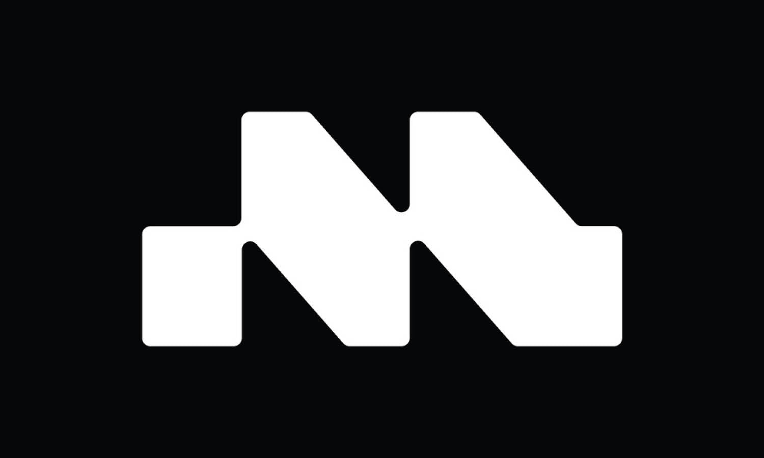
Created by Jordi Masdeu Studio | https://www.behance.net/gallery/115638701/Xocolates-Jolonch
Chocolate logo design is not just about creating a visual treat; it's an art that blends creativity with the irresistible allure of chocolate. In this article, we're going to unwrap some of the most delectable and innovative chocolate logo design ideas that are sure to tantalize your brand's taste buds and sweeten your brand's appeal. From rich, dark chocolate elegance to playful milk chocolate whimsy, these designs cater to every chocolate lover's dream.
The key to an impactful chocolate logo design lies in its ability to evoke the same pleasure and anticipation that one feels before indulging in a piece of chocolate. Whether you're a start-up artisan chocolatier or an established confectionery brand, these design ideas will inspire you to create a logo that's as enticing as the treats you offer. We'll explore a range of styles - from minimalist and modern to vintage and ornate - each serving up a unique flavor to represent your brand's identity.
Let's dive into the world of chocolate logo design, where creativity meets confectionery. Here, you'll find ideas that blend color palettes as rich as cocoa, typography as smooth as ganache, and imagery as tempting as a chocolate truffle. Get ready to embark on a design journey that's as fun and unique as your brand, sprinkled with tips to make your logo a sweet success. Keep an eye out for designs that not only look delicious but also resonate with your brand’s story and values, ensuring your logo is not just visually appealing but also meaningful. Welcome to the ultimate showcase of chocolate logo design — where every idea is a recipe for branding success!
Chocolate Logo Design Ideas
1. Wild and Tasty

Created by Maxim Ali | https://www.behance.net/gallery/74880817/Wild-and-Tasty
2. Harem Chocolate

Created by Studio Born | https://www.behance.net/gallery/141203019/Harem-Chocolate-Branding-Packaging
3. Hence Chocolate

Created by index™ Studio | https://www.behance.net/gallery/145739645/Hence-Chocolate-Branding
4. Jcoco

Created by Mónica Reyes Studio | https://www.behance.net/gallery/141999573/Jcoco
5. The Vintage Chocolate

Created by TSUBAKI KL | https://www.behance.net/gallery/140817245/The-Vintage-Chocolate
6. Ptasie Mleczko

Created by Mateusz Witczak | https://dribbble.com/shots/6240322-Ptasie-Mleczko
7. TROPICAL STATION

Created by taller M estudio de diseño | https://www.behance.net/gallery/94893185/TROPICAL-STATION-COFFEE-COCOA
8. Benebites Chocolatier

Created by Widarto Impact | https://www.behance.net/gallery/144518591/Benebites-Chocolatier
9. HOMER

Created by Paul Lee | https://www.behance.net/gallery/130323705/HOMER
10. Bliss

Created by Natalia Belousova | https://www.behance.net/gallery/145350875/Hand-made-chocolate-candies-Bliss-Logo-and-label
11. Country Chocolates

Created by Muhammed Sajid | https://www.behance.net/gallery/81484983/Country-Chocolates
12. Chocolife

Created by Matheus Ferreira | https://www.behance.net/gallery/101880825/Chocolife-Rebranding-Visual-Identity
13. CHOKS

Created by Olena Doshak | https://www.behance.net/gallery/92314569/CHOKS-brand-identity-chocolate-packaging
14. baños

Created by Mascha Wolfram | https://www.behance.net/gallery/141750997/banos-illustration-packagingdesign
15. Danaus Chocolate

Created by Alejandro Gavancho | https://www.behance.net/gallery/104851221/Danaus-Chocolate
16. Ethel M Chocolates

Created by Kristina Armitage | https://www.behance.net/gallery/118794763/Packaging-Ethel-M-Chocolates
17. Johnny Brownie

Created by Mateus Vieira da Rosa | https://www.behance.net/gallery/88786897/Johnny-Brownie
18. DEEP Chocolate

Created by Nirvana Studio | https://www.behance.net/gallery/144430907/DEEP-Chocolate-Packaging-
19. Baiko Cookies

Created by Julia Sonda | https://www.behance.net/gallery/136597809/Baiko-Cookies
20. Danke Easter

Created by Nata Design | https://www.behance.net/gallery/141480451/Danke-Easter-2022
21. Koho

Created by Team from Holiday | https://www.behance.net/gallery/123936339/Koho
22. Linha de EMBALAGENS

Created by Allan Zanellato | https://www.behance.net/gallery/130323307/Linha-de-EMBALAGENS-Chocolateria
23. KUYAY

Created by Lua Cieza | https://www.behance.net/gallery/90747817/KUYAY-Cacao-Lovers
24. Scherzo

Created by Mateusz Witczak | https://www.behance.net/gallery/135617137/Scherzo-Chopins-Favourite-Gingerbread
25. Cacau

Created by Bárbara Klosouski de Bastos | https://www.behance.net/gallery/138719147/Brand-Identidy-packaging-design
26. Wonka

Created by Elmira Hummat | https://www.behance.net/gallery/125782575/Wonka-chocolate-redesign-branding
27. Sando Crispy

Created by ARU | https://www.behance.net/gallery/131793205/-Package-Design
28. Rocco

Created by Nero Atelier | https://www.behance.net/gallery/120959745/Rocco-Belgium-Chocolate
29. Xocolates Jolonch

Created by Jordi Masdeu Studio | https://www.behance.net/gallery/115638701/Xocolates-Jolonch
30. Krausz

Created by Peltan-Brosz Studio | https://www.behance.net/gallery/76651795/Krausz
What Are the Essential Elements of a Chocolate Logo Design?
Creating a chocolate logo design is like crafting a fine piece of chocolate – it requires a blend of creativity, skill, and understanding of the essential elements that make it stand out. As a designer, I often get asked about the key ingredients needed for a delectable Chocolate Logo Design. So, here’s a fun and flavorful guide to the five essential elements that make up a truly tempting chocolate logo.
Color Palette: The Sweet Spot of Visual Appeal
Think of colors as the flavors of your logo. For chocolate logo design, it's all about choosing hues that evoke the richness and warmth of chocolate. Deep browns, creamy whites, and gold accents are popular choices, reminiscent of various chocolate types from dark to white. But don’t shy away from adding splashes of color like red or orange to represent additional flavors or ingredients. It’s like adding strawberries or chili to your chocolate – unexpected but delightful!
Typography: The Art of ‘Type’-Tasting
Just like chocolate, typography in your logo needs to be smooth, flowing, and enjoyable. The font should be legible yet stylish, reflecting the personality of your brand. Are you a fun, quirky brand? A whimsical, hand-written typeface might be your go-to. Or if you're more about elegance and luxury, consider a refined serif font. Remember, the right typography is like the perfect cocoa percentage – it needs to be just right!
Imagery: A Picture Worth a Thousand Chocolates
In chocolate logo design, imagery can range from literal (think cocoa beans and chocolate bars) to abstract (patterns or shapes that imply sweetness and indulgence). The imagery should speak to your audience, hinting at the quality and uniqueness of your chocolate. It’s like presenting a box of assorted chocolates – each element should entice and promise a delightful experience.
Brand Story: The Secret Ingredient
Your logo should tell your brand’s story. Is your brand all about exotic, worldly flavors, or do you pride itself on traditional, homemade recipes? The design elements of your logo should reflect this. A logo with a story is like a chocolate with a secret filling – it’s intriguing and makes people want to discover more.
Simplicity: The Essence of Elegance
A good chocolate logo design should be simple enough to be memorable but distinctive enough to be recognizable. Like a masterfully made chocolate truffle, your logo should not be overcomplicated with too many elements. A simple, clean design ensures that your logo is versatile and scalable, effective whether on a chocolate wrapper or a billboard.
In conclusion, creating a chocolate logo design is a delightful process that combines artistic elements with the unique essence of your brand. The right blend of color, typography, imagery, brand storytelling, and simplicity will result in a logo that not only looks good but also captures the essence of your brand. Just like the perfect chocolate recipe, the right logo design can create lasting impressions and sweet success for your brand.
How to Choose the Right Color Scheme for a Chocolate Logo Design?
Choosing the right color scheme for a chocolate logo design is like selecting the perfect ingredients for a gourmet chocolate recipe – it needs precision, understanding, and a dash of creativity. As a professional designer, I'm here to guide you through the delectable journey of picking the perfect palette for your chocolate brand's logo. Let’s unwrap these five key points to help you choose a color scheme that not only looks delicious but also effectively represents your brand's essence.
Understand the Psychology of Colors
Colors are not just hues; they are powerful tools that evoke emotions and associations. In the world of chocolate logo design, brown is a no-brainer, symbolizing the chocolate itself. It’s warm, comforting, and reliable. But don’t stop there! Consider how different shades of brown can convey different types of chocolate – dark, milk, or white. Incorporating other colors can also add personality. For instance, gold or burgundy can suggest luxury and indulgence, while bright colors like red or orange can add a playful, adventurous edge. It's like choosing the right chocolate flavor to match a mood!
Reflect Your Brand’s Personality
Your color scheme should be a reflection of what your brand stands for. Are you all about organic, artisan chocolates? Earthy tones and greens can convey naturalness and sustainability. Or perhaps you are innovating with unique chocolate flavors? Vibrant, contrasting colors can express creativity and boldness. Think about what your brand is all about and let your colors tell that story. It's like dressing up your chocolate in the perfect outfit!
Consider Your Target Audience
Who are you trying to attract with your chocolates? Different demographics respond to different colors. Younger audiences might be drawn to bright, energetic colors, while a more mature audience might appreciate refined, darker shades. It's like knowing whether your audience prefers a classic chocolate truffle or a daring chili-infused bar – understanding their taste is key.
Look at Industry Trends, but Be Unique
While it’s important to be aware of current trends in chocolate logo design, don’t forget to stand out. If all chocolate brands are using the same color palette, it’s easy to get lost in the crowd. Don’t be afraid to experiment with unconventional color combinations that can set your brand apart. It’s about striking the right balance between being trendy and being unique – like creating a new chocolate flavor that surprises and delights.
Test Your Colors Across Different Media
Lastly, make sure your chosen colors look great not just on paper, but across various media. This includes digital platforms, packaging, and marketing materials. A color that looks luxurious on a chocolate wrapper might not translate well on a website. Test your colors in different contexts to ensure consistency and versatility. It’s ensuring your chocolate looks as good as it tastes, no matter where it’s seen.
In essence, selecting the right color scheme for your chocolate logo design is a critical step in crafting your brand’s visual identity. It’s about understanding the psychology of colors, reflecting your brand’s personality, considering your target audience, being mindful of trends yet daring to be different, and testing your palette across various media. With these points in mind, you're well on your way to creating a color scheme that’s as appealing and unique as your chocolate creations.
What Typography Best Represents Luxury in Chocolate Logo Designs?
In the world of chocolate logo design, typography is like the secret ingredient that can elevate your brand from simply sweet to luxuriously luscious. Selecting the perfect font is akin to choosing the finest cocoa beans for your chocolate – it makes all the difference. Let’s embark on a flavorful journey to discover the top five typographic elements that best represent luxury in chocolate logo design.
Elegance of Serif Fonts
Serif fonts are the classic choice for luxury. With their decorative ‘feet’ at the ends of each letter, these fonts exude sophistication and tradition. Think of fonts like Garamond or Times New Roman, but with a modern twist. They are like the timeless, handcrafted chocolates of the typography world – always in style and exquisitely appealing. For a chocolate logo design, a well-chosen serif font can convey a sense of heritage and artisanal quality, reminiscent of old-world chocolate-making traditions.
Custom Script Fonts for a Personal Touch
Nothing says luxury like a custom script font. These fonts mimic handwritten calligraphy and add a personal, bespoke feel to your logo. Imagine the elegance of a hand-signed chocolate label – it’s personal, unique, and exclusive. A script font can be as intricate as a beautifully decorated chocolate bonbon, adding a touch of class and individuality to your brand. When used sparingly, it can make your logo feel like an exclusive invitation to a world of luxurious chocolate indulgence.
Minimalist Sans-Serif Fonts for Modern Luxury
Modern luxury is all about simplicity and sophistication, and a minimalist sans-serif font can perfectly embody this. Fonts like Helvetica or Futura, with their clean lines and unadorned style, lend a contemporary and chic feel to your logo. They are the sleek, dark chocolate bar in a world of ornate truffles – understated yet powerful. In a chocolate logo design, a minimalist sans-serif font can communicate a brand that is modern, trendy, and forward-thinking.
Bold and Weighty Fonts for Impact
Sometimes luxury needs to make a statement, and a bold, weighty font can do just that. Thick, impactful fonts grab attention and convey confidence and power. They are the equivalent of a rich, dense, dark chocolate – unforgettable and full of character. When used in chocolate logo design, a bold font can signify a brand that is assertive, premium, and proud of its luxurious offerings.
Combining Fonts for Layered Sophistication
Like a box of assorted chocolates, combining different fonts can create a rich, layered effect. Pair a strong serif with a delicate script, or a bold sans-serif with a subtle serif. This mix can add depth and intrigue to your logo, much like the surprising flavors in a gourmet chocolate selection. The key is to maintain balance and harmony – ensuring each font complements the other and contributes to the overall luxurious feel.
Crafting a chocolate logo design that embodies luxury is all about choosing the right typography. From the elegance of serif and script fonts to the modern appeal of minimalist sans-serif and the impact of bold typefaces, each font has its unique flavor. Just like in chocolate-making, it’s about blending these elements to create something that’s not just visually appealing but also rich in character and sophistication. With these typographic tips, your chocolate brand is set to make a luxurious statement that’s as tantalizing as the chocolates you create.
Should My Chocolate Logo Design Include an Image of Cocoa or Chocolate?
When whipping up a delicious chocolate logo design, one of the key ingredients to consider is whether to include imagery of cocoa or chocolate. It's like deciding whether to add nuts or caramel to your chocolate – it can change the entire flavor of your brand! Let's melt into five sweet reasons why including cocoa or chocolate imagery can be a treat for your brand's identity.
Instant Recognition: Speak Chocolate without Saying a Word
Including images of cocoa beans or chocolate bars in your logo can be like a universal chocolate language, instantly conveying what your brand is all about. It’s like the aroma of chocolate – you recognize it instantly. This visual cue can be particularly effective if your brand is new or expanding into new markets. When customers see cocoa pods, chocolate bars, or melting chocolate in your logo, they don’t need to read a single word to know what you're offering. It’s straightforward, simple, and as clear as a bar of the finest dark chocolate.
Emotional Connection: Stirring the Senses
Chocolate isn’t just a food; it’s an experience that evokes emotions and memories. Using imagery of cocoa or chocolate can tap into these feelings, creating a deeper emotional connection with your audience. It’s like the first bite of a chocolate bar – comforting, familiar, and joyous. When customers feel an emotional attachment, they’re more likely to remember and choose your brand. A logo with cocoa or chocolate imagery can be a sweet reminder of the pleasures of chocolate, enticing customers to indulge.
Brand Storytelling: From Bean to Bar
If your brand prides itself on the journey from bean to bar, showcasing cocoa beans or chocolate in your logo can be a powerful storytelling tool. It can illustrate your commitment to quality and the artisanal process of chocolate making. It’s like an invitation to a behind-the-scenes tour of a chocolate factory – intriguing and authentic. This approach can be particularly effective for brands that focus on ethical sourcing or handcrafted chocolates. It's not just a logo; it's a story of passion and craftsmanship.
Versatility and Creativity: A Palette for Imagination
The imagery of cocoa and chocolate offers a rich palette for creative expression. Whether it’s a realistic depiction of cocoa beans, a stylized chocolate bar, or an abstract representation of melting chocolate, the possibilities are endless. It’s like being a chocolatier with a world of ingredients at your fingertips – there’s so much you can create! You can tailor the imagery to fit your brand’s personality – whether it’s playful and whimsical or sophisticated and luxurious. It’s about finding the right visual flavor to represent your brand.
Market Positioning: Differentiating Your Brand
Including cocoa or chocolate imagery can help differentiate your brand in a crowded market. While many chocolate brands use similar color palettes and typographies, the imagery can set you apart. It’s like a secret ingredient that makes your chocolate stand out from the rest. Whether it’s a unique cocoa bean pattern or an iconic chocolate bar shape, the right image can make your logo memorable and distinctive.
In conclusion, incorporating cocoa or chocolate imagery into your chocolate logo design can be a sweet decision. It offers instant recognition, emotional connection, brand storytelling, creative versatility, and market differentiation. However, like any good recipe, it’s important to balance this ingredient with others – such as color, typography, and overall design. The goal is to create a logo that’s as enticing and unique as the chocolates you offer – a visual treat that leaves a lasting impression.
How to Incorporate Modern Design Trends in Chocolate Logo Designs?
Creating a chocolate logo design that's as irresistible as the confections you sell means keeping up with the latest design trends while maintaining your unique brand flavor. Think of it as adding a twist of modernity to a classic chocolate recipe. Here, we’ll unwrap five scrumptious tips on how to blend contemporary design trends into your chocolate logo design, ensuring it looks fresh, trendy, and oh-so-tempting.
Minimalism: The Art of Less is More
Embrace the minimalist trend in your chocolate logo design, just like a smooth, simple chocolate that lets the quality of its ingredients shine. A minimalist approach means clean lines, uncluttered layouts, and a limited color palette. This style speaks of sophistication and elegance. Consider a logo with a single chocolate bean icon, a sleek typeface, and two to three colors max. It’s about creating a design that's easy on the eyes and memorable, much like the taste of pure, high-quality chocolate.
Bold Typography: Make a Statement
Just like a bold, rich chocolate, striking typography can leave a lasting impression. Experiment with larger, bolder fonts that grab attention. Think of a chunky, sans-serif font that’s as noticeable as a chunk of chocolate. However, balance is key – if you go bold with the font, keep other elements subtle. This approach works well for brands looking to make a strong statement or appeal to a younger, more dynamic audience.
Vintage with a Modern Twist: Old-School Charm
Combine vintage elements with modern twists for a logo that’s both nostalgic and contemporary. Imagine a classic, hand-drawn cocoa pod paired with a clean, modern sans-serif font. It’s like blending a traditional chocolate recipe with a surprising modern ingredient. This style can give your brand a story, evoking the rich history of chocolate-making while keeping it fresh and current.
Geometric Shapes: Symmetry and Balance
Geometric shapes in logo design can convey balance, stability, and structure – think of the perfect symmetry of a chocolate square. Incorporating geometric elements with sleek, modern lines can create a logo that's both artistic and sophisticated. Whether it’s a circular cocoa bean or a square chocolate bar icon, geometric shapes can give your logo a neat, organized look that’s visually appealing and contemporary.
Vibrant Colors: Adding a Pop of Fun
While traditional chocolate brands might stick to browns and golds, don’t be afraid to sprinkle some vibrant colors into your logo. Bright and bold colors can make your logo stand out and feel more energetic. Imagine a splash of raspberry red or orange zest – it adds a fun, playful element to the design. This approach is great for brands that want to appear youthful, fun, and innovative.
Incorporating modern design trends into your chocolate logo design can be a delightful and rewarding challenge. It’s about finding the right balance between trendiness and timelessness, ensuring your logo not only catches the eye but also stays relevant over time. By adopting minimalism, bold typography, vintage-modern fusion, geometric shapes, and vibrant colors, you can create a logo that's as modern and appealing as the chocolate trends of today. Remember, the goal is to design a logo that’s as delectable and distinctive as the chocolates you craft – a visual treat that customers can’t resist!
Conclusion
Chocolate logo design is an art that goes beyond mere aesthetics; it's about crafting an identity that resonates with the essence of your brand and appeals to the chocolate-loving audience. As we've explored, the key to a successful design lies in balancing modern trends with timeless elements, ensuring your logo not only looks enticing but also tells a story. Remember, a great chocolate logo design should be as unique and memorable as the flavors you offer, creating a lasting impression in the minds of your customers. By considering these aspects, you can create a logo that perfectly encapsulates the luxury, indulgence, and joy that chocolate represents.
Let Us Know What You Think!
All of these creative inspirations are created by some of the best designers, creatives and professionals around the world, curated by Kreafolk's team. We hope you enjoy our gallery and remember to leave us your comment below. Cheers!
Related Articles




Leave a Comment