30 Best Catering Logo Design Ideas You Should Check

Created by Khaled Amin | https://www.behance.net/gallery/107025905/The-Meat-Angel-branding
Catering logo design is more than just a visual representation of your catering business; it's a critical ingredient in the recipe for branding success. In the bustling culinary world, where first impressions matter, a distinctive logo can set your catering service apart. This article will serve up a feast of the most innovative and appetizing catering logo design ideas to inspire your brand's visual identity. Whether you're launching a new catering venture or refreshing an existing brand, these ideas will spark your creativity and help you cook up a logo that's as unique and memorable as your culinary creations.
Fun and unique are the flavors of the day when it comes to logo design in the catering industry. After all, catering is all about creating experiences that delight and impress. Your logo should reflect the same level of creativity and attention to detail that you pour into your dishes. We'll explore a smorgasbord of styles, from elegant and sophisticated to quirky and whimsical, each catering to different tastes and event types.
Stay tuned as we dish out top tips for choosing colors, fonts, and symbols that resonate with your brand's personality and target audience. Remember, the right catering logo design not only attracts attention but also whets the appetite for what you have to offer. Let's embark on this culinary branding adventure and discover how your catering logo can be the cherry on top of your business success!
Catering Logo Design Ideas
1. André Leal

Created by António Tudella | https://www.behance.net/gallery/74883537/ANDRE-LEAL-BRAND-IDENTITY
2. Freshly

Created by Sophia Park | https://www.behance.net/gallery/115254475/Brand-Identity-Design
3. Magna Catering

Created by Manuala Zapata Uribe | https://www.behance.net/gallery/111448407/Magna-Catering-y-Eventos-Logo-Design
4. Know Meals Catering

Created by G · UP | https://www.behance.net/gallery/89050373/Know-Meals-Catering
5. Brown Butter Kitchen & Catering

Created by Michael Penda | https://www.behance.net/gallery/77013547/Brown-Butter-Kitchen-Catering
6. Shizen Shusi Catering

Created by Nova Estudio Gráfico | https://www.behance.net/gallery/27977951/Shizen-sushi-catering
7. Grand Catering

Created by Anna Mikhailenko | https://www.behance.net/gallery/99900105/Branding-Grand-Catering-by-Belmond-Grand-Hotel-Europe
8. Alternativa Catering & Events

Created by Grafica 360 | https://www.behance.net/gallery/71173913/Alternativa-Catering-Events
9. Caramello Fondete

Created by Angelo Longo | https://www.behance.net/gallery/52333427/CARAMELLO-FONDENTE-Pasticceria-Catering-Gelateria
10. Ginger Restaurant

Created by Bee Tsui | https://www.behance.net/gallery/42346569/Ginger-Restaurant
11. Lauren Foodies & Catering

Created by Ivan Scayan | https://www.behance.net/gallery/104578777/Laurens-Foodies-Catering
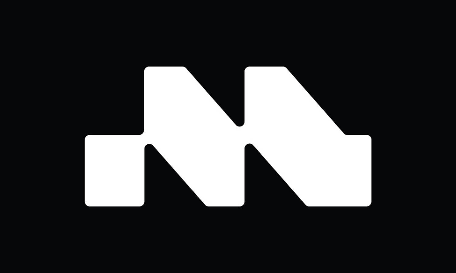
12. M Catering NYC

Created by Riccardo Sabioni | https://www.behance.net/gallery/37337723/M-Catering-NYC
13. Hungry Berry

Created by Studio Spectro | https://www.behance.net/gallery/112752577/Hungry-Berry-identity
14. Comparti

Created by Whitney Clark | https://www.behance.net/gallery/105535777/Comparti
15. Applausi Catering

Created by Panmella Araújo | https://www.behance.net/gallery/114154759/Applausi-Catering-%28Branding-UI%29
16. Galato Catering

Created by Coruna Branding| https://www.behance.net/gallery/86750499/Galato-Catering
17. Tasty Catering Service

Created by Adrianna Bilas | https://www.behance.net/gallery/86449351/Tasty-Catering-Service
18. Room Service

Created by Marie Stadelmann | https://www.behance.net/gallery/101422891/ROOM-SERVICE
19. Whoa Nelly Catering

Created by Cody Small | https://www.behance.net/gallery/10151205/Whoa-Nelly-Catering-Branding-Website
20. eLunch

Created by The Lab Studio | https://www.behance.net/gallery/75731921/eLunch
21. Balsamico

Created by BR/BAUEN Design | https://www.behance.net/gallery/57255417/Balsamico-Brand-Design
22. Beto Cunha

Created by Carlos Braga | https://www.behance.net/gallery/84340857/Branding-Butchery-Catering
23. Eatertainment

Created by Blok Design | https://www.behance.net/gallery/52703239/Eatertainment
24. S2

Created by Nero Atelier | https://www.behance.net/gallery/70895047/S2-Premium-Banquet
25. Catering Pro

Created by Rahi Ismayil | https://www.behance.net/gallery/94693099/Branding-Identity
26. Gold Catering

Created by Formula Creativa - César Torres | https://www.behance.net/gallery/73497729/Industrial-Food-Catering-Branding
27. Akla

Created by Medhat Amin | https://www.behance.net/gallery/104348649/AKLA
28. The Meat Angel

Created by Khaled Amin | https://www.behance.net/gallery/107025905/The-Meat-Angel-branding
29. Victoria Casanova

Created by Mújica 750 | https://www.behance.net/gallery/113875949/Victoria-Casanova
30. Platter

Created by Andrew Fathalla | https://www.behance.net/gallery/111014573/PLATTER-Branding
What Are the Key Features of a Catering Logo Design?
When it comes to catering logo design, there are a few key ingredients that must be mixed in to ensure your brand stands out in the ever-competitive culinary world. A logo is not just a pretty picture; it's the face of your brand and the first taste your customers get of your catering service. Let's slice into the five essential features of an effective catering logo design :
Appetizing Color Palette
Just like in cooking, where the right blend of spices can make a dish sing, the color palette of your logo is crucial. Colors in catering logo designs should be appetizing, evoking a sense of hunger and desire. Warm tones like reds, oranges, and yellows are known to stimulate appetite, while greens and browns can convey freshness and organic quality. However, the key is to align these colors with your brand's personality. Whether you're aiming for a rustic, home-cooked feel or a more sophisticated, gourmet vibe, your color palette should be a visual representation of your culinary style.
Memorable Imagery
The imagery in your catering logo design should be as unique and special as your menu. Common symbols include chef hats, cutlery, plates, and food items, but don't be afraid to think outside the box. Maybe your specialty is Italian cuisine, so a subtle olive branch could be a nod to your roots. Or perhaps you're known for your sumptuous desserts, and a whimsical cupcake could be your mascot. The image should be easy to recognize and memorable, ensuring that once seen, it stays in the viewer's mind like the aftertaste of a delicious meal.
Readable and Tasty Typography
Fonts in catering logos should be as carefully chosen as the ingredients in your signature dish. They should be readable across all mediums, from business cards to billboards. While it's tempting to go for elaborate, decorative fonts, clarity is key. A good balance is a font that reflects your brand's personality while remaining legible. For instance, a hand-written style might convey a more personal, artisanal feel, while a clean, sans-serif font could suggest modern efficiency.
Scalability and Versatility
A great catering logo design should be like a versatile kitchen tool, working well across various applications. From tiny social media icons to large banners, your logo should maintain its integrity and readability. This means having a design that is simple yet effective, avoiding overly complex graphics that might lose detail when scaled down.
Brand Consistency
Your logo should be a visual appetizer, giving a taste of your brand's overall flavor. This means consistency in style, color, and mood with your other branding elements. If your catering business prides itself on organic, locally-sourced ingredients, a rustic, earth-toned logo would be fitting. Conversely, a high-end catering service might opt for a sleek, minimalist design to convey elegance and sophistication.
In conclusion, a well-designed catering logo is a blend of thoughtful color choices, memorable imagery, clear typography, scalability, and brand consistency. It should whet the appetite and leave a lasting impression, much like a beautifully presented, delicious meal. Just as in the culinary arts, creativity, and a dash of personality in your catering logo design can go a long way in making your brand the talk of the town!
How Can I Make My Catering Logo Design Reflect Gourmet Quality?
Creating a catering logo design that screams "gourmet" is like crafting a fine dining experience; it requires attention to detail, a dash of creativity, and a pinch of sophistication. If you want your logo to reflect the high-quality, gourmet nature of your catering business, there are several key ingredients you need to consider. Here are five tips to help your logo embody gourmet excellence :
Elegant Color Palette
The colors you choose can speak volumes about your brand. For a gourmet feel, think of a palette that exudes elegance and sophistication. Rich, deep hues like burgundy, navy, or forest green can give a sense of luxury. Alternatively, a monochromatic scheme with shades of black, white, and grey can create a sleek, modern look. Metallic colors like gold or silver can add a touch of opulence. Remember, the goal is to evoke a feeling of exclusivity and high-end dining.
Sophisticated Typography
The font in your logo is the equivalent of the font on a menu in a Michelin-star restaurant; it needs to be just right. Opt for clean, elegant typefaces that are easy to read yet have a touch of finesse. Serif fonts often convey a sense of tradition and sophistication, perfect for a gourmet catering brand. Avoid overly decorative fonts that might detract from the upscale feel and make sure that your chosen font is legible across various platforms.
Minimalist Design
In gourmet cuisine, sometimes less is more, and the same goes for logo design. A minimalist logo can communicate elegance and simplicity, focusing on quality over quantity. A simple yet clever design can be more impactful, allowing your brand to be remembered and recognized easily. Think of a single, well-crafted visual element that represents your brand - it could be a stylized fork, a chef’s hat, or even an abstract design that conveys a sense of culinary artistry.
Use of Negative Space
Just like a well-plated dish, where the space around the food is as important as the food itself, negative space in logo design can be a powerful tool. Clever use of negative space can create an air of sophistication and intrigue. It can also make your logo more engaging, encouraging the viewer to take a second look and appreciate the subtlety of the design.
Consistency with Brand Values
Your logo should be a reflection of your catering brand's values and the quality of service you provide. If your catering service specializes in locally-sourced ingredients, organic produce, or specific cuisines, this should be subtly incorporated into the design. The logo should tell a story, your story, and give a sense of the gourmet experience clients can expect. Whether it's through a specific icon, color scheme, or the overall aesthetic, your logo should align with and communicate your brand's ethos.
In conclusion, a gourmet catering logo design should be a blend of elegance, simplicity, sophistication, and storytelling. It should reflect the high quality of your service and leave a lasting impression, much like a well-crafted gourmet meal. By focusing on an elegant color palette, sophisticated typography, minimalist design, clever use of negative space, and consistency with your brand values, your logo can effectively convey the gourmet essence of your catering business. Remember, in the world of gourmet catering, your logo is the appetizer, setting the stage for the exquisite experience that awaits your clients.
What Color Schemes Are Most Effective for Catering Logo Designs?
Choosing the right color scheme for your catering logo design is like selecting the perfect ingredients for a signature dish; it needs to be appealing, memorable, and reflective of your brand's flavor. Colors can profoundly impact how your brand is perceived, so it's crucial to pick a palette that not only looks good but also communicates the essence of your catering service. Here's a guide to the most effective color schemes for your catering logo, served up in five delectable points
Appetite-Stimulating Reds and Oranges
These warm hues are known for their ability to stimulate appetite, making them a popular choice in the food industry. Red evokes feelings of passion and excitement, while orange combines the energy of red with the happiness of yellow, perfect for a vibrant and energetic catering brand. Use these colors to add a dash of boldness and warmth to your logo, but be cautious with the shades – too bright, and it might be overpowering; too dull, and it loses its effect.
Fresh and Organic Greens
Green is the color of nature, health, and freshness. It's a great choice if your catering service specializes in healthy, organic, or vegetarian cuisines. Different shades of green can convey different messages; darker greens are associated with prestige and wealth, while lighter greens are more calming and speak of growth and harmony. Incorporate green into your logo to communicate a fresh, natural approach to food preparation and presentation.
Luxurious Purples
Purple, a blend of calming blue and fiery red, can convey a sense of luxury and sophistication. It's an excellent choice for high-end catering services that want to emphasize their quality and exclusivity. Lighter shades like lavender can be soothing and romantic, while deeper purples like eggplant can give a more luxurious and mysterious vibe. Use purple to add a touch of elegance and refinement to your catering logo.
Classic Black and White
Sometimes, simplicity speaks volumes. A black and white color scheme can convey a sense of sophistication and timelessness. It's versatile, works well in any context, and can be paired with any accent color for additional flair. This color scheme is particularly effective for catering services that want to communicate classic elegance and a focus on the quality of their culinary creations.
Earthy Browns and Beiges
These colors can convey a rustic, homey feel, ideal for catering services that specialize in traditional, comfort food, or farm-to-table experiences. Browns and beiges can give your logo a warm, inviting feel, suggesting reliability and a down-to-earth approach. They can be paired with other colors to add depth and warmth or used on their own for a simple, understated look.
In conclusion, the color scheme of your catering logo design should be a reflection of your brand's identity and the type of experience you want to offer your clients. Whether it's the boldness of reds and oranges, the freshness of greens, the luxury of purples, the classic elegance of black and white, or the warmth of browns and beiges, the right colors can make your logo as appealing and appetizing as the delicious dishes you serve. Remember, like the perfect recipe, the best color scheme is the one that balances all its elements harmoniously, creating a memorable and effective visual identity for your catering business.
What Are the Latest Trends in Catering Logo Design?
In the ever-evolving world of catering logo design, staying abreast of the latest trends is akin to a chef keeping up with culinary fashions – it's essential for staying relevant and appetizing to your audience. As a professional designer, I'm here to dish out the freshest trends that are currently making waves in the realm of catering logos. Here are five delectable trends to feast your eyes on :
Minimalism and Clean Lines
The minimalism trend in logo design continues to simmer on a slow burn, and it's particularly tasty in the catering industry. Clean, uncluttered designs with simple lines and limited colors are not just visually appealing; they also convey professionalism and a focus on quality. This trend is all about 'less is more,' making the logo easy to remember and recognize. It's like serving a perfectly plated dish with just a few key ingredients, each one shining on its own.
Hand-drawn and Artisanal Elements
There's a growing appetite for logos that have a more personal, handcrafted feel. This trend is perfect for catering businesses that want to highlight their artisanal approach or homemade style. Hand-drawn logos can include elements like custom illustrations of food items, handwritten typefaces, or sketch-like icons. It’s like adding a personal touch to a meal, making it feel more intimate and crafted with love.
Vintage and Retro Vibes
Retro and vintage styles have made a comeback, adding a nostalgic flavor to catering logos. These designs often feature old-style fonts, classic color palettes, and imagery that harks back to a bygone era. This trend suits businesses that want to emphasize their long-standing tradition, heritage, or a classic approach to food. It’s like a cherished family recipe that has been passed down through generations.
Bold and Vibrant Colors
While past trends leaned towards muted and earthy tones, we’re now seeing a shift to more vibrant and bold color palettes. Bright and eye-catching colors can make your logo stand out, reflecting energy, creativity, and modernity. It's like adding a splash of exotic spices to a dish, transforming it into a vibrant and unforgettable experience.
Incorporating Negative Space
Clever use of negative space in logos is a trend that continues to intrigue. This design technique involves using the background of a logo to create an additional image or symbol. It’s a subtle yet effective way to add depth to your design and engage the viewer. Think of it as the culinary equivalent of a hidden ingredient in a dish, offering a delightful surprise when discovered.
In summary, the latest trends in catering logo design offer a buffet of options, from the simplicity and elegance of minimalism to the warmth of hand-drawn elements, the nostalgic charm of vintage styles, the boldness of vibrant colors, and the clever use of negative space. When designing your catering logo, consider these trends as ingredients in your creative kitchen. Mix and match them to create a logo that not only looks delectable but also tells the unique story of your brand. Remember, a great logo, much like a great dish, is a balance of different elements coming together to create something memorable and distinctive. Bon appétit!
How Can I Use Cultural Symbols in My Catering Logo Design?
Integrating cultural symbols into your catering logo design can be like adding a secret spice to a recipe – it infuses your brand with flavor, depth, and identity. When used thoughtfully, these symbols can convey the essence of your culinary style and heritage, making your brand resonate with your target audience. But beware, the art of using cultural symbols in logo design must be approached with sensitivity and respect. Here's a five-course menu on how to tastefully and effectively incorporate cultural symbols into your catering logo :
Understand the Symbol's Meaning and Context
Before you start sketching out designs, do your homework. Each cultural symbol carries its own history, meaning, and significance. Understanding the background of the symbol is crucial to ensure that its use in your logo is appropriate and respectful. It’s like knowing the origins of a traditional ingredient – this knowledge is key to using it correctly and honoring its significance.
Ensure Relevance to Your Brand's Story
Just as every ingredient in a dish should have a purpose, every element in your logo must relate to your brand's narrative. If your catering service specializes in a particular cuisine or draws inspiration from a specific culture, using symbols from that culture can reinforce your brand's identity and connect with your audience. It’s like adding a regional herb to a dish; it should complement and enhance the overall flavor.
Simplicity is Key
In logo design, less is often more. When incorporating cultural symbols, aim for simplicity. A clean and uncluttered logo is not only more versatile and recognizable but also ensures that the symbol’s significance is not lost or overshadowed by other elements. Think of it as plating a dish – the presentation should highlight the main ingredient without overwhelming it.
Combine Tradition with Modernity
Balancing traditional elements with a modern design approach can create a logo that is both timeless and contemporary. Consider stylizing the cultural symbol to give it a fresh twist while retaining its essence. It’s akin to giving a classic dish a modern makeover – it retains its traditional roots while appealing to contemporary tastes.
Be Culturally Sensitive and Avoid Stereotypes
This is perhaps the most important point. Cultural appropriation is a hot-button issue, and using symbols without understanding or respecting their cultural significance can lead to negative repercussions for your brand. Avoid clichés and stereotypes – your aim should be to celebrate and honor the culture, not reduce it to a caricature. It’s like respecting the integrity of a traditional dish rather than turning it into a gimmick.
In conclusion, using cultural symbols in your catering logo design can add depth and character to your brand, but it requires careful consideration, respect for the culture, and a balance between tradition and modernity. Just as in cooking, where the best results come from a deep understanding and respectful use of ingredients, the best logos are those that thoughtfully and authentically incorporate cultural elements. Do it right, and you’ll not only have a beautiful logo but one that tells a story and connects with people on a deeper level.
Conclusion
Catering logo design is an art that combines creativity with strategic thinking, much like the culinary arts themselves. A well-crafted logo is essential in setting the tone for your catering business, serving as the visual appetizer that entices and engages potential clients. Remember, your logo should reflect your brand's unique flavor and personality, whether through color, typography, cultural symbols, or current trends. As the culinary world continues to evolve, so too should your logo, adapting to new tastes while maintaining the essence of your brand's identity. In essence, a great catering logo is the first step in a memorable gastronomic journey for your clients.
Let Us Know What You Think!
All of these creative inspirations are created by some of the best designers, creatives and professionals around the world, curated by Kreafolk's team. We hope you enjoy our gallery and remember to leave us your comment below. Cheers!





Leave a Comment