30 Best Camera Logo Design Ideas You Should Check
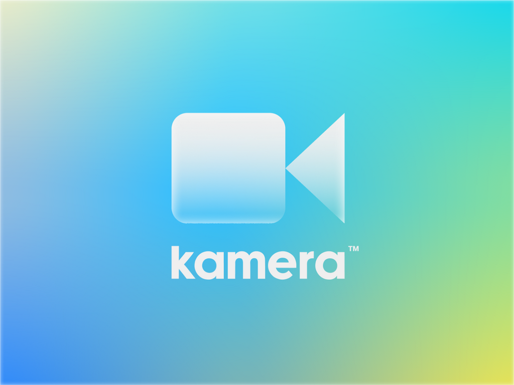
Created by Jordan Jenkins | https://dribbble.com/shots/15504928-Kamera-Logo
Camera logo design stands at the forefront of visual creativity, blending art with the essence of photography. As we delve into the realm of logo aesthetics, it's essential to recognize the power of a well-crafted camera logo. It's not just a symbol; it's the face of your brand, the first impression that captures the essence of your photographic journey. In this article, we're going to showcase some of the most innovative and eye-catching camera logo design ideas that are sure to spark your imagination.
Why is camera logo design so pivotal? In a world where images are the language, your logo is the prologue. It's the visual storyteller that conveys your brand's story, style, and specialty. Whether you're a budding photographer, a seasoned pro, or a photography brand, your logo is your silent ambassador. It's more than just a graphic; it's a reflection of your artistic vision and the quality of your work.
Let's embark on a fun-filled journey through the landscape of camera logo designs. From minimalist masterpieces to vibrant, dynamic creations, the diversity is as vast as the world of photography itself. Each logo we're about to explore is not just a design; it's an inspiration, a catalyst for creativity. These ideas will not only appeal to your artistic sensibilities but also resonate with your target audience, making your brand memorable and distinct.
Stay tuned as we unveil camera logo designs that are the epitome of creativity and charisma. Get ready to be inspired and find the perfect emblem that captures the essence of your photography brand in the most striking way. Let's turn the lens towards innovation and discover the best camera logo design ideas that will set your brand apart in the vibrant world of photography.
Camera Logo Design Ideas
1. Focus

Created by Babu Ahmed | https://dribbble.com/shots/20267242-Focus
2. Pland

Created by Daniel Ayers | https://dribbble.com/shots/15378470-Pland-Nature-Photography
3. Optic

Created by Dmitry Lepisov | https://dribbble.com/shots/14656839-Optic-Logo-Concept
4. Socam

Created by Chase Estes | https://dribbble.com/shots/19923798-Socam-Logo
5. Vidello

Created by Vadim Carazan | https://dribbble.com/shots/17222488-Vidello-logo-concept
6. Showman

Created by Aditya | https://dribbble.com/shots/19373027-Showman-video-film-logo-design
7. All Paws Portrait

Created by Andrii Kovalchuk | https://dribbble.com/shots/20340841-All-paws-portrait
8. Photo

Created by Akdesain | https://dribbble.com/shots/12126773-Photography-logo
9. Chad Savage

Created by Faikar | https://dribbble.com/shots/17002531-Chad-Savage-Photo-Logo-Design-Concept
10. Photo Studio

Created by Yuri Kartashev | https://dribbble.com/shots/15141780-photo-studio
11. Light Cam

Created by artology | https://dribbble.com/shots/18392756-LightCam-Camera-lights-color-grading-Concept
12. Dalajlampa

Created by Dalajlampa | https://dribbble.com/shots/14831957-Reel-Girls-Film-Festival
13. Piksel

Created by Dimitrije Mikovic | https://dribbble.com/shots/6493824-Piksel
14. Hits_design

Created by hits_design | https://dribbble.com/shots/19710129-CAMERA-AND-BOOK-LOGO-DESIGN
15. vClick

Created by LogoCaptain Studio | https://dribbble.com/shots/16752076-vClick-Video-Production-Logo-Brand-Logo-letter-c-v
16. Md Arif Hossain

Created by Md Arif Hossain | https://dribbble.com/shots/15920098-Paper-Camera-Premade-Logo-Design
17. Jordan Jenkins

Created by Jordan Jenkins | https://dribbble.com/shots/15504928-Kamera-Logo
18. Bojan Gulevski

Created by Bojan Gulevski | https://dribbble.com/shots/16888419-Camera-lens-Brick
19. El Dorado Multimedia

Created by Juguel BOMA | https://www.behance.net/gallery/161134643/El-Dorado-Multimedia
20. Captic

Created by Bojan Oreskovic | https://dribbble.com/shots/11368804-Captic
21. Capovilla

Created by farjanafim | https://dribbble.com/shots/17625314-Capovilla-logo-concept-Modern-logo-logo-mark-creative-logo
22. Mylocalstock

Created by Frank Sandres | https://dribbble.com/shots/13263167-Mylocalstock-brandmark
23. Patrick Tuell

Created by Patrick Tuell | https://dribbble.com/shots/15121683-M-K-Camera
24. Spoonlancer

Created by spoonlancer | https://dribbble.com/shots/5418950-Cm
25. Spark Media

Created by Faikar | https://dribbble.com/shots/15902075-Spark-Media-Logo-Design
26. Lucian Radu

Created by Lucian Radu | https://dribbble.com/shots/14033641-Bird-and-Camera
27. Filmeon

Created by Omar Faruk | https://dribbble.com/shots/15639199-filmeon-Logo-Design-Concept
28. Meraki Media

Created by Jovana Randjelovic | https://dribbble.com/shots/10042171-Meraki-media
29. Aakash Patel

Created by Aakash Patel | https://dribbble.com/shots/12129175-Camera-Lens-Logo-concept
30. Syzmon Wojcik

Created by Tiamin | https://dribbble.com/shots/8166246-SW-monogram-photographer-logo
What Are the Essentials of a Camera Logo Design?
When it comes to creating a standout camera logo design, there are a few essentials that you simply can’t overlook. Whether you're a burgeoning photography business or a seasoned pro looking to revamp your brand, understanding these key elements can make your logo not just good, but snapshot-perfect. Let’s focus our lens on the essentials of camera logo design that will help your brand click with your audience.
Simplicity is Key
Remember, the best camera logo design is easy to recognize and memorable. A cluttered logo can be like an overexposed photo – too much to take in. Stick to simple shapes and clean lines. Think of the iconic Instagram logo – it’s simple yet instantly recognizable. Your logo should be versatile enough to look great on everything from a business card to a billboard.
Symbolism Speaks Volumes
A camera logo should be more than just a camera. It’s about capturing what your brand stands for. Are you all about vintage photography? Maybe incorporate a classic camera silhouette. Specialize in nature photography? How about adding some natural elements like leaves or a sunrise? The symbol you choose should be a snapshot of your brand's unique perspective.
Color it Right
Colors evoke emotions. Choose colors that resonate with your brand's personality. Are you modern and high-tech? Cool blues and greys might be your palette. More into vibrant, lively photos? Go for brighter, more energetic colors. Just like in photography, colors in your logo can set the mood and tell your story.
Typography Matters
Just as in a well-composed photograph, the font in your camera logo design needs to balance the image. Whether you go for a sleek, modern font or a more whimsical script, ensure it aligns with your brand's character. The right typography can speak as loud as the image itself, so choose a font that reflects your brand's style and ethos.
Be Unique, Be You
Lastly, the essence of a great camera logo design is originality. Your logo should be as unique as your photography style. Avoid clichés and overused concepts. Stand out in a sea of camera logos by being authentically you. Think outside the box (or viewfinder, in this case) and create a design that truly represents your brand.
In conclusion, crafting an effective camera logo design is like composing a great photograph. It requires a balance of simplicity, symbolism, color, typography, and originality. Your logo is the face of your brand, the first thing people see. It should not only look good but also tell your story at a glance. Remember, in the world of camera logo design, it's all about making a visual impact that's as lasting as a timeless photograph. Keep these essentials in mind, and you'll be well on your way to creating a logo that not only looks picture-perfect but also tells your unique photographic story.
What Color Schemes Best Suit Camera Logo Designs?
Choosing the right color scheme for a camera logo design is like picking the perfect filter for a photo; it can completely transform the mood and message. The colors you select for your logo can convey a lot about your brand, from your style to your specialty. With the focus keyword of “camera logo design”, let's dive into the palette of possibilities and explore which color schemes best capture the essence of camera logos.
Classic Black and White
Sometimes, going back to basics is the best approach. Black and white are the timeless duo in the world of camera logo design. This color scheme speaks of elegance, sophistication, and a nod to the classic era of photography. It's perfect for brands that want to portray a sense of tradition, professionalism, and a focus on the artistry of photography. Think of it as the little black dress of logo colors – it never goes out of style.
Vibrant and Vivid Hues
If your brand is all about capturing life in its most colorful forms, don’t shy away from bright and bold colors. Vivid hues like reds, yellows, and blues can convey energy, creativity, and fun. They’re ideal for brands that specialize in dynamic photography like sports, travel, or events. These colors can make your logo pop and give off an aura of excitement, just like the moments you capture through your lens.
Earthy Tones
For those who specialize in nature, landscape, or outdoor photography, earthy tones like greens, browns, and blues can be very appealing. These colors are grounding and can represent growth, stability, and a connection to nature. They’re perfect for conveying a sense of calm, serenity, and the great outdoors. It’s like telling your clients that through your lens, they’ll see the true beauty of nature.
Pastel Palette
Soft, muted colors like pastels can be a great choice for a camera logo design, particularly if your brand’s personality is gentle, whimsical, or focused on softer subjects like newborns, weddings, or fashion. Pastels can convey a sense of warmth, tenderness, and subtlety. They’re like the gentle morning light that casts a soft glow on everything it touches.
Metallic Tones
To convey a sense of luxury, high-end technology, or cutting-edge services, metallic colors like silver, gold, or bronze can be very effective. These colors can give your logo a sleek, modern look, perfect for brands that want to emphasize their state-of-the-art equipment or high-end service. It’s like saying your brand is the gold standard in photography.
In conclusion, the right color scheme for your camera logo design should reflect your brand's personality, specialty, and the message you want to convey. Whether it’s the classic elegance of black and white, the vibrancy of bold hues, the grounded feel of earthy tones, the gentleness of pastels, or the luxury of metallics, your choice of colors can set the tone for your entire brand. Remember, your logo is the snapshot of your brand identity, so choose colors that develop that picture perfectly.
How to Design a Camera Logo Design That Captures Attention?
Designing a camera logo design that captures attention is like trying to take the perfect shot: it requires creativity, focus, and a touch of flair. In the competitive world of photography, your logo is the snapshot of your brand's identity, making it crucial to design one that stands out. Let's zoom in on the five key elements that can make your camera logo design not just good, but ‘picture-perfect’.
Embrace Uniqueness
Your logo should be as unique as your photographic style. Avoid falling into the trap of clichéd camera imagery. Instead, think about what makes your brand different. Are you a drone photographer, a wildlife expert, or a wedding photojournalist? Let these specialties shine through in your design. This could mean incorporating elements that represent your niche – like a drone silhouette for aerial photographers or a wildlife icon for nature photographers. Unique doesn’t mean complicated; it means being true to your brand’s essence.
Focus on Simplicity
In the world of camera logo design, less is often more. A simple logo is not just memorable; it’s also versatile. It should look great whether it’s on a business card, a website header, or emblazoned on photography gear. Aim for a design that is easy to understand at a glance. Remember, in a fast-scrolling digital world, your logo often gets just a split second to make an impression.
Play with Symbols and Metaphors
Photography is an art form, and your logo can be too. Think beyond the obvious camera symbols. Play with metaphors and symbols that relate to photography – like an eye (for vision), light (for exposure), or even a bird (for freedom and perspective). These symbols can add depth to your design and make it more intriguing and meaningful.
Color Psychology is Key
Colors speak a visual language all of their own. Choose colors that resonate with your brand’s personality and the emotions you want to evoke. For instance, blue can convey trust and professionalism, perfect for corporate photography brands, while vibrant colors like orange or yellow can exude creativity and energy, ideal for more dynamic photography styles.
Typography Matters
The choice of font in your camera logo design can say a lot about your brand. A sleek, modern font might be perfect for a high-tech photography brand, while a hand-scripted typeface could suit a more personal, portrait photography business. The font should complement the logo’s graphics, balancing it out. Just like in a photo, where every element in the frame contributes to the overall composition, in a logo, your typography is a crucial piece of the puzzle.
In conclusion, designing a camera logo that captures attention is about blending uniqueness, simplicity, creative symbolism, thoughtful color choices, and appropriate typography. It’s about creating a visual emblem that not only represents your photography business but also tells a story, engages your audience, and leaves a lasting impression. Just like the perfect photograph, your logo should be a frame-worthy representation of your brand's unique perspective and style.
What Are the Current Trends in Camera Logo Design?
In the ever-evolving world of photography, keeping up with the latest trends in camera logo design is like trying to capture the perfect golden hour light - it's all about timing and perspective. Just as photography styles change and evolve, so do the trends in camera logo design. Let's focus our lens on the current trends that are making waves in the world of “camera logo design”, ensuring your brand's visual identity stays as fresh and relevant as your photography.
Minimalist Designs
The trend of minimalism has firmly planted its roots in camera logo design. This isn't just about being sparse; it's about being impactful. Think clean lines, uncluttered compositions, and a limited color palette. A minimalist logo can convey a sense of modernity and sophistication. It’s like the photographic rule of simplicity – sometimes, less is more.
Vintage Revival
There’s a charming nostalgia in vintage designs that’s captivating the hearts of many brands. Vintage camera logo designs often incorporate elements from classic cameras, such as retro fonts or old-school camera icons. This trend is perfect for brands that want to evoke a sense of history, craftsmanship, and timeless elegance in their logos. It's like developing a photo in a darkroom – the process may be old, but the results are timelessly beautiful.
Bold Typography
In the world of camera logo design, fonts are stepping into the spotlight. Bold, impactful typography is becoming a central element of many logos. This trend is all about making a statement – the font becomes as significant as the graphic elements. Whether it's a serif font that speaks of tradition or a sans-serif that screams modernity, the right choice of typeface can set the tone for your entire brand.
Dynamic Geometry
Geometric shapes are not just for high school math classes; they’re making a big splash in camera logo designs. This trend involves using shapes like circles, squares, and triangles in dynamic, sometimes abstract, ways to create a logo that’s both modern and memorable. It’s about bringing a sense of balance and proportion to your logo, much like the rule of thirds in photography.
Playful Animation
With the digital age in full swing, animated logos are becoming increasingly popular. An animated camera logo can be a fun way to engage your audience, especially in digital spaces like websites or social media. Think of a camera lens that opens or a flash that blinks. This trend brings your logo to life, making it not just a static symbol, but a dynamic part of your brand’s story.
In conclusion, staying abreast of the current trends in camera logo design can give your brand a fresh, contemporary feel. Whether it’s embracing the crisp clarity of minimalism, the nostalgic allure of vintage, the bold statement of typography, the balanced beauty of geometry, or the engaging charm of animation, there’s a trend out there that can make your logo not just a symbol, but a conversation starter. Remember, in the fast-paced world of photography, having a logo that resonates with the times can be as crucial as having the right lens on your camera.
Can I Incorporate Modern Elements in Camera Logo Designs?
In the rapidly evolving world of photography, blending modern elements into a camera logo design is like adding a fresh roll of film to a vintage camera – it bridges past and present. Incorporating contemporary trends into your camera logo design not only keeps your brand relevant but also adds a touch of current aesthetic appeal. Let's snap through five ways you can infuse modern elements into your camera logo to make it as striking as the latest high-definition image.
Sleek Minimalism
In the world of modern design, minimalism is the new black. Adopting a minimalist approach in your camera logo can give it a clean, sophisticated, and contemporary look. Think streamlined shapes, limited color palettes, and uncluttered layouts. This style is akin to a perfectly composed photograph, where every element has a purpose, and nothing is superfluous. A minimalist logo is versatile and adaptable, just like a great camera adapting to different lighting conditions.
Bold and Experimental Typography
Gone are the days when fonts just played a supporting role. In modern logo designs, typography can be the star of the show. Experiment with bold, unconventional fonts or even custom typography to give your camera logo a cutting-edge look. This approach is similar to experimenting with unusual angles in photography to create a unique perspective.
Vibrant Color Schemes
While classic black and white will always have its place, modern logo designs often feature vibrant, even neon colors to make them pop. Think about the kind of photography you specialize in and choose a color scheme that reflects this energy. Are you into urban photography? Neon colors can evoke the feel of city lights. For nature photography, consider lush, vibrant greens.
Abstract Graphics
Abstract elements can add a touch of modern artistry to your camera logo design. Instead of literal camera shapes, think abstract - maybe a series of geometric shapes or a minimalist representation of a lens or shutter. This is like using a photographic technique to focus on form and color rather than specific subjects, creating a logo that is open to interpretation and intrigue.
Dynamic Animation
In our digital-first world, animated logos are becoming increasingly popular, and they can be a game-changer for a camera logo design. Consider a subtle animation for digital use – a lens that zooms, a shutter that clicks, or a flash that blinks. This not only catches the eye but also adds a storytelling element to your logo, much like a well-captured photo tells a story.
In conclusion, incorporating modern elements into your camera logo design can transform it from a static image to a dynamic, memorable brand identity. Whether it's through minimalist sophistication, bold typography, vibrant colors, abstract artistry, or engaging animation, modernizing your logo can make your photography brand relevant, relatable, and ready for the future. Just like photography, logo design is about capturing the essence of a subject - in this case, your brand - and modern elements can help you do just that in a fresh and exciting way.
Conclusion
Camera logo design is an art that mirrors the essence and evolution of photography itself. As we've explored, the key to creating a compelling logo lies in balancing modern trends with timeless principles. Whether it's through minimalism, vibrant colors, or dynamic animations, each element of your camera logo should reflect your brand's unique perspective and storytelling prowess. Remember, a well-designed logo not only captures the eye but also the imagination, making your photography brand unforgettable. Embrace these insights in your camera logo design journey, and watch as your brand develops into a picture-perfect representation of your artistic vision.
Let Us Know What You Think!
All of these creative inspirations are created by some of the best designers, creatives and professionals around the world, curated by Kreafolk's team. We hope you enjoy our gallery and remember to leave us your comment below. Cheers!



Leave a Comment