10 Common Yet Crucial Typography Mistakes To Avoid
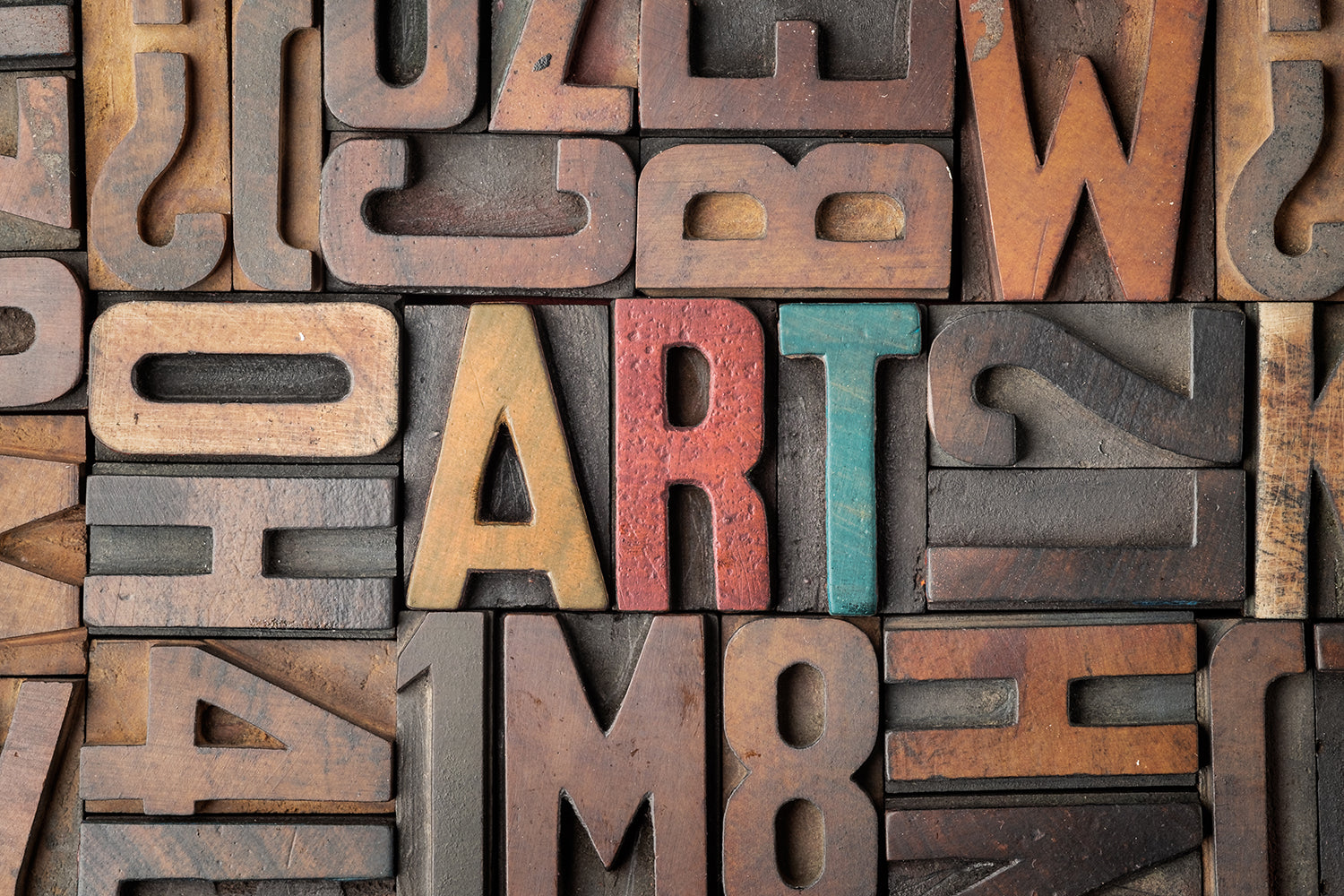
Playing with lettering and creating some stylish swashes of font stroke can make one project look different. That is why your typography is pretty much one of the crucial aspects. With many elements to consider, including typefaces, pairing, to alternates, users can turn them into masterpieces or big mistakes. As a way to learn, here are some typography mistakes that you should avoid!
Common typography mistakes That You Should Get-out
1. Choosing Dull Typefaces
Surprisingly, some people still find dull typefaces for their lettering projects. This is one of the major yet basic typography mistakes you have to face. The thing is, you can tell that this kind of project will emphasize fancy-looking design as it focuses. So, make sure you use some fancy typeface design to follow the most obvious reason.
The good thing is that there are tons of cool, good, and extravagance typefaces out there. You have the internet in your hand, so use it to find the most appropriate one. It is also worth noting that there are tons of typography ideas out there. Even more, almost every other day you can find new foundries. Talented font designers give you a lot of choices.
So, there is no excuse to make these typography mistakes. Rather than using the same old choices for your next project, try to explore and open for a broader horizon. You can also play around with the basic font such as Helvetica and craft it into something new. Avoid typography mistakes and do something with Photoshop or illustrator.
So, what kind of fonts can you choose or you have to avoid? If you are looking for some best fonts to take as a default, you can go with Futura, Garamond, Bodoni, Didot, Verdana, Gill sans, and many more. They have good consistency, legible fonts, easy to read, balance, and good kerning. Thus, it can ease your process of making typography.
On the other side, some of the worst or fonts that you can steer away from are those that are overused. Those font mistakes that are too hard to read, imbalanced, or simply boring are worse for typography. Typefaces such as Bonzai, Arial, Times New Roman, Curlz, Trajan pro, Souvenir, Papyrus are some of the examples. Try to browse and find new ones to expand your collection.

2. Apply Too Many Typefaces
Some people might consider using more than one typeface to avoid boring typography. While part of the idea is right, it can turn into complete mistakes if you overdid it. These typography mistakes are highly related to the way you choose the typeface. Chances that you are already browsing for more options, but how many fonts can you apply?
In the case of a lettering project, less Is better. It is crucial for you who are choosing and trying to use some fonts at the same time. Most likely, professional designers can go around and nail the idea by executing the typography with a handful of typefaces. But, you can also start with a simple and less font as a way to learn. It is better to learn and help you to gain more freedom.
It also helps you avoid any other typography mistakes, such as over-scaling or choosing the unsuitable one. This time, take a chance to learn more about the basics of typefaces. You will find that you can play around even with just one type of font. For example, you use serif typefaces and play with the swashes. It will add personality to your lettering.
There are also some other details of typefaces that can help you decide how many typefaces to uses. You can also look at the eligibility of each typeface in a diverse scale range, the most appropriate usage, impression, to other reasons. So, jot down some of your ideas to avoid typography mistakes. Are you going to uses serif, sans serif, script, or monospaced font for your typography?

3. Inappropriate Typefaces
It is not a surprise that some typography has different impressions and looks with ranges of typefaces styles and also ranges of creative designer, chance that some font has specific utilization. You can name some old vintage-styled fond design, or you can also take a look at the ranges of script typefaces on the internet. Browse them to avoid picking the font mistakes.
One thing for sure, when there are specific typefaces, then you can also find some versatile options. Choosing versatile or easy to adopt fonts help you steer away from selection typography mistakes. At some point, it even helps you a lot in creating or altering your typography design. You can use it for every project element, from logotype to menu detail.
To avoid mistakes, try the easy-to-use and versatile typefaces such as myriad Pro. It is one of the humanist sans serif fonts, which is a very familiar font for Apple users. Some other typefaces you can take a look at Ubuntu font family, Lobster, Cabin, Corbel, Museo Slab, or PT Serif. They offer balanced design and also ranges of models.
As important as style and model, your typeface impression or look can also determine suitability. The audience will think twice if they found a luxurious perfume product with childish typography. Coffee lovers will have a hard time if their coffee shop mural uses comic sans as its font. All of them don't fit the theme, which makes the typography mistakes very apparent.
Underline that most typefaces have their particular appropriate usage to tag along. The vintage-styled design works better for coffee or authentic wood business. Script typefaces bring out personal touch and elegance that fit a fashion brand. Luxurious products tend to use the simple, minimalistic, and modern touch in their typography.

4. Applying All Caps
Doing all caps is the big taboo in the current modern living style. When you type with caps locked on, most of the time, it will be considered a little rude. Thus, these typography mistakes are a big no for designers. At some point, this kind of appearance also represents action such as shouting or yelling. If it is not your intention, then steer away from the all-caps font.
However, you also need to underline that doing all caps is also very prominent to make a focal point. You can emphasize a particular message by doing so. For example, you capitalized letters for headlines or text bubbles. Apart from those ideas, this kind of lettering should be avoided. It is also important to note that typography mistakes can create misunderstanding or disrupt the look.
The changes in font size will affect your overall typeface display. It can make your typography appear messy and hard to read. At the same time, the all-caps will make a big break in your typesetting. Your typography will look shouty and inappropriate for some occasion. It also makes your design look boring and lacks variances.
To break these cursed mistakes, you can play around with the font-weight. Make the crucial part have a heavier weight (bold) and play around with others parts. You can also use underlining as a way to emphasize certain information. However, don't do both at the same time. Choose one, or else you will make other typography mistakes (overdid).

5. Lengthy Paragraph
Take a look at newspaper or magazine typography. You will find that the display has a uniform look for its text length. Underline the fact that the editor spent decades to finally find the optimal length line that eases the reader. The well-thought length line increases the readability, makes the project appear better in everyone's eyes, and avoids reading mistakes.
It also works the same as your typography project. One of the most basic mistakes that you should avoid is the long line length, which can make your reader lose their focus. It is very basic, but some people still do the same because they don't consider the long paragraph and overall impression.
In case you still unaware of line length, it refers to the distance between the left and the right edges of the text block. A shorter length can make a big difference in the layout professionalism, readability, and legibility. It also lessens the chance of out-wordy paragraphs and some other typography mistakes.
So, what is the ideal line length? To make your typography layout easy to read and clean, you can go with 45-90 characters. Or you can also do 2-3 alphabet line lengths. However, what you have to consider is the longer progress tracking. As long as it is easy to make vertical tracking easier, then go for it.
However, you can make other mistakes by cutting your text abruptly. It is another thing that you might have to consider. When wrapping up your lines or text too much for a shorter length, it will make your lettering unreadable. Readability is the main objective of lettering anyways, so check it out and browse through many media to get the line length cue.

6. Tracking Too Tight
Tracking or letter spacing. Most designers should understand the particular element to avoid a lot of typography mistakes. This term helps you understand the space between the letters. It will be easier to find out when viewed as a whole document. It includes kerning that explains the individual spaces between each letter.
When done correctly, tracking can help you create wholesome typography art. Playing with the distance and also the eligibility will increase your project values. But the common mistakes are tight tracking. Yes, you can make it dense or loose to fit the style. But when it is too tight, your typography is unreadable.
Big chance that this mistake happens due to the tiny spaces that force designers to condense words and cramp them. With some flairs and wording information, it can highly affect the readability. That is why you should be wise when playing with space. Increase the kerning, give room to breathe, and you will be able to avoid many typography mistakes.

7. Orphans Or Widows
How can orphans and widows in typography turn into typography mistakes? When it comes to designing fancy lettering, your layout can create a different impression. Those with an appropriate length line, balanced fonts, and typeface will look neat. It works the same with widows or orphans. Your typesetting will greatly change with some leftover words.
So, the mistakes circulate the way you take care of orphans or widows in your text. If you are not following, the term refers to the one or two words that are left on the bottom of the top column of the page. A widow is an ending line that is left at the beginning of the following page. Meanwhile, an orphan is an opening paragraph that is stuck on the bottom page.
There is also a term called runt, which refers to a single or two words that are left at the end of the paragraph. While some of them are left unintended, they can create white space and disrupt your typesetting. At some point, it can also make the paragraph more difficult to read and follow. That is why you should take care of your typography orphan or windows.
To solve the typography mistakes, you have to be smart with line length and tracking adjustment. Make sure everything is fit, so nothing is left behind! Another way to do it is by paying close attention to the space between paragraphs. The chance that you can decrease the amount of white space by taking care of the indent and minimize the spaces.

8. Oversized Words
Chances that people love typography due to its fancy-looking scale. One thing for sure, creating one takes a lot of experience, ideas, experiments, trials, and mistakes. When you find an interesting and beautiful design with its flowy strokes and swashes, there are high chances that the designer will put a lot of effort into making it perfect. It is safe to say that they know what they do.
In this case, you can underline that whatever strokes they make for the serifs and sans serifs typography come with a lot of consideration. They have to underline that the process of scaling and stretching the typeface is the crucial part. Doing it too much will make design mistakes that look overwhelming and lose their purpose.
But if it is too lacking, the design will appear dull. This kind of dilemma is no other than the most heartbreaking typography mistakes. Making it fancy is not the only crucial part; you also need to make it readable, neat, attractive, and engaging. Thus, leave the scaling detail to the professional so you can avoid oversizing mistakes.
But if you want to play around with your typeface, try it for different elements. You can start with adjusting weight, tracking, kerning, width, height, and other parts. It might sound very trivial for a typography project, but they are the basics. After you understand and master it, you can expand your horizon with scaling and make sure you steer away from mistakes.

9. Ragged Alignment
After all of the consideration and mentions of mistakes, you should run down your works very carefully. It means to help you find some hidden typography mistakes, including alignment. This part can be a little bit tricky, especially if you use quite a lot of text and context. Chances that your paragraph will have differing edges due to the different message to deliver.
But that means you should check it more carefully. Make sure that you got the line neat and uniform. Don't let some words or texts make your design appear zig zagging all over the place. These typography mistakes will disrupt the readability and decrease the overall look. Once again, pay attention to your line length, kerning, spaces, widows, orphan, or tracking mistakes.

10. Typos
Even though typography mistakes are not necessarily part of typing details or adjustments, typos can ruin the whole purpose of your typography project. Sometimes, little mistakes such as forgotten punctuation or spelling are the main nightmare in publishing or lettering projects. It does not even care about your perfect typesetting or other possible mistakes.
Simple spelling mistakes can ruin your entire work quality. Think about every single word and detail. You can check the typeface, tracking, leading, line length, and any other elements. But, don't forget the languages. Run through your whole project, read it all over just to make sure you got everything right and straight!

Conclusion
Good typesetting will include all types of consideration. It will help you avoid typography mistakes and typos. If possible, you can ask people to check out your work and give reviews. Let them be a proofreader, so you can make sure your project is clean, clear, and neat as your typesetting.
When it comes to design elements, your lettering will be one of the best ways to convey a message. Making it fancy and turning it into an art form of typography, however, is not easy. Some of the typography mistakes appear from the very simple case of typefaces, tracking, scaling, alignment to your typos.





Leave a Comment