
How to Summarize Information for Presentation Design
Let's find out how to summarize information to get the best out of your presentation design!

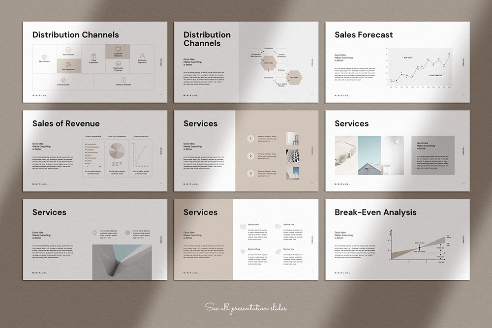
Created by GoldenPixelStudio | https://creativemarket.com/GoldenPixelStudio/6347979-Marketing-Plan-Presentation
One of the challenges in the organization's life is presented. The task forces you to work around the already compiled data and summarize it into more visualizing or enticing slides. Indeed, everyone will eventually face what you call bad presentation design. It is unavoidable, especially with abundant information to tell.
But, no matter how much the data is, you can always summarize and make it presentable. It is where you have to learn how to summarize information in more stimulating slides. You can always pay more attention throughout the design, so you got everything in it without making a clog full of info to read. Here are some tips and trick guides you can try on.
1. Building Up A Definite Outline
It helps create a nice flow with an outline. You can think of the outline as the roadmap for the presentation design, especially if the information is on the abundant side. A strong plan will help you pinpoint every key point that you need to cover and avoid getting lost in the process. It also helps you plan slides for your presentation and the overall plan.
One of the best presentation outlines is starting with an introduction. After that, you can tell the vision, financial profit, cash flow, investment, and question. It is one of the vital parts of creating a presentation design. As you summarize information, the idea is also adjustable according to your goals. Some of the objectives are for study, business, or any other presentation.
Another reason why you need an outline is to summarize the information. If you got a lot to say, the outline or flow could make it easier to know what to put in the slides or talk about. It also helps a lot if you want to put the outline in dedicated slides. The idea will eventually explain the presentation design flow to your audience and help them know what to expect.
2. Sliver The Topic
To help you summarize information and create an easier-to-follow presentation design outline, you can start with splitting group presentations. One of the best ways to do it is to sliver some material into chunks according to its topic. It will help you balance and find the right way to summarize in slides.
One of the reasons you need to do it is to ensure every presentation slide will not look disjointed. One thing that is for sure is that the idea is not only about the information but also the template. Every slide deck under the same topic group can help it be easier to read and grasp. It is why it is mostly used to make an open discussion for different groups.
If you want to follow this presentation design, you have to start with splitting the group by topic. After that, you can introduce the speaker to explain the information in the slides. Don't forget to rehearse your presentation in advance to summarize and speak better. You can turn into an expert to summarize information written in the slides.
3. Decide The Core Message
One way that can help you summarize all of the info in your presentation design is deciding the core message. After you get the outline and the group, you will know how to find the core or the focus of the data. It will help you summarize information better and make slides easier to read or understand.
Hold dearly the fact that the audience can easily be distracted or overwhelmed with too much data or text. It not only makes your presentation appear longer but also has a dull look. That is why you need to identify the central or the core message of your information to communicate with the audience. Next, you can build the presentation design from it.
If you can find or use core messages, it will ensure you summarize information and every detail that supports the primary goal. One way that you can do to try this design trick is to tell what you want the audience to learn (the core). After that, try to minimize or get straight to the fact or supporting information without any rounding explanation.
4. One Major Takeaway Per Slides
The core message in every slide also means you will have one major takeaway. The key focus is to avoid making your audience struggle too much in learning or reading your slides. So, you can limit the audience focus with one primary key point in the slides. You can also make it better with a single simple statement to summarize the information.
One of the best ways to summarize information is to pick the core message. After that, you can tell the message with a few keywords or short lines. The presentation design will look simple, but it highlights the point. Using a simple and short text also helps you create more appealing slides to read. So, the audience can focus on the slides and be engrossed in them.
However, one downside of the idea is the number of slides. Since you spread out every point, you are bound to have more slides. It might feel like too much hassle. However, more slides can also decrease the chance of your audience losing interest in a single slide. So, try the presentation design and summarize information even with more slides.

Created by TemplateZuu | https://creativemarket.com/TemplateZuu/2690981-Voodoo-Presentation-4.1-UPDATED
5. Omit Superfluous Information
If you want to make it shorter, consider omitting any superfluous information. Since you summarize ideas, it will help you plan the slides. The primary focus is to eliminate information that you find not have any relation to the core message. If you can cut some extra details, you will make more understandable presentation design slides.
It is one of the solutions to change the text-heavy slides. You will need to summarize information harder, and don't be afraid to omit some extra details. Some of the data you can delete are detailed descriptions, trivia, background details, redundant statements, or common knowledge. However, keep some quotes, illustrative examples, and persuasive facts or figures.

Created by Loh Studio | https://creativemarket.com/loh-studio/3702238-WREN-Presentation-Template
6. Less Text More Visual
If you summarize information and presentation design points, then you will find yourself going for less text and more visuals. It is a thing that you need to hold dear when creating a presentation. The idea itself is pretty fundamental, which highlights the need for visualization over heavy-text information.
In presentation fundamental design, you need to learn that the audience hates three things. They don't want a speaker that reads the slides, a text-heavy slides design, and ineligible text. The mistakes will only make your presentation lower the engagement rating. It also makes your audience bored and lose concentration.
Due to that fact, you can focus on creating a presentation design that focuses on visuals. A visually focused presentation not only helps the audience pay attention but also summarizes information more interestingly. You can visualize slides, add graphics like the example, or bring up visuals to highlight information.

Created by GoldenPixelStudio | https://creativemarket.com/GoldenPixelStudio/6347979-Marketing-Plan-Presentation
7. Text Is To Reinforce Your Saying
As said in the previous point, you need less text and more visuals for your presentation design. The idea itself highlights the importance of speaking to present your information. In this part, you need to understand that your audience will likely read all the text in the slides. You need to summarize information in the absolute minimum text.
Make it short, explanatory, but straightforward. However, the design and the text also need to support whatever you want to say. The primary summary point is not writing every word for word that you want to say out loud. Writing every detailed information will only make your slides look cramped up.
That is why you need to summarize your saying and make it simpler in slides. Only write down text that reinforces your verbal explanation. You can put some number, data, or core message. So, you can ensure the audience will not lose any important detail from your speaking. You can also summarize information, add quotes or illustrations to support your saying.

Created by TemplatesForest | https://creativemarket.com/TemplatesForest/5232047-Business-Plan-PowerPoint-Template
8. Play With Visual Highlight
If you don't want your audience missing, you summarize details in slides, try to add visual highlights. Most of the time, presentation design will only put the primary messages in the slides. Meanwhile, you will summarize some of the lengthy details by saying. In many cases, people or the audience can lose in the process.
That is why you need a highlight for your key message. In this design idea, you can add unique images or graphics that help create memorable information. The visual framework model is also one of the best ways to summarize information in a group or integrated details. Some other visuals or graphics can help you make a spotlight.
Some ideas to summarize with visual design are flowchart, funnel, icons, different colors, chart, data visualization, concept, stock photos, or template. While you have a lot of design to summarize and make information more stimulating to look at, you also need to be careful when choosing one. You need to ensure every detail, information, visual, and strategy are related.
It is also vital to avoid falling into the trap of unprofessionally selected stock photos. There are times when the presentation design that summarizes information ends with low resolution or unrelated pictures. It is not only making your slides look amateur but also making the graphic distracting. Try to ensure everything fits like a puzzle, which also looks like part of the template.

Created by CreativityForest | https://creativemarket.com/creativityforest/5017219-Pitch-Deck-Google-Presentation
9. Stress Information With Text Size, Weight, Or Color
If you wonder how to stress information with text in presentation design, the answer is typography. You can play around with the size, weight, or color. It is like design in general, which uses text-heavy elements. You can do the same with the presentation slides. After you summarize some of the details, write it in simple text, and emphasize it.
One of the best-emphasized designs is color. You can create a visual focal point by giving different stress in certain words using brighter, larger, or bolder font elements. Making it have varying size and weight also helps you create a definite hierarchy. It will force your viewer to pay attention to the highlighted information.
However, it is also vital to consider the best typeface. You need to ensure everything is readable, which means it has a clear difference between different hierarchies. Lastly, just because you can highlight and summarize information, it does not mean you can add too much of it. Your presentation design will lose its value if everything is highlighted.

Created by GoldenPixelStudio | https://creativemarket.com/GoldenPixelStudio/6347979-Marketing-Plan-Presentation
10. Use Scaffolding Slides For Engagement
If you want to make a presentation with a lot of slides, consider scaffolding slides. The key point of slides design is telling the agenda by highlighting the section title. It will give the audience some information about the progress throughout the whole presentation. Thus, they will keep on engaged in the time. You can also use numbers or progress bars as alternatives.
11. Getting Started With Templates
If you are not good at planning the presentation slides design, you can go with a template. There are many templates in presentation programs or apps, which help create related summarized information. It is also easier to do than create a design from scratch. After that, you got the chance to work around the font, image, photos, or color.
12. Create Varying Layout
If you got some experience in design, you could make some exciting layouts for every slide. However, some presentation design layouts offer the same premise. Regardless of your choices, using different or varying layouts can increase audience engagement and interest.
There is no limit to slides or layout design. However, you need to ensure that you can summarize information in the selected layout. It is also important to make every piece of design elements fit together as you summarize the data. It is also beneficial if you want to splash some of your personal touch in the presentation.
Some of the examples are using colored background, photo, or text. You can mix and match the orientation or the visual point. Try to make every presentation design go well with each other, such as color selection, position, font, or graphic. Another point that you need to do is summarize the information and make a design that keeps the audience engaged.

Created by Loh Studio | https://creativemarket.com/loh-studio/3702238-WREN-Presentation-Template
13. Apply Consistent Design
After you get some templates and designs, apply them consistently. Audiences can easily be distracted, frustrated, and bored. However, they are also easy to pick out the summarized information and focus on any inconsistency in your design. If it happens, your audience will have a hard time getting to the point.
One way to avoid it is to be consistent with your presentation design. You can have different points in slides and summarize information with ranges of data. However, you have to make the slides' design look consistent. So your audience won't be distracted by the looks. Pay attention to your font, color, style, and image design for a more uniform look.
14. Get Some Inspiring Quotes
Another good idea to make your audience engaged with your presentation is engaging quotes. You can put some enchanting and inspiring sentences to make them pay attention to your work. However, make sure all of the quotes can support your material. Summarize information, look for quotes, and apply it to fit with your presentation design.
Created by TemplatesForest | https://creativemarket.com/TemplatesForest/5232047-Business-Plan-PowerPoint-Template
15. Adding Examples
To make your design more impactful, you can add some examples. The design idea not only helps you summarize information with visuals but also elevates your audience's interest. If you want to summarize some details with an example, ensure you got it right and not distract your key message.
However, you can also add examples in the form of people or inspiring figures. It is a great presentation design idea to highlight achievement or trait. Some celebrities, inspiring scientists, or people will help you create a better explanation. Again, try to ensure the example is appropriate with the material that you want to emphasize.
16. Make Label For Your Slides
If you are a person that tends to forget about the data, try to summarize the slides with labels. It will help you a lot when speaking in front of audiences. Using labels for the slides not only summarizes information but also helps you stay away from looking too rigid. Some presenters are bound to write the entire script and read it.
It makes the presentation lose some flexibility and human feeling. However, you can summarize the data in the label and read it. It will boost your memory about the information and the presentation design. The key point is to put some primary phrases in the slides that work as a label of your saying.

Created by GoldenPixelStudio | https://creativemarket.com/GoldenPixelStudio/6347979-Marketing-Plan-Presentation
Conclusion
To make enticing, effective, and professional presentation slides, the primary point is to stress less text and more visuals. Remember that too much text-only plummets the engagement, which emphasizes the need for visual focus in it. While you try to summarize information, it is also preferable to make it more impactful, memorable, and exciting.
Related Articles


Leave a Comment