National Geographic Logo Design: History & Evolution
Image Source: https://wallpaperaccess.com/national-geographic-logo | Image Courtesy: National Geographic
When it comes to iconic imagery, few symbols resonate with audiences quite like the National Geographic logo design. This emblem, a simple yet striking yellow rectangle, has become synonymous with exploration, discovery, and a commitment to visual storytelling. Whether you're a seasoned graphic designer or just starting your creative journey, the story behind this recognizable logo has lessons to teach.
The National Geographic logo design has gone through a fascinating evolution since its inception. As we dive into its history, you'll get to explore not just the aesthetics, but the underlying philosophy that has guided this visual evolution. How did a basic geometric shape come to represent a world of wonders? What design principles made this logo so enduring and effective?
Join me as we take a journey through the world of National Geographic logo design, from its historical roots to the contemporary adaptations that keep it fresh and engaging. Whether you're seeking inspiration for your own projects or simply fascinated by logo design's ability to communicate complex ideas, this exploration promises to be an enriching one. Stay tuned!
National Geographic Logo Design History
1997 - 2001
The era between 1997 and 2001 marked a significant chapter in the National Geographic logo design's journey, showcasing creativity and a commitment to the brand's core message. The logo unveiled during this period speaks volumes about the way National Geographic saw itself as a "window to the world." Here's an in-depth look at what made this version of the National Geographic logo design so compelling.
The debut logo from this era consists of two harmoniously integrated parts: an iconic elongated yellow rectangle and the accompanying text to the rectangle's left. It's hard not to notice the resemblance of this shape to a standard magazine or window. This clever metaphor was no accident; it was a thoughtful design choice meant to emphasize the brand's unique role as a gateway to discovery and learning.
The elongated rectangle's yellow lines are wide, creating a bold statement that catches the eye. In height, they are comparable to the adjacent phrase "National Geographic Channel." This balanced and proportional design lends itself to a feeling of harmony and interconnectedness between the visual icon and the textual element.
Typography played a key role in this version of the National Geographic logo design as well. The chosen serif typeface was beautifully arranged in three rows, giving it a classic yet robust appearance. This choice was perfectly in line with the brand's history of bridging tradition with innovation.
What really made this logo stand out was the subtlety with which the designers played up the name of the society as a literal and metaphorical "window to the world." It's an idea that resonates deeply with what National Geographic has always been about: bringing distant lands, exotic creatures, and unknown cultures right into our living rooms.
The yellow window doesn't just symbolize a magazine cover or a TV screen; it is a lens through which we can view the entire world. The choice of color, shape, and typeface all align perfectly to create a visual narrative that captures the brand's essence.
The National Geographic logo design from 1997 to 2001 is more than a mere symbol. It's an artful embodiment of a brand's mission and values. The understanding and execution of these design principles during this period serve as an inspiring lesson for anyone interested in logo creation and branding.
In conclusion, the National Geographic logo design during these years is a stunning example of how thoughtful design can communicate complex ideas and emotions. It's a timeless lesson in aesthetics, balance, and storytelling that continues to inspire designers around the globe. If you're seeking to create meaningful logos that resonate with audiences, this chapter in design history offers a wealth of insights and inspiration.
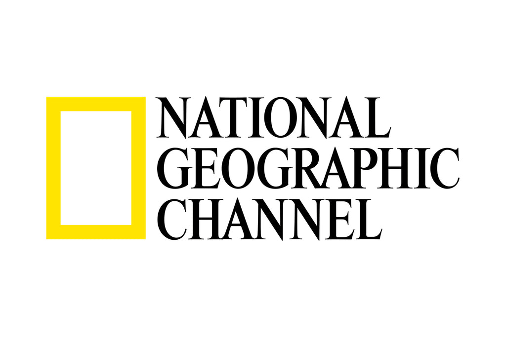
Image Courtesy: National Geographic
2001 - 2005
The early 2000s brought about an intriguing evolution in the National Geographic logo design, reflecting subtle shifts in the organization's identity and a modernizing approach to visual branding. Between 2001 and 2005, designers introduced changes that, while not dramatic, were significant in their own right. For graphic designers and branding enthusiasts, this phase of the National Geographic logo design offers intriguing insights into the nuances of logo evolution.
During this period, the most noticeable alteration affected the form of the name. While the top and middle sections of "National Geographic" remained unchanged, maintaining continuity and brand recognition, the bottom word "Channel" underwent a striking transformation. Not only did it change in typography, but it was also separated from the rest by a dividing line and adopted a different writing style.
The new "Channel" text lost its serifs and was reduced to half the size of the other words. This decision might seem minor, but it had a profound impact on the overall aesthetics of the National Geographic logo design. By changing the typeface and introducing a dividing line, the designers created a visual separation that emphasized the distinction between the National Geographic Society and its Channel.
This redesign wasn't just about a fresh look; it was a strategic move that aligned with National Geographic's expanding media presence. The resized and re-styled "Channel" word subtly but effectively highlighted the specific identity of the television component, without losing the iconic yellow rectangle and the traditional font of the rest of the name.
What can we, as graphic designers, learn from this evolution? First and foremost, the importance of subtlety and precision in design. The changes made to the National Geographic logo design during this period were neither radical nor flashy. They were, however, incredibly effective in communicating a new direction and a refined focus.
Moreover, this logo evolution teaches us that even small adjustments can have a big impact on how a brand is perceived. It reminds us that every element in a logo design – from typography to spacing, to lines – has a purpose and a message. A shift in a font, a resizing of a word, or the introduction of a line can carry significant meaning and affect the way audiences connect with a brand.
The National Geographic logo design from 2001 to 2005 is a masterclass in thoughtful, purpose-driven design. It illustrates how even subtle changes can breathe fresh life into a logo, ensuring that it remains relevant and resonant with its audience. For those of us in the world of graphic design, it's a vivid example of how to evolve a brand's visual identity with grace, intention, and a deep understanding of what that brand represents. It's yet another inspiring chapter in the rich history of one of the world's most recognized logos.
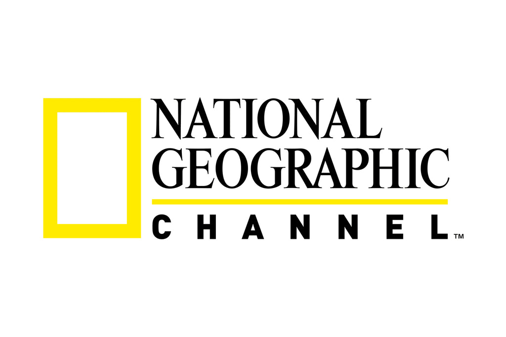
Image Courtesy: National Geographic
2005 - 2016
The National Geographic logo design experienced another pivotal evolution from 2005 to 2016, demonstrating how the brand continued to adapt to a changing media landscape while preserving its core identity. This phase offers graphic designers a fascinating glimpse into how minor tweaks can have substantial visual impact.
In 2005, the management approved a new iteration of the National Geographic logo design, reflecting a modern take while retaining key elements that make the logo so recognizable. This transformation included a few well-thought-out adjustments, each of which conveyed a new layer of meaning.
Firstly, the designers adopted a revised sans serif font, bringing a more contemporary and streamlined feel to the logo. The text appeared cleaner and more approachable, aligning with modern design trends without losing touch with the brand's rich heritage.
Secondly, the demarcation line that previously separated "Channel" from the rest of the text was removed. This seemingly simple decision created a sense of unity and cohesion, tying the words together into a single, harmonious whole. It marked a return to a more integrated design, emphasizing the brand's overarching vision rather than differentiating between various elements.
The word "Channel" didn't just return to its original size; it was also highlighted in gray. This subtle color shift had a dramatic visual effect. The gray shade not only added visual interest but also cleverly emphasized the television component of the brand without overpowering the rest of the logo. It's a perfect example of how color can be used strategically in design to convey specific messages and draw attention to particular aspects.
The National Geographic logo design during this period is a testament to the power of calculated, precise design modifications. Every change was purpose-driven, each choice meaningful. It's an invaluable lesson for graphic designers in how to keep a logo fresh and relevant while respecting its legacy.
The National Geographic logo design from 2005 to 2016 is more than a piece of branding; it's a story of adaptability, innovation, and the nuanced use of design principles. It shows that a well-crafted logo can evolve with the times without losing its essence. For those of us immersed in the world of graphic design, the National Geographic logo continues to inspire, providing valuable insights into how small changes can have a big impact. This chapter in its history reinforces that effective logo design is not just about aesthetics; it's about strategic thinking, storytelling, and a profound understanding of the brand it represents. It reminds us once again why the National Geographic logo design remains a touchstone in the world of visual branding.
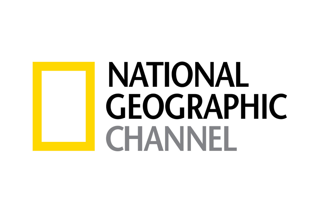
Image Courtesy: National Geographic
2016 - Present
Navigating the constantly evolving landscapes of media and technology, the National Geographic logo design took another remarkable turn from 2016 to the present day. With a multifaceted brand that encompasses a digital and satellite channel, a society, a publishing house, a magazine, and a series of travel guides, the administration faced a unique challenge: unifying the logo to suit all these aspects simultaneously. This latest phase of the National Geographic logo design illustrates the brand's adeptness in adapting to change while preserving its iconic identity.
In a decisive move toward unity and simplicity, the developers removed the word "Channel" from the logo. This change was more than just a design tweak; it was a strategic shift that embraced the brand's multifarious nature. By omitting a word that specifically referred to one aspect of their offerings, National Geographic made a statement that the logo represents everything they stand for, be it television, print, or digital content.
This recent update to the National Geographic logo design underlines a crucial principle in graphic design: Less can indeed be more. Removing a single word allowed the logo to become more versatile and universal, without losing its essence or diluting its impact. It's a brilliant example of how a minimalist approach can amplify a brand's message, making it more accessible and relevant to a broader audience.
The contemporary version of the National Geographic logo design resonates with the brand's unending quest for exploration and discovery. It encapsulates its role as a window to the world, no matter the medium or platform. Whether you're tuning into a documentary, flipping through the pages of the magazine, or exploring a travel guide, the unified logo assures you that you're partaking in the rich tradition of National Geographic.
For graphic designers, the National Geographic logo design's current iteration is a masterclass in clarity, adaptability, and thoughtful reduction. It's a lesson in how to gracefully navigate the challenges of a multifaceted brand, maintaining consistency, and ensuring that the logo remains true to its roots.
The evolution of the National Geographic logo design from 2016 to the present is a testament to the art of thoughtful design and strategic thinking. It's proof that a logo can be both timeless and timely, evolving with the brand's needs without losing its core identity. As we continue to observe the journey of one of the world's most recognizable logos, it offers ongoing inspiration and insights for anyone in the field of graphic design. The story of the National Geographic logo design is a vivid reminder that good design is not static; it's a dynamic, evolving expression of a brand's mission, values, and connection with its audience.
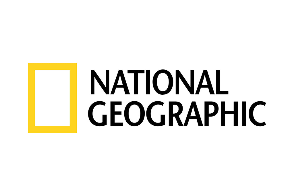
Image Courtesy: National Geographic
Analysis: National Geographic Logo Design Evolution
The story of the National Geographic logo design is a compelling journey through time, reflecting the brand's mission and adapting to the ever-changing media landscape. For graphic designers, this evolution offers rich insights and lessons on how to create a logo that remains both timeless and timely. Let's dive into a five-point analysis of the National Geographic logo design and explore what makes it so iconic.
Simplicity and Versatility
The National Geographic logo design has always been admired for its simple and versatile aesthetic. From the initial elongated yellow rectangle, symbolizing a window to the world, to the removal of the specific word "Channel," the design has evolved to fit various platforms while maintaining its distinct identity. This simplicity allows it to resonate with diverse audiences and across different mediums, making it a classic example of minimal yet effective design.
Color and Typography
Color and typography play crucial roles in the National Geographic logo design. The bright yellow rectangle has remained a constant, symbolizing exploration and discovery. The thoughtful use of typography, from serif to sans serif, and the strategic highlighting of certain words, demonstrates how type can be used to convey specific meanings and nuances. These elements have been fine-tuned over the years to keep the logo fresh while staying true to its core identity.
Strategic Evolution
The National Geographic logo design has never been about abrupt changes. Each modification, be it the resizing of a word or the removal of a demarcation line, has been a calculated move to align the logo with the brand's evolving needs. This strategic evolution shows a deep understanding of how small changes can make a significant impact, offering valuable lessons in adaptability and forward-thinking design.
Unified Brand Identity
With National Geographic's expansion into various fields, the logo design has managed to unify the brand across different platforms. The removal of the word "Channel" and the creation of a logo that fits everything from a digital channel to travel guides exemplifies how a logo can be a cohesive force for a multifaceted brand. It's a compelling study in how design can create a harmonious and consistent brand image.
Timeless Appeal
The National Geographic logo design's ability to remain relevant across decades is a testament to its timeless appeal. By marrying tradition with innovation, the logo continues to be a symbol of exploration and learning. It’s a shining example of how a logo can evolve with the times, without losing its essence, providing ongoing inspiration for designers seeking to create lasting visual identities.
The National Geographic logo design evolution is a masterclass in effective branding and design strategy. It's a story that continues to inspire and instruct, emphasizing the importance of clarity, adaptability, and thoughtful design. For graphic designers seeking to create impactful and enduring logos, the journey of the National Geographic logo design offers a rich tapestry of ideas and principles that resonate far beyond a simple visual mark.

Image Source: https://www.instagram.com/natgeo/ | Image Courtesy: National Geographic
The Philosophy & Meaning Behind National Geographic Logo Design
Unpacking the philosophy and meaning behind the National Geographic logo design reveals a profound understanding of the brand's essence, a symbol of exploration, education, and connection. This iconic logo has more to tell than what meets the eye. Let's delve into five core aspects of the philosophy and meaning that have shaped the National Geographic logo design, offering a deeper understanding for graphic designers everywhere.
A Window to the World
The National Geographic logo design, especially the prominent yellow rectangle, has been likened to a window to the world. This imagery resonates with the brand's mission of exploration, discovery, and providing unparalleled insights into our planet. It's a powerful metaphor that connects viewers with diverse cultures, landscapes, and phenomena, encapsulating the spirit of curiosity that defines National Geographic.
Unity Across Platforms
With its evolution, the National Geographic logo design has embraced the brand's multifaceted nature. From television and digital media to magazines and travel guides, the logo symbolizes a unified vision. The subtle changes over time, like the removal of the word "Channel," reflect a conscious effort to create a versatile logo that resonates with a broad audience while maintaining a cohesive brand identity.
Tradition Meets Modernity
The National Geographic logo design masterfully blends traditional elements with modern aesthetics. The shift from a serif to a sans serif font and the thoughtful use of color and form demonstrate a balance between honoring the brand's rich history and aligning with contemporary design principles. This combination creates a timeless appeal that continues to resonate with audiences around the globe.
Symbolism of Color
The yellow color in the National Geographic logo design is not just a design choice; it's a symbol. Yellow represents sunlight, warmth, and optimism. It aligns with the brand's mission to enlighten minds and inspire exploration. The consistency of this color throughout the logo's evolution underscores its significance and the intention behind its selection.
Clarity and Simplicity
The National Geographic logo design embodies a philosophy of clarity and simplicity. It communicates a complex message with minimal elements, highlighting the power of well-thought-out design choices. From the elongated rectangle to the carefully selected typography, every aspect is purpose-driven, reflecting a philosophy that values clear communication and elegant simplicity.
The philosophy and meaning behind the National Geographic logo design offer a rich exploration of design thinking and brand alignment. It's a study in how visual symbols can encapsulate a brand's mission, values, and connection with its audience. For graphic designers seeking to create logos with depth and resonance, the National Geographic logo design stands as an inspiring example of how design can transcend mere aesthetics, becoming a profound expression of a brand's core essence.
When it comes to iconic imagery, few symbols resonate with audiences quite like the National Geographic logo design. This emblem, a simple yet striking yellow rectangle, has become synonymous with exploration, discovery, and a commitment to visual storytelling. Whether you're a seasoned graphic designer or just starting your creative journey, the story behind this recognizable logo has lessons to teach.
The National Geographic logo design has gone through a fascinating evolution since its inception. As we dive into its history, you'll get to explore not just the aesthetics, but the underlying philosophy that has guided this visual evolution. How did a basic geometric shape come to represent a world of wonders? What design principles made this logo so enduring and effective?
Join me as we take a journey through the world of National Geographic logo design, from its historical roots to the contemporary adaptations that keep it fresh and engaging. Whether you're seeking inspiration for your own projects or simply fascinated by logo design's ability to communicate complex ideas, this exploration promises to be an enriching one. Stay tuned!

Image Source: https://www.instagram.com/p/CwfoNfWSjcL/ | Image Courtesy: National Geographic
What Can We Learn from National Geographic Logo Design
The National Geographic logo design is more than a visual symbol; it's a treasure trove of lessons for graphic designers. Whether you're a seasoned professional or a budding designer, the evolution, philosophy, and execution of this iconic logo offers valuable insights. Let's explore five key lessons we can draw from the National Geographic logo design that can guide and inspire our creative endeavors.
Timeless Design Principles
The National Geographic logo design is a masterclass in creating timeless appeal. Its simple geometric shape, consistent color palette, and well-chosen typography have allowed it to endure across decades without becoming dated. The lesson here is the importance of understanding and applying timeless design principles, focusing on clarity and simplicity, to create logos that can withstand the test of time.
Adaptability to Change
Over the years, the National Geographic logo design has demonstrated remarkable adaptability, seamlessly evolving with the brand's expansion into various media. The strategic changes made to the logo show the importance of being flexible and responsive to a brand's needs without losing its core identity. It's a reminder for designers to think long-term and create logos that can adapt to future changes.
Symbolism and Meaning
The yellow rectangle in the National Geographic logo design, symbolizing a window to the world, teaches us the power of incorporating meaningful symbols into our designs. Symbolism adds depth and resonance, allowing the logo to connect with the audience on a more profound level. It emphasizes the importance of aligning the visual elements with the brand's mission and values.
Consistency Across Platforms
With its presence across multiple platforms, from print to digital, the National Geographic logo design illustrates the importance of consistency in branding. The logo maintains a cohesive look and feel, reinforcing brand recognition and trust. Designers can learn the value of creating versatile logos that maintain consistency while fitting different contexts and platforms.
Strategic Evolution
The thoughtful evolution of the National Geographic logo design offers lessons in strategic design thinking. Each modification has been a calculated move aligned with the brand's goals. It teaches us that logo design is not a one-off task but an ongoing process that may require thoughtful adjustments. Designers should embrace this evolutionary approach, considering how a logo might need to grow and change with the brand.
The National Geographic logo design serves as a rich source of inspiration and education for graphic designers. From its timeless appeal to its adaptable nature, the logo embodies principles that are relevant and instructive. As we seek to create meaningful, lasting, and effective logos, the lessons drawn from the National Geographic logo design provide a roadmap, guiding us to think deeply about our design choices and their long-term impact. Whether we are crafting a logo for a global brand or a local business, these insights can empower us to design with purpose, vision, and a connection to the heart of what the brand represents.
Conclusion
In unraveling the journey of the National Geographic logo design, we've uncovered a rich tapestry of lessons that resonate with graphic designers at every level. From timeless aesthetics to strategic evolution, the National Geographic logo design illustrates how thoughtful design choices create enduring symbols. Whether you're starting a new project or looking to refine your design philosophy, the insights gleaned from this iconic logo can be your guidepost. It's a celebration of what thoughtful and creative design can achieve, making the National Geographic logo design a timeless example to inspire us all.
Let Us Know What You Think!
These fantastic logo design articles are written and curated by Kreafolk's team. We hope you enjoy our information and remember to leave us a comment below. Cheers!


Leave a Comment