10 Logo Design Basics You Should Learn As A Beginner

Created by Badal Patel | https://www.behance.net/gallery/115017855/Stage-Kitchen
Embarking on the journey of logo design can seem daunting for beginners, yet it's an exhilarating challenge that taps into the heart of visual storytelling. At its core, logo design is about creating a distinct identity that speaks volumes about a brand without uttering a single word. Grasping the basics of logo design is the first step towards mastering this craft.
The essence of a good logo goes beyond a pleasing aesthetic; it's a fundamental business asset that reflects a company's values, mission, and presence in the marketplace. In the realm of branding, a well-crafted logo serves as a silent ambassador. As a newcomer to the field, understanding the balance between form, function, and simplicity is paramount. This balance makes logo design both an art and a strategic endeavor.
This article aims to lay down the foundational stones of logo design, ensuring that as you take your first steps, you are well-equipped with the knowledge to develop logos that are not just visually compelling but are also timeless and functional. Whether you’re aiming to create a logo for a start-up or looking to refine your skills for larger projects, the basic principles outlined here will serve as your guide. Embrace the journey, for every great brand begins with a powerful logo.
Understanding the Purpose of a Logo
Diving into logo design, it's crucial to recognize its role as the cornerstone of a brand's identity. A logo's purpose extends beyond the realm of aesthetic appeal; it functions as the face of a company, encapsulating its essence in a single emblem. For beginners in the field of logo design, grasping this fundamental concept is pivotal.
A well-executed logo serves multiple essential functions. It provides a visual shorthand for the brand, allowing instant recognition even without the presence of the brand name. This level of recognition is the basic goal of effective logo design – to create a lasting impression in the consumer's mind. A logo acts as a silent communicator, conveying the brand’s values, professionalism, and the nature of the products or services offered.
Moreover, a logo helps in differentiating a brand from its competitors. In a saturated market, having a distinctive logo is not just an advantage; it's a necessity. It's one of the first steps in developing a brand strategy, fostering brand loyalty, and establishing trust with customers. A compelling logo design can influence decisions and encourage engagement, making it a powerful marketing tool.
For those new to logo design, remember that a logo must be memorable, timeless, and versatile. It should stand the test of time, be adaptable to various contexts, and resonate with the target audience. It's a basic but vital ingredient in building a cohesive brand narrative.
In essence, the purpose of a logo is multifaceted. It’s not only about creating a visually appealing symbol but also about crafting an icon that carries the weight of the brand's identity and promises to the world. As you embark on creating a logo, ensure that it reflects the brand’s core values and fulfills its intended purpose with clarity and precision.

Created by Liteshop | https://www.behance.net/gallery/135432551/Koffein
The Significance of Simplicity in Logo Design
When it comes to logo design, simplicity is not just a basic principle; it's a strategic approach that has proven its effectiveness time and again. The adage "less is more" holds particularly true in the realm of logos, where a simple design can yield the most impactful and enduring results.
The significance of simplicity in logo design is manifold. Firstly, a simple logo is easily recognizable. It stands out in a sea of complex designs and is more likely to grab a viewer's attention. Consider some of the world's most iconic logos; they often use clean lines, minimalistic shapes, and limited color palettes. This simplicity makes them highly adaptable to various uses, from small mobile screens to massive billboards, without losing their integrity.
A basic, simple logo is also more memorable. Human brains are wired to recall simple images more quickly and accurately than complex ones. By stripping a logo to its essentials, you make it easier for customers to remember and, subsequently, to identify your brand across different platforms.
Another critical aspect of a simple logo design is its timelessness. Trends come and go, but a simple logo remains relevant. It avoids the pitfalls of appearing outdated when design trends evolve, ensuring that the brand image stays consistent and reliable in the eyes of consumers.
For beginners, achieving simplicity in logo design requires a deep understanding of the brand's core message and the creativity to distill that message into a clear, concise visual. It's about finding the most straightforward expression of the brand's identity. It requires designers to make every line, shape, and color count, with nothing superfluous to dilute the logo's message.

Created by Antonio Stojceski | https://www.behance.net/gallery/139213383/Dropterra
Color Psychology in Logo Design
The strategic use of color is a fundamental element in logo design, with the power to influence perception and behavior. Understanding color psychology is basic yet essential for designers to communicate a brand's message effectively. Colors evoke emotions and carry with them cultural and social meanings, making their selection in logo design a critical decision.
When it comes to logo design, color can be a silent communicator, conveying messages without words. For instance, blue often represents professionalism, security, and trust, making it a popular choice in the corporate world. Red, on the other hand, is associated with energy, passion, and action, often used to draw attention and evoke a strong emotional response. Green is commonly linked to growth and health, suitable for brands that want to emphasize natural or eco-friendly attributes.
Each color has its psychological associations, which can vary based on culture and context, but the basic principles of color psychology remain similar. It's vital for a logo designer to consider the psychology behind colors when crafting a brand's visual identity. The chosen palette should align with the brand’s values, target audience, and the message it aims to convey.
Moreover, the use of color in logo design is not just about the individual hues but also about the combination and balance between them. Complementary colors can create harmony, while contrasting colors can make a logo stand out and increase readability.
Incorporating color psychology into logo design requires a nuanced understanding of how colors interact and the emotions they evoke. As a designer, your choice of color should be deliberate and informed, a basic but powerful tool in creating a logo that resonates with its intended audience.

Created by Saul Osuna | https://www.behance.net/gallery/94321823/tradeer-Brand-Identity
Choosing the Right Typography
Typography in logo design is as critical as the emblem itself. It's not merely about choosing a font; it's about finding the right typeface that embodies the brand's ethos and complements its visual iconography. Basic knowledge of typography is therefore indispensable for any budding logo designer.
Selecting the right typography involves understanding the personality of fonts. Serif fonts, for instance, are often seen as traditional and reliable, while sans-serif fonts are viewed as modern and clean. Script fonts can convey elegance or creativity, but they may not always be the most legible. The key is to match the font's character with the brand's identity.
The readability of your typeface is another fundamental aspect. A logo must be legible across different mediums and sizes. If a font is too intricate or abstract, it could lose clarity, especially when scaled down for smaller applications, such as a mobile app icon.
In logo design, simplicity often translates to effectiveness. A basic, clean font can be incredibly versatile and timeless. However, designers sometimes may choose to customize a typeface, altering its weight, spacing (known as kerning), or even creating a bespoke font to ensure the typography is unique and tailored specifically for the logo.
The art of selecting typography in logo design should not be overlooked. It requires a basic understanding of typeface personalities, legibility concerns, and the overall brand strategy. A well-chosen typeface can significantly enhance a logo's impact, making it a fundamental decision in the logo design process.

Created by Lili Köves | https://www.behance.net/gallery/139122877/Moe-Oat-Dairy
The Role of Scalability and Versatility
In the world of logo design, scalability and versatility are not just advantageous attributes—they're imperative. A scalable logo maintains its clarity and impact whether it's on a tiny mobile screen or a massive billboard. Versatility means the logo performs well across a variety of media and applications. As a basic requirement, these characteristics ensure a logo can adapt to the ever-evolving landscape of brand marketing.
For beginners, understanding the role of scalability in logo design is crucial. A logo must be designed with the foresight that it could be used in countless contexts, from digital adverts to printed merchandise. This means that intricate details, which may look stunning on a large scale, could become indecipherable when reduced. A logo must be designed to be legible at any size, ensuring the brand's identity remains intact across all platforms.
Versatility goes hand in hand with scalability. A versatile logo design is effective in color as well as black and white. It should work on both dark and light backgrounds, within photographs, and alongside other text or design elements. Basic considerations such as these ensure that the logo can be used in various applications without losing its identity or requiring significant modifications.
To achieve both scalability and versatility, a minimalist approach is often recommended. Simplifying a design to its most essential elements not only makes a logo more adaptable but also often more memorable. Vector formats are typically used in logo design because they allow for infinite scaling without quality loss.
In essence, the basic principles of scalability and versatility in logo design are not just about creating a functional logo but about future-proofing the brand's visual identity. A logo that excels in these areas is a strong foundation upon which a brand can build a lasting and flexible visual presence.

Created by M — N Associates | https://www.behance.net/gallery/112403463/Ruco-International-Clinic-Rebranding
Creating a Unique and Memorable Logo
The hallmark of a great logo is its ability to stand out in the collective memory of the audience. Creating a unique and memorable logo is a fundamental challenge for every designer. It demands innovation, strategic thinking, and a deep understanding of the brand's core values. A logo should capture the essence of the brand in a way that is instantly recognizable and hard to forget.
To achieve uniqueness in logo design, it’s essential to steer clear of clichés and overused motifs. Beginners should delve into the history and values of the brand, searching for stories and symbols that are authentic to the company's narrative. This research can inspire distinctive concepts that set the logo apart from competitors.
Memorability, on the other hand, can be accomplished by striking a balance between simplicity and distinctiveness. The most memorable logos often have a basic but bold visual concept that encapsulates the brand's identity. They make smart use of colors, shapes, and typography to create a lasting impression. The brain is more likely to remember a logo that is easy to process and resonates on an emotional level.
For designers starting in the field of logo design, the process of creating a logo should always begin with the question: "Will someone remember this logo after seeing it just once?" If the answer is yes, you're well on your way to creating a successful visual emblem. Whether through a clever use of negative space, an unexpected twist on a familiar shape, or a handcrafted typeface, the goal is to craft a basic logo that captures the attention and stays in the memory, serving as an enduring symbol of the brand.

Created by Mateus Seifert | https://www.behance.net/gallery/141810023/Avisto
The Importance of Research in Logo Design
Before a designer sketches the first draft of a logo, a crucial step must be taken: research. The importance of research in logo design cannot be overstated. It forms the foundation upon which a meaningful and effective logo is built. In the pursuit of creating a logo that not only captivates but also communicates the brand's ethos, research is a basic yet pivotal phase in the design process.
Research in logo design goes beyond looking at design trends and competitors' logos. It involves a deep dive into the brand's history, values, target audience, and industry. Understanding the business environment in which the brand operates can uncover unique insights that inform the design direction. This knowledge allows designers to create logos that resonate with the intended demographic and stand out in the market.
Moreover, cultural research is crucial to ensure that the logo does not inadvertently offend or alienate any group. Symbols, colors, and even typography can carry different meanings in different cultures. A well-researched logo considers these nuances, ensuring the final design is appropriate for all audiences it intends to reach.
In summary, research empowers designers with the necessary insights to create logos that are not just aesthetically pleasing but also contextually relevant and strategically sound. It's a basic but essential step in the logo design process that helps build a solid foundation for a brand's visual identity.

Created by ThinkBold | https://www.behance.net/gallery/137565535/Grahams-Late-Bottle-Vintage
Sketching: The Fundamental Step in Logo Creation
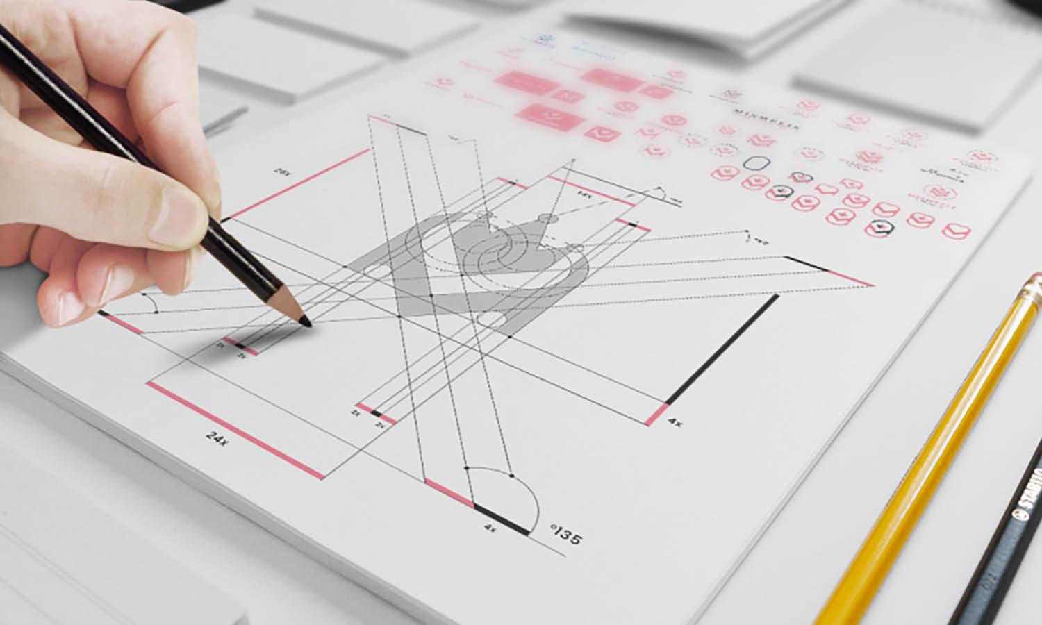
The digital age has equipped designers with an array of sophisticated tools for logo design, yet one of the most basic and powerful steps in the creative process remains sketching by hand. Sketching is the fundamental step in logo creation, where ideas take their first tangible form. It is an uninhibited and quick way to explore concepts, shapes, and arrangements that can later be refined on digital platforms.
The act of sketching allows designers to freely experiment with their thoughts, without the constraints of software or the temptation to settle too quickly on a single idea. It is in these preliminary sketches that the brainstorming process is visualized, and the raw essence of the logo begins to emerge. This step is crucial in translating abstract concepts into concrete elements that can make up the final logo.
For those learning the basics of logo design, sketching can serve as a low-pressure method to develop skills and instincts. It teaches designers to iterate quickly and to recognize which elements of a design are effective and which are not. Through sketching, a designer learns to distill a brand's identity into its purest form, an essential skill for creating logos that are both simple and powerful.
From a practical standpoint, sketching is time-efficient and cost-effective. It allows for rapid exploration of directions without committing resources to fully rendering each idea. Once a promising direction is identified through sketches, the designer can move to digital execution with a clear vision, saving time and ensuring the final logo is well-considered.
Sketching is more than just a basic step in the creation of a logo; it's an indispensable part of the design process that fosters creativity and innovation. It is the bridge between the conceptual and the concrete, providing a solid foundation upon which a memorable and effective logo can be built.

Created by Eddie Lobanovskiym | https://dribbble.com/shots/5684773-
Using Negative Space Effectively
In the realm of logo design, mastering the use of negative space is a basic yet profound skill. Negative space—also referred to as white space—is the unmarked area surrounding and within the elements of a design. When utilized effectively, it can transform a simple logo into an ingenious work of art, creating a dual imagery or hidden message that can intrigue and engage the viewer.
The power of negative space lies in its ability to add depth and secondary meaning to a logo. Take, for instance, the iconic FedEx logo. At first glance, it appears straightforward, but a closer look reveals an arrow formed between the letters 'E' and 'X', symbolizing precision and forward direction. This clever use of negative space adds to the memorability of the logo, enhancing brand recognition.
For beginners in logo design, the use of negative space requires a keen eye for balance and simplicity. It involves envisioning not just the elements you add, but also the shapes and spaces that are created in between. This can be as basic as the choice of letter-spacing in a wordmark, or as complex as integrating a whole new image within the logo’s form.
Effective use of negative space often requires a minimalist approach, where less is more. By stripping a design down to its essential elements, a designer can exploit the empty space in a way that brings additional layers of meaning to the design. It’s about finding the harmony between what is there and what isn’t, using the background as actively as the foreground in the design.
When designing logos, it's important to remember that negative space is not just empty space—it's an active component of the design. It should be considered from the very beginning of the design process, not as an afterthought. Mastery of negative space can elevate a basic logo into one that is sophisticated and compelling, a silent storyteller of the brand it represents.

Created by Mateus Araújo | https://www.behance.net/gallery/146841789/JIMMYS-PIZZA-DELIVERY
Incorporating Feedback and Iteration
Feedback and iteration are the backbone of a successful logo design process. These stages involve refining ideas, addressing potential issues, and evolving the design to better meet the client's needs and the brand's objectives. For those new to logo design, understanding how to incorporate feedback and employ iterative design is a basic yet critical part of becoming a skilled designer.
The feedback phase starts once the initial logo concepts are presented to the client. It's important to approach this stage with an open mind and a willingness to listen. Feedback should not be seen as criticism but as a valuable insight that can guide the logo towards its most effective form. This is where communication skills are as vital as design skills, as understanding the client's perspective is crucial.
Iteration, on the other hand, is the cyclical process of refining the logo based on the feedback received. It involves revisiting the design, making adjustments, and often, exploring new directions that may have emerged from the discussion. Iteration is where the basic ideas evolve into mature, polished designs that resonate with the target audience and embody the brand's identity.
Both feedback and iteration are integral to the logo design process, requiring patience and persistence. They ensure the design is not just a creative expression but a solution that works in the real world. This stage may involve going back to the drawing board multiple times, but each round of revisions brings the logo closer to its final, most effective incarnation.
Embracing feedback and iteration is fundamental to achieving excellence in logo design. It helps in creating a logo that is not only visually appealing but also strategically sound, relevant, and adaptable to the brand's evolving needs.
Conclusion
In conclusion, understanding the basics of logo design is pivotal for creating visual identities that are both timeless and effective. From leveraging negative space to embracing the iterative process of design, each aspect contributes to the crafting of a logo that truly represents a brand. Remember, a logo is not just a graphic but the embodiment of a brand's essence, making its design a critical undertaking. Whether you're a beginner or seasoned professional, revisiting these fundamentals can enhance your designs, ensuring they're not just seen but remembered. As the digital landscape evolves, let these basic principles be the anchor that grounds your creative ventures in logo design.
Let Us Know What You Think!
These fantastic logo design articles are written and curated by Kreafolk's team. We hope you enjoy our information and remember to leave us a comment below. Cheers!


Leave a Comment