10 Tips to Create a Good Flat Logo Design
Here are some inspiring tips you can easily follow to create a fantastic flat logo design!

Created by Vask | https://dribbble.com/shots/17055474-Dineup-Logo-design
If you are involved yourself in a business, then you should know people have started to leave the traditional and old way of business. Digital business has been a new trend in the business world. And as you noticed, you would see how the web layouts change from time to time.
The change is inevitable. The trends move all the time, and if you cannot keep up with them, then surely, you have lost the opportunity to compete with your predecessors, especially.
You should recognize how fast the web design trend moves. Some of them are quite subtle. The creation they use, especially on the iconic image as the representative of the business, could be very small yet, significant. They can just play simply with the use of color. From solid color then, they create the gradients on the background. In comparison, some others made a huge change to the whole plan, from the materials to the use of color and even putting a new image on the logo depiction.

Created by Ikram H Sakib | https://dribbble.com/shots/18242615-FRT
One of the most notable of these changes is the moves that happen back then in the 2010s. Many designs which apply skeuomorphism (It is when the objects are intentionally created to represent the real-world elements) transform into what is called flat design. A flat logo design is basically a style that highlights the simplicity and minimalism in the design. As a flat design, you can barely tell that this is a two-dimensional design that apparently, with its simplicity, has even made it a stand-out choice.
A flat logo design will actually be effective in boosting your brand. It is an artwork with two-dimensional and simple characters and is commonly made without highlights, shadows, or intricate details. And these should be the strong character of the design to make it even stand out in the crowd.
A simple logo, in particular, has proven itself useful in promoting the brand. Do you want some proof? Take a look at Spotify, Netflix, or Apple. Those are famous brands that applied simple symbols for their products. And you can see how effective it is, right?

Created by Vask | https://dribbble.com/shots/16347916-Leroty-Logo-design
Now, if you want to go with this kind of creative work for your brand, you may check the tips below.
A flat logo design will help you to promote the brand better. With its simplicity, people will acknowledge the brand much easier. However, this type didn't just come out and become today's trend. It started back then in the 1920s when the Swiss style emerged. Swiss style has also known as the International Style, where it found its criticism, but later on, it has its acknowledgment in 1940-the 1950s. Then, it becomes the firm foundation of graphic design in the mid-20th century all over the world. Various designs are finally progressing, and even today's approaches the flat design as the digital business has kept growing.
When you are intended to re-shift your iconic image into the more minimalist one, check out the suggestions below. There are some things you should know first when you want to create a simple symbol like this.
10 Tips to Create a Good Flat Logo Design
- Always Start From Good Research
- Get Ideas From Good References
- Consider A Strong Concept
- Simple Is The Best Solution
- Start With Geometric Shape
- Use Simple Fonts & Typography
- Consider The Color Contrast
- Check The Legibility
- Test The Logo In Different Sizes
- Be On Trend

Created by Vask | https://dribbble.com/shots/16726899-NEON-Logo-design
1. Always Start From Good Research
A good logo doesn't start from a sketch. Well, some experts may suggest you make a sketch first before you make a fixed one. However, there's something more important than that; that is, do the research first.
Remember that a logo is a representative tool for a company to tell the customer about the brand or products they offer, so that's why the icon should be made based on the knowledge of the company and the brands.
If you are a logo designer, do a deep discussion with the clients for whom you do the work. Explore as much information as you need to know about the company. Ask about the company history and what is the value the company believes. What is their mission, how do they react to the competition atmosphere, how do they want to compete with the competitors, what are their strategies to get into the right market, what are the target markets, and any information related to the character and the personality that describe the company and the brand. The more you know about the company, the more powerful the logo design you make for them. You can put the soul into the work you make, and so this vibe will be able to be delivered through the work, and people will feel that. As the people can relate the company logo with themselves, it will be a good point, so that they finally will be a loyal customer in the future.

Created by Gennady Savinov | https://dribbble.com/shots/16488087-Moore-Museum-Logo
2. Get Ideas From Good References
Inspiration or ideas may come in pieces, not in a full way around. In that case, you need to be very disciplined and meticulous. As you start to have a piece of ideas, write them down piece by piece until you have a wholly full idea and are ready with a concept. Moodboards are a good tool for making the plan of the logo. You may use them to conceptualize the materials that you have gathered before. Explore what is available there, and then you may help your client to visualize the art direction that you both agree on.
You can also check any other artists' creations and then learn some important points from there that are relevant to your work, and then you can take those elements from there to create your own.

Created by Milos Bojkovic | https://dribbble.com/shots/17095770-Decipad-identity
As you are ready with the plan of the work, consult your clients, and discuss whether the draft you have created has met their needs or not. If the clients haven't been satisfied yet, then you can start to discuss the revision.
It is also suggested that you don't only bring a draft only to your client. Bring them several options of your drafts so that they can choose which one they like most or which one represents their company most.

Created by Milos Bojkovic | https://dribbble.com/shots/14473494-Blocksy-logo
3. Consider A Strong Concept
The main concept of the flat logo is simplicity. This style should convey the idea of simplicity yet elegance. Therefore, the right choice of materials, colors, and other elements for the symbol is important. Through its simplicity, it has, it should still be able to communicate the brands well to the people when seeing the simple symbol at first.
The flat design always shows in two-dimensional shape, simple, with no shadows or highlights, and no delicate details upon it. Just remember, the main key is simple. Whether you use an image of a letter, your number one consideration should be: simple. Some international brands have been using this kind of creation for their business. Look at Apple. It simply shows in the shape of an apple, with a small bite on top of it. And see how successful it is. Now, who doesn't know what an "Apple" is? Another example is the Facebook app. It only has one letter with a solid color. And who doesn't have a Facebook account today? Now, you can see it, right?

Created by mparvej | https://dribbble.com/shots/17041251-Xevisn-Logo-Design
4. Simple Is The Best Solution
After all the materials are ready, then you can start to create the logo. You don't need to be worried about making some iterations. Perfection will come after all. You can first start with a silhouette. In making an artwork, you need to make a strong silhouette and don't worry much about what is going inside. Like any other artwork, the iconic structure is mostly recognized by its silhouette. So, here, in this phase, when you succeed in making a strong silhouette, then the first step is already done.
After finishing some concepts to be offered to the clients, then select them and work deeper with several of them which are closest to the client's demands. And make them in black and white first. Then the next step is to consult with the clients. Do not add color yet in this phase. Why? Because in this phase, you and your client need to focus on the draft first before it is filled with colors that may distract your attention.
If you don't want to do everything by hand, or you don't want to sketch, you can use the applications available on the internet. Just browse in the app, choose the logo templates, or use the free app to make a logo and customize your need there. Easy and not time-consuming.

Created by Tornike Uchava | https://dribbble.com/shots/18090829-an-abstract-logo
5. Start With Geometric Shape
A flat logo is simple, and the use of the basic geometrical shape is important to build such an image. Just like minimalist design, a flat logo style aims to create a distinct picture without any ornamental details. It is believed that a good and simple iconic symbol will have a long lifespan to be loved by many people. A famous designer said that when you look back into history, you will find that all memorable symbols are flat, like a star, a moon, a cross, or even a flag; there's nothing much about them. They are all flat. And those are even the ones memorable most.
By using only a certain sharp and strong shape, people won't get distracted by any other element in the logo. Imagine that when you see a symbol, and you're only looking at a single image or a single letter with solid color plus it has a great background to support the symbol you are making in the logo; then it will be difficult for you. To forget it, right? Or, the curiosity will at least intrigue you to find out more about the brand. And that is a good logo. The one which explains the brand well, or the one which intrigues people so that they try to find out more about the brand.

Created by Wesley Marc Bancroft | https://dribbble.com/shots/16592138-Finish-Brand
6. Use Simple Fonts & Typography
When you create a flat logo, and you need to put a letter or two into the plan, you should choose a readable and simple yet, elegant font. Most of the time, this artwork applies the sans serif font for those reasons. The various and delicate fonts may look pretty, but they won't help you to achieve the simplicity and the ability of the symbol to be memorized well and present a modern look.
The main focus of the use of the letter for the logo is basically to help people understand the delivered message. However, if you don't choose the right font, or you misplace them or mis-design them, it will have a bad impact as well. So, you'd better just stick to the simple choice and keep it minimum to get the maximum impact.

Created by Sumon Yousuf | https://dribbble.com/shots/18295281-Satr-Logo-Design
7. Consider The Color Contrast
Flat logo designs tend to eliminate delicate or ornamental elements from it. They don't even come up in several colors into a single display; instead, emphasizing the contrast is the choice to be made to make the creation eye-catching still.
This kind of style doesn't use elements like texture or gradients; a single color or two will be the choice made by the designer for the whole formula.
Since this logotype always comes up in a very simple design using only one kind of color or two, therefore, the use of the contrast technique is highly needed. Look at the Apple symbol. You will only find black and white colors in this kind of artwork. The contrast has made the symbol presents powerfully on any occasion or anywhere it is placed. Take another example, the simple iconic symbol used by Netflix. It only comes in a letter, N, with a strong red color, which has remained strong in the people's minds.

Created by Gennady Savinov | https://dribbble.com/shots/16519600-Molecula-Logo
8. Check The Legibility
The main point of the logo function is to communicate with the people so that they will recognize your brand at the same time they see it. As a businessman, you need to communicate your products fast to the customers, and the best to do it is by making a simple logo. As you put more information on the logo, it will consume more time for the people to read it, and it becomes difficult for them to understand your message. Just create a simple symbol for the icon of the business you are running. Get rid of some unimportant highlights or intricate details so that only a simpler shape is left for you. In that way, people will easily understand what your symbol means, and therefore, it will be memorable for them.

Created by Gabriel Hernandez | https://dribbble.com/shots/18160244-Bru-Coffee-Roasters
9. Test The Logo In Different Sizes
Flexibility means a lot in creating a logo. It means that your design can be reshaped or can be customized in any size it needs. A flat design with its simplicity is the perfect choice for flexibility. You can easily scale the size up and down per its media. So when you want to put it in a large banner outside of the office or building, it will still look good. On another occasion, you may need to put it on the heading of the company formal letter; then, you can reshape it in a sort of a way to make it look good yet firm. Or, when you want the image you make to look cute in the application icon, you can still make it that way.
The minimalist character possessed by the flat logo design will help you adjust it well in any media that you need.

Created by MD Mahfuj | https://dribbble.com/shots/16334224-Logo-Design-for-medisquare
10. Be On Trend
Simplicity has been the trend in the world today. Something simple and minimalist is preferable by the generations of today. Look at the housing trend; you will tend to find minimalist model houses much simpler than finding the other model of the house today. Well, the same thing happens in design, either graphic or illustration art. A flat design that brings the main theme of simplicity is more liked by many companies today. In the business, the idea is much loved by the owner of the business because it is simple, and there's no need for intricate things.
Besides, something straightforward is the other element contained in the portrayal, which is also the reason why this style is preferable today. People don't have much time in their lives. They need to go faster; they need to move faster; therefore, when they need to perceive any information, they tend to choose to be understood in a very short time. And this is what the simplicity functions here.
A flat logo design always appears with a simple meaning so that the information is well-perceived in no time by the people as soon as they see the icon. It doesn't take much time for people to understand it. In addition, as it is stated earlier that more people from today's generation like something in a simple way, the flat design is also good in delivering the idea of modern touch.

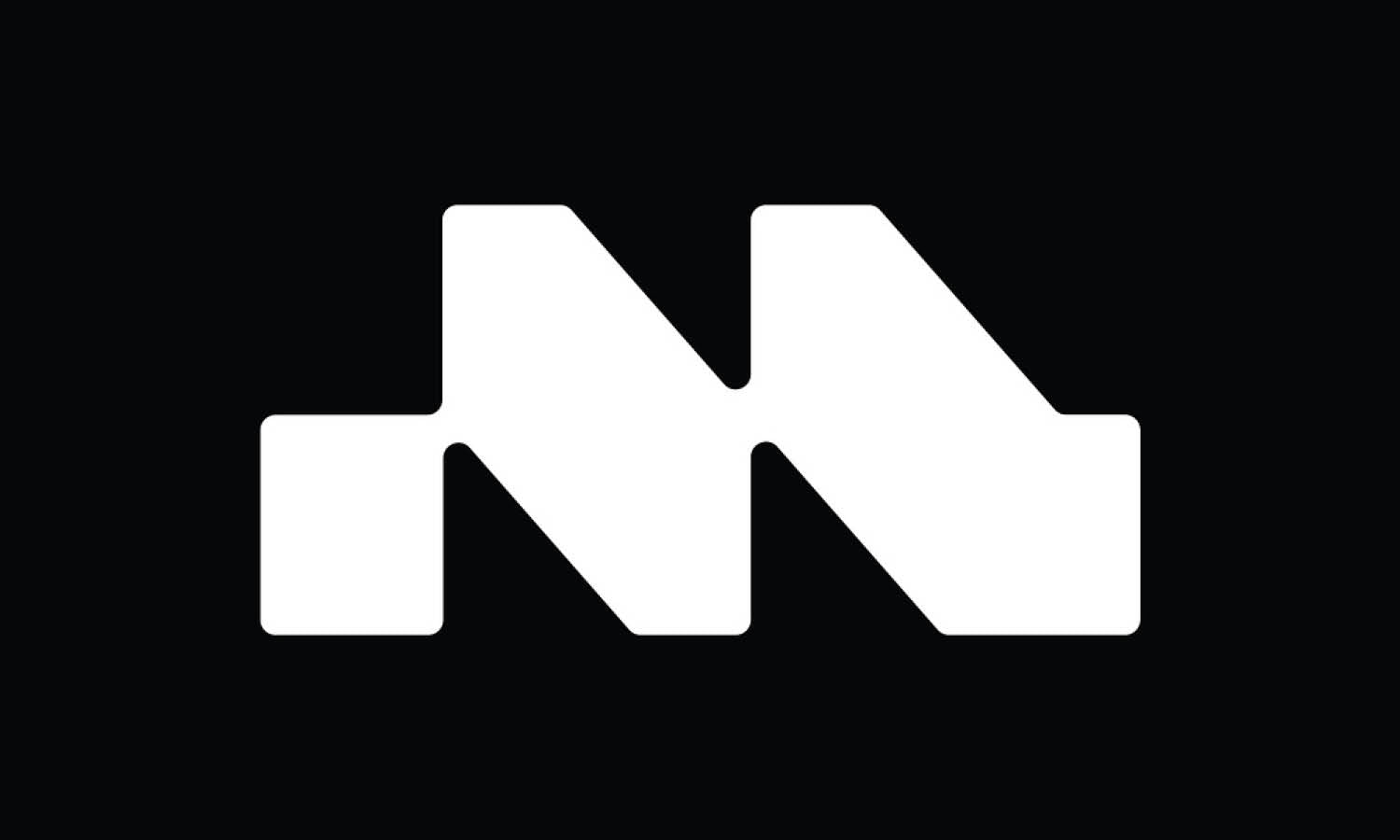
Created by Salma | https://dribbble.com/shots/17911278-Real-estate-logo-design-Letter-M-logo-Modern-M-letter-logo
Final Words
Now that you have already known the things you should keep in mind before creating a flat logo design, you can start to get to work then. Once you can make a good one, then it is a sure thing that other types are not going to be a problem for you at all.





Leave a Comment