10 Tips To Create A Good Construction Logo Design

Created by Rahul Bhogal | https://www.behance.net/gallery/115192241/Spline-Group-branding
Construction businesses and industries tend to have a strong and heavy stereotype. It goes with the fact that those aspects are the essential essence of the service itself. The said points are something that designers love to create a memorable and corporate logo design. It is straightforward, direct, and literal. A very traditional and old way to reflect the company.
But it does not make the process of making a good construction logo design easier. A huge amount of logos under construction and building categories fall into stereotypical imagery. It later turned into an adverse effect on the company's recognizability, identity, and personality. Everything looks similar; in the worst case, the design appears the same.

Created by La Libertat (TNC) | https://www.behance.net/gallery/104628959/PEITA-PAINTING-CONSTRUCTION-Branding
For a company identifier, a logo should be a very distinctive aspect of the company. No matter the industry or the business area, great research and planning help avoid the harmful trend and the stereotypical imagery trap. To help you generate the idea and plot the best construction identifier, try to keep up with the following tips.
10 Tips To Create A Good Construction Logo Design
- Good Process Creates Good Result
- Look At Your Competition
- Use Symbolism To Tell A Story
- Make Sure It's Relevant With The Brand
- Consider Use Or Create A Custom Font
- Choose Your Color Carefully
- Keep The Visual Simple, Relevant, and Original
- Check Its Readability
- Avoid Common Tricks And Trends
- Keep It Modern And Professional

Created by Milk Network | https://www.behance.net/gallery/31421643/Levels-Contracting-est
1. Good Process Creates Good Result
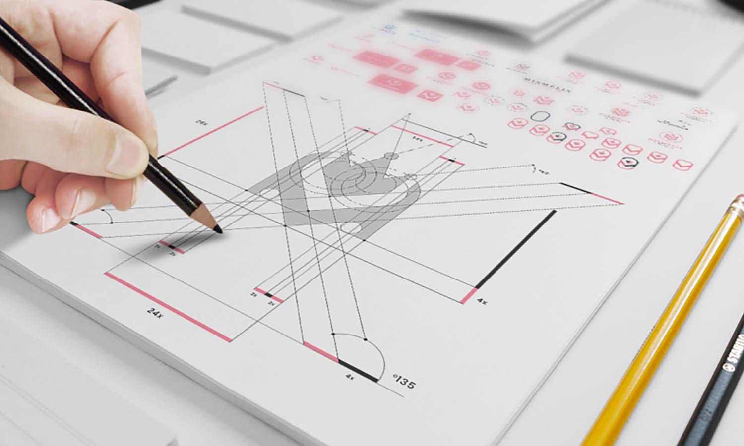
Since the construction industry comes with its unique challenge, going with the old-fashioned logo design can be a great way to solve the confusion. The tips highlight the use of very common imagery for the logo. Creators can use some resources such as building frameworks, ceilings, walls, roofs, tools, or utilities.
Even though the imagery or ideas seem pretty common, the designer has the chance to add personality to the images. Creators can modernize the image, adding slur and unique symbol meaning or looking for a new perspective in delivering the common image. That will help make a unique construction logo design.

Created by David Hortobagyi | https://www.behance.net/gallery/85843215/Progressive-Offices-Brand-Identity
2. Look At Your Competition
The best idea to create a good logo design is to keep the work in the field or market. That is why some creators or designers will do extensive research on the market trend and competition for inspiration. At the same time, competitions are there to help determine what kind of step or idea to use for the logo.
In many senses, you learn about the competition to prevent or avoid using similar-looking work. Remember that the construction industry is pretty vast, which means the chance of having similar works are high. Checking this competition and market helps you learn what is good and what the market looks like.
Another function is to create a logo that the design stands apart from the competition. In other words, make a construction identity that appears distinctive and understand the business. A great input of inspiration also comes with its positive insight. So, you can customize or try something that helps create a distinguished identity in the market.

Created by Parámetro Studio | https://www.behance.net/gallery/61080321/DOER
3. Use Symbolism To Tell A Story
What makes a logo design memorable is the imagery or the visual. In many cases, the best option is to go with the icon. It comes with the fact that humans can remember images better compared to text. Going with symbols and icons is the best pick to create a logo. But despite its preferability, creating one for a construction business comes with certain tricks.
In an industry that is full of literal meaning, creators can try playing with certain simple imagery tricks. The first one is going with straight lines. Straight line visuals are easier to see, and it also composes a special effect of leading the audience's attention or eyes. The control comes from the line that can go from up and down or side to side.

Created by Mubien Studio | https://www.behance.net/gallery/111415691/Fenway-Center
When implemented in the logo, the design will create an efficient message delivery. It helps the audience see the image but also goes to a certain focal point, the construction company name. Another good point of using straight lines is to imprint a sense of efficiency, balance, and organization. Meanwhile, the curved lines are considered more casual and playful.
Using geometry is always a great option for construction logo design. In general, it is always the best solution for simple, minimalist, or modern visuals. But when used for construction business, experimenting with squares and triangles can bring extra meaning. In a sense, the simple shape reflects the meaning of organization and stability.

Created by Regular | https://www.behance.net/gallery/48157059/DK
The two images are what a good and trusted construction company needs to exude. Not only that, the defined geometric shapes are an ideal option to create an impression of confidence, power, and order. In that sense, the logo can provide the best image for the company. Take the example of Cat, the heavy-duty tools company kin to construction and building function.
When the simple imagery of lines and shapes is not enough, logo design can also appear more literal. Some famous companies out there pretty much use construction imagery to state its meaning. Housing, roof, high-rise building, hammer, tools, cranes, or worker hats are pretty good options to tell the business.
Not only does it create clearer imagery, but when used properly, the logo can showcase a significant story of the company. Take an example of adding tools in a house silhouette. The unique rendition of imagery constructs a meaning of how the company works. It includes developing, finishing, and caring.

Created by Continuum Agency | https://www.behance.net/gallery/74396963/Navigator-Residential-complex-branding-logo-identity
4. Make Sure It's Relevant With The Brand
The main point of having a logo is to make an identity or something that reflects the company's business, services, or personality. Thus, the obvious tip every designer needs to highlight is to ensure the imagery or the design will reflect the company. With that in mind, it realizes why and what makes a great logo for the construction business.
The best answer to the question is trust. A design, a logo, an identity that reflects the trust or legibility of the construction business. One way to create that impression is by appearing professional, quality, and impression to trust. To make it happen, the first thing people will see is the company logo design. In other words, an identity that reflects the company.

Created by Aleksey Busygin | https://www.behance.net/gallery/86198861/Hilti
It is given with the fact that a first impression can lead to the next action. In the construction and building industry, the cutting-throat market forces one to appeal to the audience in a great way. Since the logo is the first thing to see, make sure the design respects and delivers the message. Take an example of professional residential construction service.
To express the said "professional" impression, the logo should do the same. It can appear with a dignified color, a strong, bold, and professional font, or appeal to the audience with a professionally rendered visual on its icon. You won't want to use a template or stock image. Creating customized imagery, high quality, and meaningful image, plus a good color pick, can share the same impression.

Created by Alexey Akhmetov | https://www.behance.net/gallery/92512705/BRICK-CONSTRUCTION
Not only about professional mannerism. A properly reflecting construction logo design can also appear by highlighting the main message, vision, or the niche of the business itself. The said industry has many to offer, from offering building services, supplying workers, selling materials, or focusing on certain areas of the building.
That aspect of message and services is something you need to deliver throughout the logo design. Imagine the company works as a real estate broker or project management consultant. The designers should pick the best design that reflects that service, not going with the stereotypical image of a bulldozer or truck image.

Created by Zupagrafika | https://www.behance.net/gallery/42523447/SPP-Branding
5. Consider Use Or Create A Custom Font
The next part of the construction logo design is the font or the typography. It is best to remember that font and typography have their meaning and impression. Since the project is for serious services that need to instill a sense of strong, trust, and quality, the logo needs to use a font with a similar look. Thus, the answer is to use clean and straight fonts.
Talking about fonts, creators can use the default or common options under the Serif category. A bold and blocky texture can also reflect the company images. Take the example of Garamond, Europe, or MagistralC. Each of them has a pretty clear design with a strong styling. When used in logos, the design can come along with the construction image.
Another good idea in picking fonts is to make a customized one. Many designs for construction will go with a direct and clear image. But, working with a customized style helps add a personality to the design. Take an example of a construction niche with brick highlights in it. The creator can add brick texture to the font or the logo design.

Created by Ville Oké | https://www.behance.net/gallery/84928107/Relay-Visual-Identity
6. Choose Your Color Carefully
Color is another element where the logo reflects the construction company. In general, the vast option makes the idea of no definite pick of the best color for a logo. No matter the industry, it tends to have its particular styling. In a construction company, the common color pick is something that can exude a sense of strength, balance, and trust.
However, the color should reflect and also relate to the company's identity. In many cases, logos are part of the branding strategy. It means the hues for the design come as a uniform selection. You won't want the final logo design to appear too different or look the opposite of the company image. If the brand personality uses yellow or orange, try to adapt it to the logo.

Created by Eva Design | https://www.behance.net/gallery/114122271/Koncreto-Branding
As you can make a unique color set for the company, pay attention to the meaning, combination, and meaning. Pay attention to what you can learn from the psychology of colors. The hue can develop emotional cues and make the audience feel something. It has a similar effect to the image and font. If it is harder to pick the color, try to consider simple and bright hues.
White can create a sense of hygiene and simplicity in construction. Blue is the most common pick for security and control. Red will add an emotion of passion, power, and determination. Yellow and orange are also the two warm colors commonly used in logo design that try to emphasize positive energy.
In many cases, the color option for construction logo design is varied and free. The key is to come back to the company branding and personality. But to ensure the pick works its best, try to limit the choice between 1 or 3 with a clear combination. It will help the logo easier to remember and identify.

Created by Agi Haxhimurati LLC | https://www.behance.net/gallery/116666217/QUADRANGLE-Branding-%28London-England%29
7. Keep The Visual Simple, Relevant, and original
Even with the leeway in adding imagery or visual options, a good construction logo design always appears simple, relevant, and original. Simply refers to the limitation of color and fonts, for about two or three at most. It is also applicable to the image details. An overly detailed logo will not do anything, especially when the imagery is used on a smaller scale.
Relevant refers to logo design and its ability to reflect the company (as said in point 1). Relevant can also be associated with the market, niche, product, and personality. It covers every element of the design, including the color, font, images, or meaning. And lastly is original. A good construction logo stands out amid the noisy and cutthroat industry.
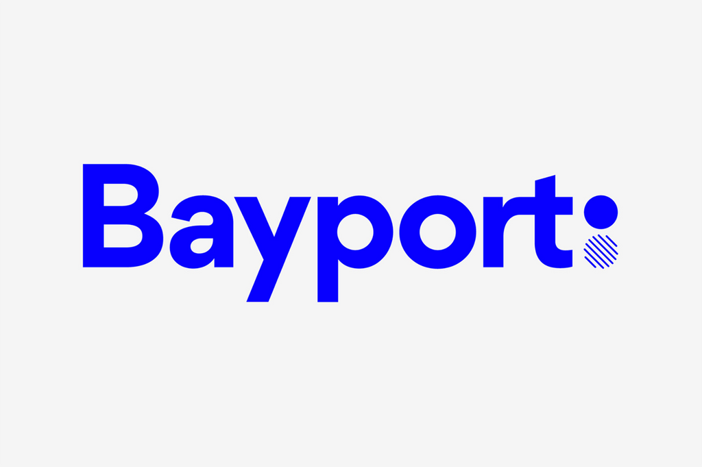
Created by A Friend of Mine | https://www.behance.net/gallery/67593009/Bayport
8. Check Its Readability
Logo recognizability still relates to its readability and understandability aspect. No matter how complex the image is, the design will be less noticeable if people cannot understand or remember the meaning. That is why the deliverability of the design is part of a vital aspect of the creation, especially for construction businesses that cover a huge range of possible services.
The readability aspect can be broken down into several points. The first one is the use of font and choice of typeface. It's not only relatable but also something that people can read. Thus, avoiding handwriting or script fonts can help. Another point goes to size and hierarchy. A text that is too small will lose its readability with a smaller scale logo.
The readability point is also associated with the use of color contrast. Make sure the font has a great contrast with its background, and use an opposite color for better contrast. Meanwhile, understandability can refer to the proper image in construction logo design. Inappropriate detail addition or too abstract imagery can cause confusion. Thus, refer to a simpler style.

Created by Ig2 Montreal | https://www.behance.net/gallery/48937729/Fenplast-lg2
9. Avoid Common Tricks And Trends
The trend in a logo can be a big pitfall since the popular details or ideas are likely to die in a short time. But not all trends cover or have the same effect. Designers need to be smart in filtering the best trend that can be adopted or avoided. Take an example of a trend in color palette or font style. In a year or so, the trend can die down.
The solution to this situation is not merely avoiding any trend. In one way or another, every construction logo design or any other industry will need a rebrand. But constant rebranding is harmful to the company's identity. Thus, try to make a timeless visual identity. It can be simple, direct, and clear imagery for the company.

Created by Valeria Weisz | https://www.behance.net/gallery/47861515/Sport-Construction
10. Keep It Modern And Professional
Other than that, it is also a good idea to keep the creation more literal but not too logical. When crafting a logo for a construction business, many renditions appear more literal. All thanks to the pretty stereotypical imagery the industry is. But it can also help make a more modern style design, which composes a very simple and literal image with better clarity.
Sometimes it works to add modern technologies, spacious, or commonly used details in the construction work. To make it more modern and stay cohesive with the current community, the literal image provides a hyper-focused meaning. That is something you can get, which also helps deliver the meaning or information directly to the audience.

Created by Łukasz Kokosiński | https://www.behance.net/gallery/30012361/Afrobat-Construction
Final Words
Similar to many other logo designs for various industries or companies, designers need to pay great attention to making correlated imagery. In many ways, a successful logo is not only about its visual and attractive style. But it should also be a proper visual identity for the construction company itself. Thus, the first thing to put in mind is a design that reflects the company.
The next thing to do is to ponder around the three main logo elements, the image, font, and color. Make sure the three of them are relatable, create a concept, and work together. To help gather ideas and design inspiration, designers can check out the competition and market. It is also a great move to figure out the real bar or standard in the construction industry.

Created by Shift | https://www.behance.net/gallery/50540997/GRUPO-SALTOR
The rest are about how to grasp the styling and its overall appearance. A great logo design should appear simple, readable, and recognizable. Designers can do anything from trying a modern style or making up with the old-fashioned process to creating a distinguished identity. In many ways, being wary of trends can help the overall construction logo design process.
In the end, it is safe to say that creating a logo and its proper design demand a great amount of planning and research. For the construction industry, designers need to learn more about the company, its message, and its personality. The gathered information can help provide the best elements and ideas for the work, which shapes the best final result.




Leave a Comment