10 Tips To Create A Good Circle Logo Design

Created by Kristian Grljević | https://www.behance.net/gallery/143146011/Logos-Marks-Vol1
Despite looking pretty straightforward, the process of logo creation is particularly unique and complex. There are tons of elements where the design can create an immense meaning and a certain impression for its audience or product. One of them is the shapes, how the brand will look good or appropriate in certain shapes.
This is where many creators need to determine the proper shapes for their logo creation. Circle, in particular, is famous and commonly used for varying logo designs. But what makes a circle logo design appear or has its unique appeal come from its meaning plus styling. There are certain tips and ideas that the creator needs to consider.
Before going to the tips and creation, it is best to learn why shapes matter for logos. In general, the logo's shapes and imagery can stay memorable compared to its name. There are also varying associations of shapes and their meanings. That is why circle or many other shapes has a pretty crucial function in design.

Created by Tania Martínez Cerqueira | https://www.behance.net/gallery/90851863/Personal-Branding
Circle, in particular, is part of the generic geometric shapes. The non-linear appearance makes it easier to understand, has many possible usages, and is used as many universal symbols. But due to its no edges aspect, adopting the shape comes with its unique share of challenges. Creators need to fully use the shapes, which both restrict and form the logo design.
With that point in creation, it is best to underline that adopting a circle in a logo does have its unique trait and styling. As the shape is universally used for varying works, it can also make a logo design process successful or missing. At worst, it can make the logo appear cheap. But with proper planning and tips, you can make it impressive imagery for a visual identity.

Created by iframe design studio | https://www.behance.net/gallery/144373881/Logos-Marks-2021
1. Understand The Audience, Company, and Product
The company, product, and audience information are some of the pivotal matters designers need to understand before introducing a circle logo. The idea comes as the information is known as the fundamental details that will shape and form the design itself. Without a doubt, the process of learning about the information becomes the first point to pinpoint.
Talking about the company, some clients might have their preferred essence and impression of the circle logo design. Take an example of BMW, which is the logo with its simple color but high-end impression. That is the essence that was meant to explain the product, an automatic giant with luxurious cars. That is why product and company impression meant a lot in design.

Created by Milán Prischetzky | https://www.behance.net/gallery/110937517/Organized-identity
Not only their impression but the audience details are also key in developing a successful logo. Circle has its unique usages, which can cover varying types of customer levels, degrees, and people. The circle is also a versatile geometric shape that can blend for both women's or the man market. However, each audience also has many other elements related to styling.
Take an example of a female-based audience, which has a particular color style and visual imagery. Those details should help the creator work around the circular shapes and develop the best logo design fitting with the purposes. In other words, working with a circle logo demands more research to fit the impression, audience, and product.

Created by GAX Creative Studio | https://www.behance.net/gallery/127153231/BrandFolio-1
2. Start From Basic Shapes
Even though the circle is known for its versatile geometric shapes, the option also has its particular meaning. Before fully embracing the imagery or visual design, try to understand the meaning behind the shapes. As part of the geometric shapes, the circle has its popularity and versatility to offer. But it also has associated meaning in its uses.
Circle has no edges and is mostly a popular choice across industry or company impressions. In its appeal, the circular emblem emphasizes the feeling of softness and roundness. That is one of the reasons that circle logo designs are likely associated with femininity. But at the same time, the lack of edges or line breaks also provides a meaning of continuity, security, and protection.
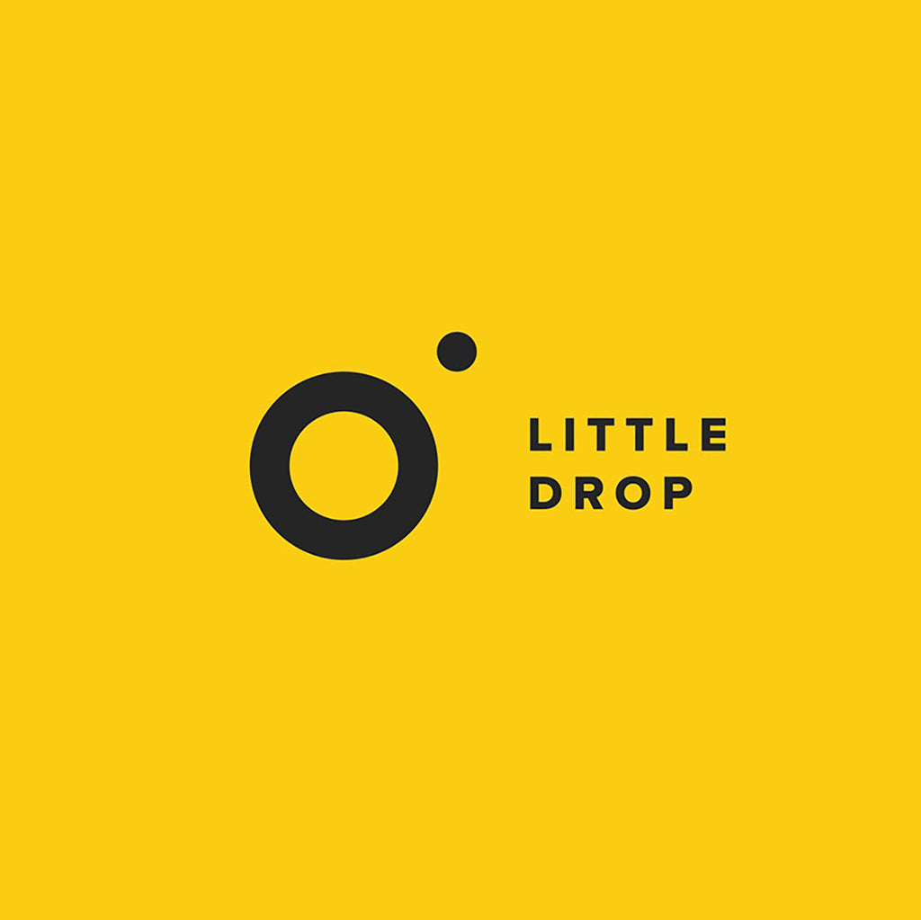
Created by Anna Kuts | https://www.behance.net/gallery/29975481/Big-Drop
Circle shapes are not only the perfect circular looks; some designers include ovals as part of the category. Sometimes, it can also include multiple circles combined. Given the fact that the logo should appear unique despite the shape options, putting those unique geometric shapes is considered proper.
On the other hand, the unique shapes and styles tend to offer different representations. Multiple circles found in the World Olympic symbol are often associated with love, support, community, continuity, and infinity. Logo design with circular shapes is considered very common, which increases its difficulty. Designers need to think out of the box to make a unique identity.

Created by Only1Mehedi | https://www.behance.net/gallery/122233743/Onid-Logo-Design-App-Logo
3. Pick A Good Design Style
Circle logo design is widely used for varying businesses and industries, making it one of the most versatile shapes you can use. At the same time, it also comes with a certain challenge to emphasize the visual identity. That is why the variation of styles can help creators in many ways. The style refers to the ideation of the works itself.
You can check out the vintage images in the circle-based logo design. It comprises fantastic uses of iconic color, font, and visuals. A more modern style can also appear unique with flashy or vibrant colors in the emblem. The design elements and how the creator, you, comprise the visual styles can also make a difference.
Take an example of Starbucks coffee, which complements simple fonts with a visual mascot in the middle. It comes with a similar recipe as KFC's logo, but the style makes the two of them widely apart in their impression. You can also find design styles under the minimalist works using mostly monotone colors of black and white.

Created by Mila Katagarova | https://www.behance.net/gallery/119738403/Circle-based-logos
4. Check The Brand Consistency
As much as the creator has the leeway to play around with styles and elements, it is best to stay loyal to the brand's consistency. Brand consistency relates to how the company uses its brand identity, impression, and styling. Most of the time, clients have personal preferences and unique styles to use in the circle logo design.
At one point, the circle emblem project might be part of the rebranding works. In other words, you, as the creator, have to stay with the brand identity. Take an example of Mozilla Firefox, which is identical to its blue earth, curling orange fox, and fire-like tail. The circle design evolution did not lose its brand consistency, despite having several overhauls overtimes.

Created by Graphéine | https://www.behance.net/gallery/96490581/Ferney-Voltaire-Brand-design
The reason for pinpointing the consistency also goes with the fact that circle design is pretty common. Losing company identity only makes the business lose its traction in the market. In the case of logos, brand consistency meant a pivotal role. It serves as an identity for the widely used visual impact in the market.
Providing brand consistency itself can appear in many ways. You can stay consistent with the circle shape, the color, text or typeface, or the associated meaning. Take an example of using a monogram and simple sans serif typeface. Other than staying close to the brand, it also helps improve legibility, recognizability, and memorability.

Created by helve tian | https://www.behance.net/gallery/60572213/Emblem-Logo
5. Choose A Suitable Color
Color in a logo means more than just beautification. It is one of the pivotal elements in the design, which also has a lot of hidden or psychological meaning. When it comes to a circle, there is nothing considered a color limitation. The logo and company's branding should be the same, including the use of some similar color identity.
Many will say that vibrant color is the best for logo design. However, it should depend on the company itself. Color can attract and be widely used to fit the company's message, product, delivery, and demographic target. Atlas sign with oranges color is a great example of a simple design. Its concentric circles of orange and yellow make it stand out.

Created by bishoy yousry | https://www.behance.net/gallery/138994431/Red-Moon-logo
However, it mostly tries to deliver the company's impression that conveys optimism, dynamic, and youthfulness. It is considered a playful color, which is why you can find similar elements for soft drinks, a children's logo, a fun design, and a similar style. In general, you can categorize color options into warm and cold.
The cold option makes a stronger and more professional impression. That is why some designs with blue, black, gray, green, and similar cold hues are used by important and professional companies. Meanwhile, red, oranges, yellow, and many other warm colors are likely used for circle logo design meant for culinary, young, modern, or fun impressions.

Created by Brandon Nickerson | https://www.behance.net/gallery/143352723/Logofolio-2021-2022
6. Play With Typography
The next thing you need to pay attention to in a circle-shaped logo is the text or font. The font, in general, means typefaces, which you can find from a simple sans serif, serif, to fancy-looking script. When it comes to text or fonts, you need to ensure the text fits with the company's impression or audience.
The most common combination is using a script for luxury or feminine imagery. A serif block font is popular to combine with circle logos made for prestigious, formal, or well-known brands. The design and its look widely vary depending on the project itself. But to ensure the text is readable, it is best to use the straight serif style.
Considering the lack of space, one of the best tricks is to curve the text. Many will say that the trick is pretty common for vintage looks, but it can also be a solution to accommodate more information. It goes with the fact that some companies might be longer than the available space in our outside-the-circle logo design.

Created by Dlanid | https://www.behance.net/gallery/99714773/Caribou-Home
With that in mind, curving the text helps put the information inside. It can be the company name, catchphrase, or small points to highlight. Arched text in a circle logo can also add a deeper meaning or add particular visual attention. All because the curved text appears different from other elements.
Other than curve text, there are also many styles and unique ways of providing text in a circle-shaped logo design. One of the solutions is to add elements such as a crossing line, ribbon, or horizontal space for the text. Some other logo designs go beyond with overlapping text on top of the sphere, such as Poppy Hamilton or Burger King.
When it comes to a round logo, it does not mean that the overall work should be inside the circle. It is best to say that many designers prefer to use sphere shapes and design as the containment of certain formulas, such as mascot, visual hierarchy, colors, or initials. Meanwhile, the text name or the company identity is located outside the circle.

Created by Mel Bruning | https://www.behance.net/gallery/44348743/Of-Nourishing-Nature
7. Check The Visual Hierarchy
As said in the previous point, the creator can add visual hierarchy to make or add deeper meaning to the circle logo design. Circular shapes do not mean the limit it can be the main or the second aspect of the symbol itself. Regarding the visual hierarchy, you can work with several fundamental options to add to the design.
The first one is mascots, such as Starbucks or KFC. The two logos have their mascots inside the ring, making them part of the pivotal identity of the brand. Other than mascots, there are many other visual styles and additions to make a statement in the logo design. You can make a unique identity by using dots to create stylish imagery and patterns.

Created by Anon Nantanavanich | https://www.behance.net/gallery/138385433/CONCRETO-BRANDING
Rainbow color logos are also very popular in the modern spectrum. You can see it from the Google Chrome circle logo, which is pretty simple but still delivers its meaning and unique aspect. Going more abstract with lines, a combination of shapes, to a visual that represents the product will also work the best. Your best examples are Burger king and Pepsi.
Sometimes, a circle does not fully refer to the circular shape itself. Some innovative creators out there use the circular style to shape or contain image boundaries, such as the Flying Fish seasonal Texas seafood. The shapes are made thanks to the curved text. Meanwhile, the center is a fish graphic shaped in a circular form.

Created by Nikolai Parshin | https://www.behance.net/gallery/144376169/Logofolio-2022vol-01
8. Pay Attention To The Golden Ratio
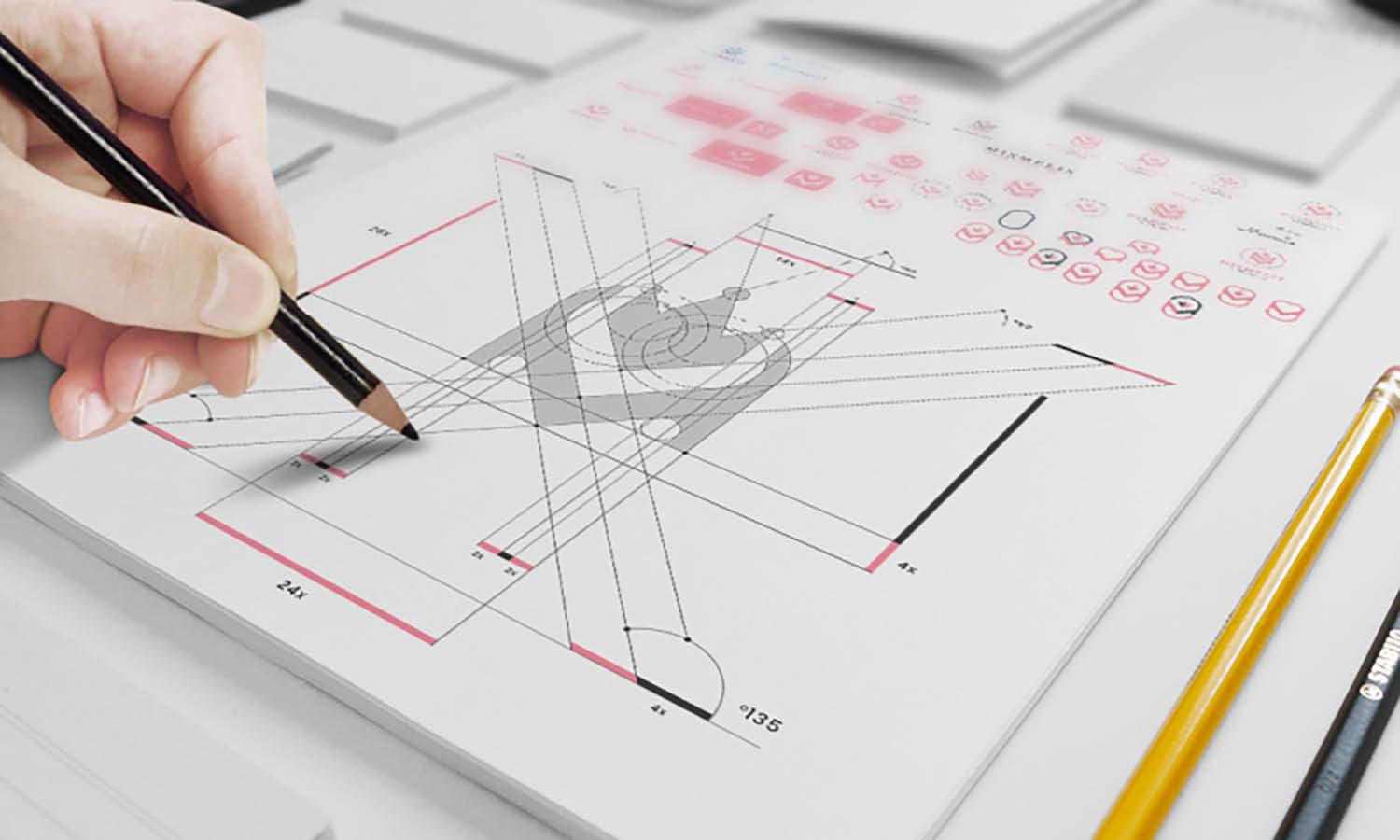
Golden Ratio helps make the circle logo design more appealing to the eyes. While it is not a universal formula used in every logo, it can be a good tip with a sphere shape. The golden ratio principle with some design techniques can work wonders. The ratio itself is a mathematical proportion that refers to 1 to 1.618. It needs some practice to apply.
Generally, the golden ratio meant the designer needed to put a certain aspect in one location as a focal point. Most of the time, it is located in one of the intertwining lines of the ration. The lines are made by splitting the screen into 3x3 boxes. So, the hot focal points on the circle should be around the top or bottom left or right.

Created by Hubert Siemiński | https://www.behance.net/gallery/142171347/Brand-Identity-Round-Records
9. Try Use Symmetry
While the golden ratio is good, many still have problems implementing the principle in circle-shaped logos. The best solution to the situation is to go with a symmetrical design. A symmetrical image also represents stability, firmness, and reliability. In human eyes, it is also easier to perceive. Thus, creating a desirable, memorable logo design.

Created by Sanaullah Ujjal | https://www.behance.net/gallery/106674029/CuFo-Logo-Design
10. Keep It Simple
Keep it short can apply to how you use the name or apply the company name in the circle design. Due to the smaller space, try to keep everything short to 1-5 characters at max. If the name is too long, go with the initial or acronym. You can put the name outside the circle, but using a wordmark or monogram adds a certain style to it.
One last thing to consider when working with circles or any shapes of logo design is to keep everything simple. Circle, in particular, has unique and versatile shapes to use. But the limitation and its looks tend to make the design cramped out. That is why going for simple imagery, style, color, or text is preferable.

Created by Graphéine | https://www.behance.net/gallery/113281355/CCO-Brand-identity
Final Words
To conclude, creating a good circle logo design refers to many fundamental measures. Designers need to learn further about the company or the clients, including the background, impression, and audience. With that information, creative workers can make a proper interpretation and visual style using the ring as geometric shapes.
As circle also comes up with its unique challenge, the key to developing the logo is by taking a simple and short design. Keeping brand consistency is also the key to the process. After that, designers can work around many other elements, such as color, text, and visuals. Adding another touch of design style and technique can also ramp up the visual value.

Created by Ethen Eulcheol Park | https://www.behance.net/gallery/99726355/4CAST
That is why many designers can implement or pick the proper design style. The styles can vary from vintage, modern, minimalism, old style, chic, fancy, or anything. Creators can also underline the proper use of symmetry and the golden ratio, which is the key to making the circle logo design easier to remember, perceive, and be unique.
Overall, working with logos comes with its design challenge. Circle shapes, which are famous ones, do have their share of unique applications. One might have to work around with simple visual imagery, arrange the text or color properly and use a golden ratio or symmetry to embrace the fully functional circle-shaped logo.






Leave a Comment