10 Tips To Create A Good Boutique Logo Design
Here are some inspiring tips you can easily follow to create a fantastic boutique logo design!

Created by Zero Design | https://www.behance.net/gallery/139576619/Joice-Fashion-Branding
A boutique logo design plays a major role in helping your business thrive amidst heavy competition in the fashion industry. A catchy and attractive sign can easily distinguish your boutique from the competitors, allowing you to create effective branding for a solid foundation.
Your fashion boutique requires a logo that represents exclusivity and elegance while creating a bond with customers. It should help the audience build trust with your business, allowing you to earn loyalty that promotes higher returns in the future.
Furthermore, an effective boutique logo design should have the ability to improve a connection with your audience and attract them to learn more about your business. As a result, it can help nurture credibility that leads to happy customers.

Created by Saif Zain | https://www.behance.net/gallery/121515575/Komode
A good drawing is not only a visual pitch of your boutique, but it is also a work of art—at least, that’s what people expect from your fashion house. It requires your creativity and deep thought to build a boutique symbol that truly represents your business value, professionalism, and quality.
Your logo helps build a positive reputation among competitors. For this reason, it is essential to create a genuine and one-of-a-kind boutique trademark that will bring positivity to your business as a whole.
There are so many aspects to consider when creating an impeccable boutique logo design, from elements to color choices, fonts, and readability. Paying attention to these aspects allows you to create a proper mark that is not only visually attractive but also memorable.

Created by Atul Charde | https://www.behance.net/gallery/136089113/Senora-Undergarments-Branding-Project
Whether you begin to sketch a sign for your fresh boutique or you plan on a redesign, there are some helpful tips to make your artwork stand out. We have put together the top 10 tips you need to know to create a good plan for a fashion boutique. Take a look at the following list.
10 Tips To Create A Good Boutique Logo Design
- See What Other Popular Boutiques Do
- Always Start From Paper
- Don’t Over Complicate Your Design
- Simplicity Is Beauty
- Try Using A Classy Font
- Make It Classy But Slightly Different
- Use Color To Represent Your Personality
- Always Have a Nice Emblem
- Test Your Logo Readability In Various Sizes
- Test Your Logo With A Mockup
1. See What Other Popular Boutiques Do
The fashion industry is a lucrative battlefield that invites countless players to join the competition. Design houses, clothing outlets, and fashion boutiques are abundant, so it is essential to introduce your unique business through effective branding.
How to build effective branding? Doing extensive research on your competitors offers a brilliant solution to help you create a distinct boutique logo design. Make a list of popular boutiques and find possible reasons why they can build engagement with the audience using such logos.

Created by Brand Brothers | https://www.behance.net/gallery/142567285/Losanje-Brand-identity
Make thorough analysis as possible related to the elements, including font options, patterns, color choices, and even catchy icons (if any). You might also want to figure out the meaning of the symbol so you can understand the reasons behind the sketches in question.
You can use either local or international fashion boutiques as a source of your inspiration for boutique logo design. Handpick only ones that have similar values and characteristics to your business.
Finding inspiration from other popular boutiques doesn’t mean you can copy their ideas to your own. Not only because plagiarism is a big no-no in the creative industry, but your logo should set you apart from other businesses. That’s how your audience and prospective customers can easily recognize your presence.

Created by Adriano Pereira | https://www.behance.net/gallery/141216793/BOHOMIE-BOUTIQUE-2022
2. Always Start From Paper
Plenty of graphic design software is available out there, allowing you to pick a program that meets your skills. These programs come packed with a variety of tools that help you make creative sketches, including boutique symbols.
You might be tempted to get your PC or tablet and start creating possible logos using your favorite graphic design software. But it is important to note that starting from paper is always the best decision for it has several advantages.

Created by A. Lina. Design | https://www.behance.net/gallery/144447663/Clothing-brand-brending-dlja-magazina-odezhdy
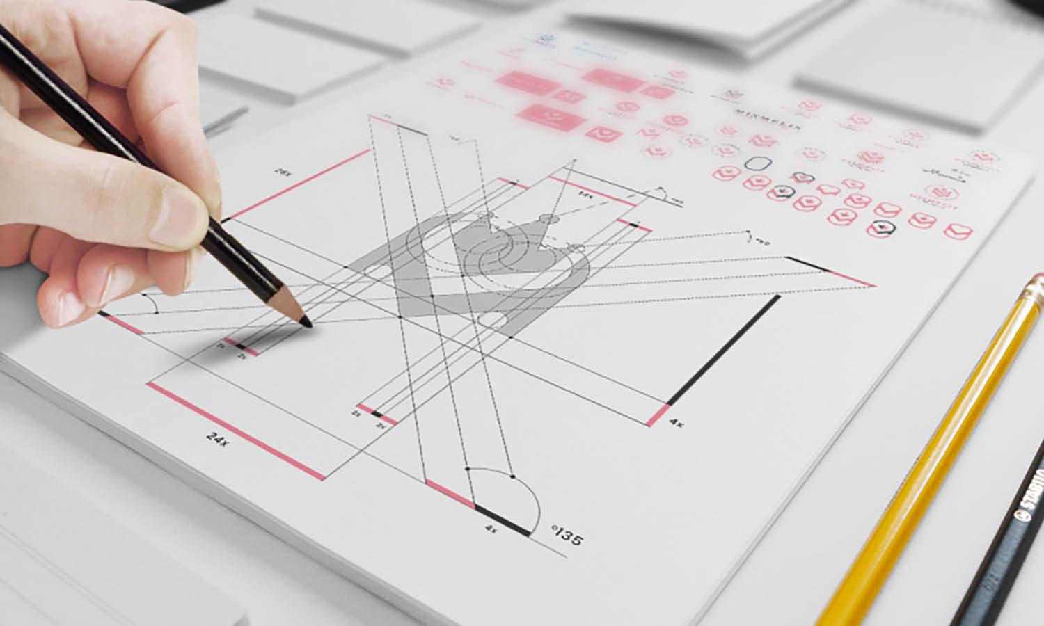
When your mapping process starts with pencil and paper, ideas will flow more naturally. This is because you can explore your creativity during the brainstorming phase without being distracted. You can also get rid of rules that commonly exist in most relevant programs.
Besides, sketching and outlining on paper helps improve your work efficiency. It lets you save time and energy on the computer, not to mention it prevents you from fatigue and red eyes because of too much screen time. Only use the computer when you already have the possible drawing.
Don’t worry; this is what many professional designers and graphic artists do. They sketch using paper and pencil before moving the blueprint to the computer.

Created by Bruno Jara | https://www.behance.net/gallery/138947193/Dear-Candles-Identity
3. Don’t Over Complicate Your Design
A good boutique logo design shouldn’t be complicated. When building one for your fashion boutique, you will want to keep it simple and easy to read so your customers can learn more about your business and understand it.
During the brainstorming phase, you may have collected all the elements to include in the outline, and you end up having a bunch of them. Simplify your list and use only the most important elements to avoid an overcrowded layout and keep the boutique sign simple yet meaningful.

Created by Leandra Rexhepi | https://www.behance.net/gallery/88100385/Ragine-Visual-Identity
Color choices can make your fashion boutique logo design look complicated. Limit yourself to one or two colors at most so your audience won’t be distracted by too many colors in it. Make sure the colors that you use are the ones that best represent your boutiques.
Besides color, font options can make or break the work. Avoid incorporating more than two different fonts in your creation because it can cause confusion in the final result, not to mention it is visually unattractive. Also, you need to avoid fonts that are difficult to read.
Most overcomplicated symbols have poor readability, and it is the last thing you want to have in your mark blueprint. Keep it aesthetic without making your customers overwhelmed.

Created by Prizma Studio | https://www.behance.net/gallery/129588457/Do-I-Do-womenswear
4. Simplicity Is Beauty
Why would you waste time and energy on complicated a boutique logo when simplicity is the real beauty? A simple boutique icon helps the audience remember your mark, which is important for building engagement and delivering a clear perspective of your business.
Keep your boutique logo design simple by limiting colors, fonts, and components like shapes, icons, or shades. Avoid overcrowding the boutique insignia with unnecessary elements and focus on the main messages you want to deliver through it.
Building a simple mark doesn’t mean you have to make it flat and unattractive. Feel free to customize a beautiful logo by choosing the most representative colors, using readable fonts, and incorporating necessary elements to make the layout more meaningful.

Created by Ekaterina Markova | https://www.behance.net/gallery/142301413/-ART-DE-FLEUR-FLOWER-BOUTIQUE
With a little know-how, even the simplest one can deliver the most powerful messages. All you have to do is focus on the pattern and main elements to incorporate into the work. When combined with design skills, you can create and customize a sign that stands out from the competitors.
Most popular fashion businesses share the same concepts when it comes to boutique logo design. They maintain simplicity and use brand-specific elements that will bring their brands to come alive, so it helps emphasize that the logo is theirs.

Created by Yana Shamykayeva | https://www.behance.net/gallery/144350349/TROPEAswimwear-brand-identity
5. Try Using A Classy Font
Nowadays, there are tons of fonts to customize your graphic outlines. However, not all fonts are ideal for representing your business. For your elegant and stylish boutique logo design, opt for a classy font that will accentuate the sense of professionalism.
Try using one of these fonts: Serif, Sans Serif, and Script. The three fonts are widely used in popular trademarks for reasons. Not only are they visually attractive, but the fonts are also highly readable. You can easily read the words in various sizes, making them suitable for your boutique logo.
Serif fonts have decorative strokes that deliver an elegant vibe, creating a traditional print effect like in magazines or newspapers. Meanwhile, Sans Serif fonts deliver crispness, exuding a clean and modern accent to your logo. If you’re attempting to create a modern boutique logo design, this one is for you.

Created by Studio Eclectis | https://www.behance.net/gallery/138955853/LA-FLORA-Floral-Boutique-Visual-Brand-Identity-Design
Not least of all, Script fonts bring a calligraphy style with distinctive decorative strokes. Similar to handwriting, it has adorable fluid strokes that add absolute classiness. However, these fonts can be less readable, so they might not work well for small sizes.
What’s interesting, these classy fonts allow creative customization. Abundant websites allow you to generate new fonts by customizing existing fonts. Graphic design programs also offer different fonts to choose from.

Created by Tamara Kondrachenko | https://www.behance.net/gallery/144430891/Logotyp-Womens-clothing
6. Make It Classy But Slightly Different
So, you have been thinking about being classy? Creating a boutique logo design that looks classy can be a bit of a task, but nothing is impossible. Understanding a few rules of elegant icons can help you achieve the goal.
First, a classy and elegant business symbol has limited color palettes. Black and white create the most elegant color combination, but that doesn’t mean you can only use monochromatic colors. If you decide to use a strongly saturated color, use one at most.
Popular boutique logos use only a single font style. It is not necessary to add another font to your plan because it can distract your audience. The fewer fonts you use, the more elegant your artwork can be. If you decide to make a combination, be sure it can create a harmonious look.

Created by Eliza Braun | https://www.behance.net/gallery/123158477/DARCO-clothing-brand
7. Use Color To Represent Your Personality
Colors play a key role in building a good creation. You may need to give it some thought so you can use a color or combinations that best represent your personality as a whole. But before picking a shade, be sure to understand the personality you want to introduce.
If you want to show up as an elegant fashion boutique, you will have fewer choices. Monochromatic colors work best to evoke a sense of classy. On the other hand, bright colors can be a great option if you wish to brand yourself as a playful and cheerful boutique.

Created by Ania Pavlowa | https://www.behance.net/gallery/139502113/MIKO-womens-clothing-brand
With fewer color options, your boutique logo design may look similar to other boutiques. To make your drawing stand out from the competitor, start with black and white. These are the safest palette to start building a logo. Next, you can try different colors and pick one that meets your preferences.
Understanding the meaning behind each color helps you choose the right one. Dark brown and beige represent warmth and reliability. Meanwhile, navy and black mean professional and optimistic.
Maroon looks bold, and it represents elegance, radiance, and class. And if you define your business as creative and confident, dark blue and turquoise can be the best options.

Created by Deep Fried Studio | https://www.behance.net/gallery/142453711/Guayaba-Beach-Boutique
8. Always Have a Nice Emblem
An emblem is a type of logo that consists of font inside an icon or a symbol. It commonly has a traditional appearance that can create a striking impact. That’s why it is often used for organizations, schools, and government agencies.
But nowadays, many companies try to adopt this classic style in a modern way. A modernized emblem makes the work stand out from its rivals; thus, the audience can easily remember the iconic design. The most popular companies that use emblems are Starbucks and Harley Davidson.

Created by Cansu Merdamert | https://www.behance.net/gallery/74971985/Thousand-The-Boutique
If you are inspired by the uniqueness of these emblems, always make sure to have a nice one. You can either use letter only or combine them with icons like fashion items, a lady, or anything that best represent your business.
Emblems are striking and give a direct impact on your prospective customers, but there’s a catch. Emblems tend to require greater details, and it is less versatile. When you shrink the size, it becomes difficult to read. Not to mention it’s hard to embroider the trademark on your fashion items.
But if you need to create a boutique logo design that is not easy to replicate, then an emblem can be a great option. Still, pay attention to the color composition, font choices, and icons.

Created by Mustafa Khaled | https://www.behance.net/gallery/143200289/MAQROU-Fashion-Store-Branding
9. Test Your Logo Readability In Various Sizes
A good logo drawing is readable even when you shrink it to a small size. Simple boutique signs are commonly more readable than ones with complex layouts. But other factors affect the readability, such as font options and elements like lines or squares.
Decorative fonts can make your graphic look attractive. However, fonts with decorative strokes can be difficult to read, especially when you reduce the size. Choose fonts that look simple with fewer strokes to ensure their readability in various sizes.

Created by Honey Nandal | https://www.behance.net/gallery/143772829/Angelo-Bridal-Branding
Color combinations can also affect legibility. If you think the color choices are too dominant, think about different colors and backgrounds where they will appear. It may be a bit tricky when they have decorative elements like squares or lines.
Testing logo legibility is an important phase in the design process, so your audience can easily identify the sign without question. When you are working with a computer program, zooming out the sketches can help you check their appearance in smaller sizes.
When doing a test, try various sizes, from the biggest to the smallest as possible. Analyze at which size your graphic is legible, the best and the worst.

Created by Jamie Prendergast | https://www.behance.net/gallery/135127381/Kove
10. Test Your Logo With A Mockup
After testing the legibility, you will want to test the result with a mockup. This is the final phase of building a boutique logo design using a computer.
A mockup is an artistic rendering that features several final elements. It can also be considered a realistic prototype of your creation. With this testing phase, you can figure out what it will look like in its final result.
A good mockup should provide context for the product. It also follows the best practices for mockups, such as coming in the correct format, and it can be easily converted to a raster file. To make it look real, it should incorporate differently textured and colored backgrounds in various environments.

Created by Minh Y Nguyen | https://www.behance.net/gallery/90426617/Mimi-Bon-Fleuriste
Today, you can find many sites to get mockup templates for free. These sites allow you to generate mockups and visualize your work. However, many free mockup generators come with hidden inconveniences like limited template options and watermarking.
As an alternative, you can use paid mockup generators that come packed with a variety of useful features. The price varies widely depending on the services, provides, and subscription model you are joining.

Created by Mohamed Alaa | https://www.behance.net/gallery/95092489/LA-SOUGE-BRANDING
Final Words
A boutique logo design is a representation of your business. It is essential to arrange the one that intrigues your audience; thus, it can garner customers in the long run. If you have already found a great name for the fashion boutique, creating a beautiful trademark is the next project.
There are different aspects to take into consideration when it comes to creating a visually attractive mark. Font options, color combinations, and supporting elements play a key role in ensuring legibility, so you’ll want to give some extra thought to them.
You always have options to customize them to make the results stand out from the rivals. Explore your creativity and add your own spin to your creation so you can achieve an ideal design that is unique, one-of-a-kind, and powerful.

Created by Baianat | https://www.behance.net/gallery/134418357/Nory-brand-design
During the final process, always remember to check out the readability in various sizes. This stage is important to make sure your work is easy to identify in any size. On top of that, generating a mockup also helps you figure out the preview of the final result.
Creating an excellent boutique logo design that is catchy and functional can be daunting, but that doesn’t mean impossible. Follow the useful tips above and make the most of your process.




1 comment
Just saw this pin on pinterest and I’m so surprised that it featured my work! Thanks for featuring La Flora!
Yan from Studio Eclectics
Leave a Comment